Unlock a world of possibilities! Login now and discover the exclusive benefits awaiting you.
- Qlik Community
- :
- Forums
- :
- Analytics
- :
- New to Qlik Analytics
- :
- Re: Score cards
- Subscribe to RSS Feed
- Mark Topic as New
- Mark Topic as Read
- Float this Topic for Current User
- Bookmark
- Subscribe
- Mute
- Printer Friendly Page
- Mark as New
- Bookmark
- Subscribe
- Mute
- Subscribe to RSS Feed
- Permalink
- Report Inappropriate Content
Score cards
Hi everyone...
I am working on dashboards and I am trying to create the score cards using qlik sense..so is it possible to create score cards using qlik sense.
- « Previous Replies
-
- 1
- 2
- Next Replies »
- Mark as New
- Bookmark
- Subscribe
- Mute
- Subscribe to RSS Feed
- Permalink
- Report Inappropriate Content
Hello Alekhya - thanks for your question and welcome to the Qlik Sense Community.
I am aware of scorecards, but the term is commonly misinterpreted. Can you provide some more detail on what you are looking for? Perhaps provide some screenshots of the desired result?
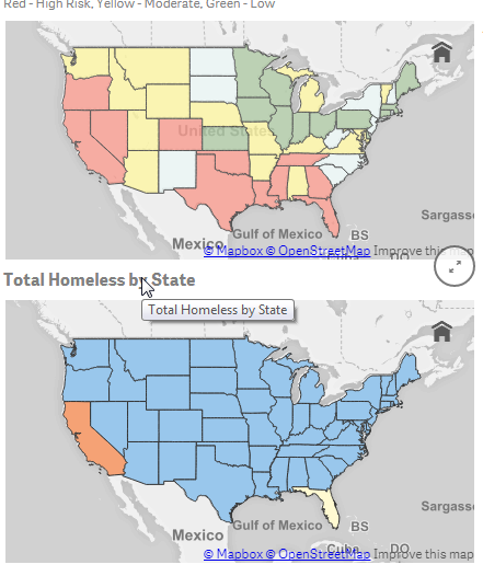
(Standard scorecard - comes to mind - showing green, yellow, red dots etc.)
Qlik Sense - uses a number of visualization objects which can have conditional colors defined based off of variables and defined limits and they can either defined in the object's settings or within a "color by expression" parameter:
Here are a few samples:

Please mark the appropriate replies as CORRECT / HELPFUL so our team and other members know that your question(s) has been answered to your satisfaction.
Regards,
Mike Tarallo
Qlik
Mike Tarallo
Qlik
- Mark as New
- Bookmark
- Subscribe
- Mute
- Subscribe to RSS Feed
- Permalink
- Report Inappropriate Content
I am trying to create this one in qlik sense any ideas how?
thanks in advance 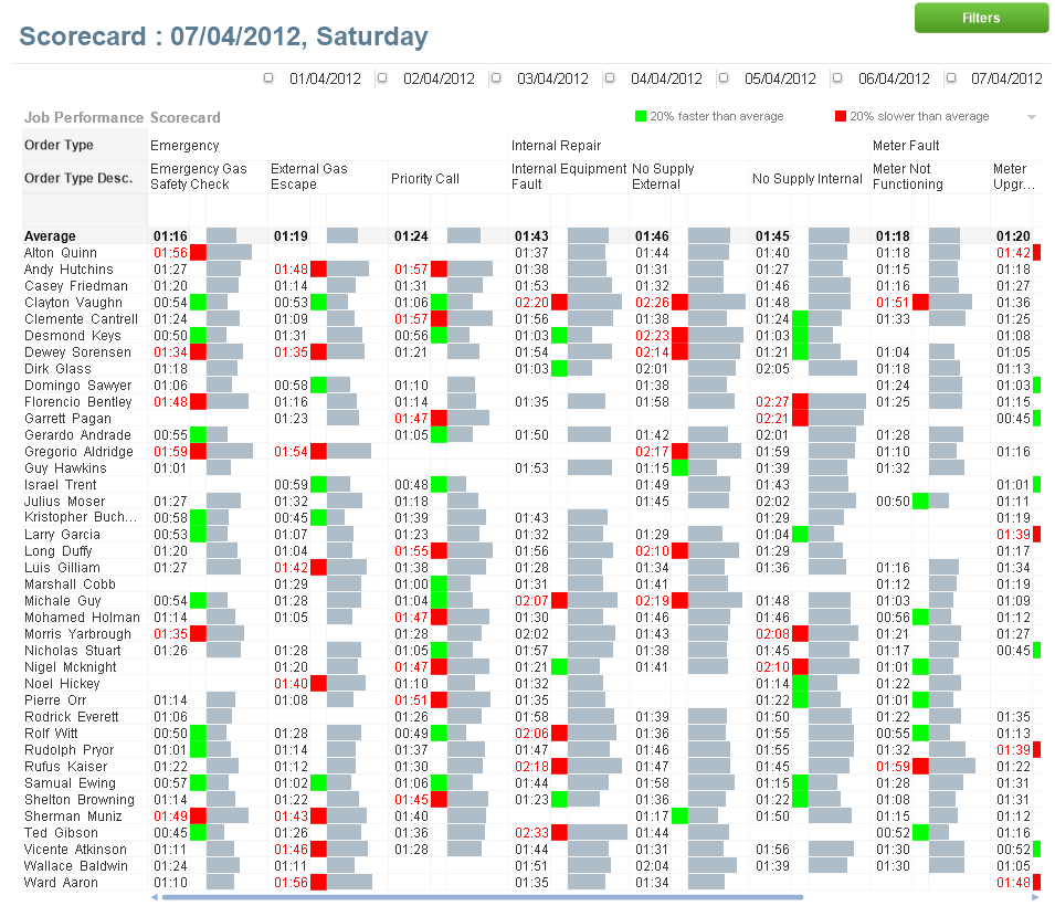
- Mark as New
- Bookmark
- Subscribe
- Mute
- Subscribe to RSS Feed
- Permalink
- Report Inappropriate Content
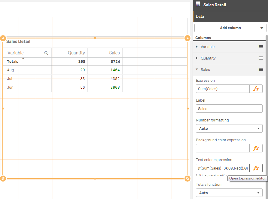
Use a cross tab table and conditional formatting on your values to get the look you have in your screenshot.
See attached.
- Mark as New
- Bookmark
- Subscribe
- Mute
- Subscribe to RSS Feed
- Permalink
- Report Inappropriate Content
Hi,
May be this will help Is it possible to add a traffic light indicator... | Qlik Community
- Mark as New
- Bookmark
- Subscribe
- Mute
- Subscribe to RSS Feed
- Permalink
- Report Inappropriate Content
Hi Noha
may be see this extrension on Qlik Branch :
http://branch.qlik.com/#!/project/56f33f1e4a4bce4cf138ba00
- Mark as New
- Bookmark
- Subscribe
- Mute
- Subscribe to RSS Feed
- Permalink
- Report Inappropriate Content
Hi andy what exactly you mean because your picture shows a regular table can you explain more
- Mark as New
- Bookmark
- Subscribe
- Mute
- Subscribe to RSS Feed
- Permalink
- Report Inappropriate Content
Hi Bruno
I did download it and I am still trying to figure out how to use it it won't show exactly what I want at the end but it is close enough though.
Thanks 
- Mark as New
- Bookmark
- Subscribe
- Mute
- Subscribe to RSS Feed
- Permalink
- Report Inappropriate Content
Thanks a lot that looks like what I want I will give it a try
- Mark as New
- Bookmark
- Subscribe
- Mute
- Subscribe to RSS Feed
- Permalink
- Report Inappropriate Content
Sure. looking at your example and breaking it down I was showing you the regular table with conditional colour formatting on the measure would handle 80% of your requirement as per your screen shot.
The title and subtitle sections would handle your header requirement and a separate filter box on your reporting dates would display your date filters.
Just as an aside I see 2 measures in your score card but I see nowhere explained what they are measuring which to someone that's never seen the report would be confusing. I'd include some context into your title, subtitle or footnote.
- « Previous Replies
-
- 1
- 2
- Next Replies »