Unlock a world of possibilities! Login now and discover the exclusive benefits awaiting you.
- Qlik Community
- :
- Forums
- :
- Analytics
- :
- Topics
- :
- Visualization and Usability
- :
- Spatial line chart from two date fields
Options
- Subscribe to RSS Feed
- Mark Topic as New
- Mark Topic as Read
- Float this Topic for Current User
- Bookmark
- Subscribe
- Mute
- Printer Friendly Page
Turn on suggestions
Auto-suggest helps you quickly narrow down your search results by suggesting possible matches as you type.
Showing results for
Creator
2019-07-04
07:58 AM
- Mark as New
- Bookmark
- Subscribe
- Mute
- Subscribe to RSS Feed
- Permalink
- Report Inappropriate Content
Spatial line chart from two date fields
I have a table similar to this:
| id | time_start | time_end | start_pos | end_pos |
| 1 | 14.31.46 | 14.31.51 | 1 | 7 |
| 2 | 14.32.44 | 14.32.53 | 7 | 4 |
| 3 | 14.33.26 | 14.33.29 | 4 | 5 |
| 4 | 14.34.34 | 14.34.39 | 5 | 2 |
| 5 | 14.35.41 | 14.35.43 | 2 | 7 |
| 6 | 14.36.35 | 14.36.36 | 7 | 8 |
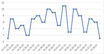
and I want to create a chart like this in Qlik Sense:
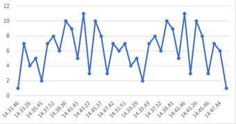
So basically use both of the time-fields at the same time. Currently I can only use the time_start as a dimension and start_pos as a measure to create something similar to this, but without the horizontal stops:
Is the first graph possible to do in Qlik Sense?
816 Views
2 Replies
Creator II
2019-07-04
08:40 AM
- Mark as New
- Bookmark
- Subscribe
- Mute
- Subscribe to RSS Feed
- Permalink
- Report Inappropriate Content
Hi,
Check out the app I have attached. Is that what you were looking to do?
Regards,
Chirag
806 Views
Creator
2019-07-05
02:01 AM
Author
- Mark as New
- Bookmark
- Subscribe
- Mute
- Subscribe to RSS Feed
- Permalink
- Report Inappropriate Content
Hi ChiragPradhan, yes that is how I want the chart to look like. However the problem is that I have both time and the position as two separate columns instead of one.
797 Views
Community Browser

