Unlock a world of possibilities! Login now and discover the exclusive benefits awaiting you.
- Qlik Community
- :
- All Forums
- :
- Visualization and Usability
- :
- Stacked bar chart colors
- Subscribe to RSS Feed
- Mark Topic as New
- Mark Topic as Read
- Float this Topic for Current User
- Bookmark
- Subscribe
- Mute
- Printer Friendly Page
- Mark as New
- Bookmark
- Subscribe
- Mute
- Subscribe to RSS Feed
- Permalink
- Report Inappropriate Content
Stacked bar chart colors
Hello,
In my report, I have the field 'Year' -- as Dimension
and Measure is Sum({<[BranchID] = p({<[Year]= {"$(=Max(Year) - 1)"}>})>}[FactSoldAmount]) (using this formula, I calculate the sum of the same companies in different years) .
In this formula I don't use the new branches that was added this year. I want to have a bar chart like in this picture, where new companies will be shown in different colours
How can do it?
- Mark as New
- Bookmark
- Subscribe
- Mute
- Subscribe to RSS Feed
- Permalink
- Report Inappropriate Content
You can use 2nd dimension which will split up bar according to values of the dimension
- Mark as New
- Bookmark
- Subscribe
- Mute
- Subscribe to RSS Feed
- Permalink
- Report Inappropriate Content
Use Company Filed as 2nd Dimension.
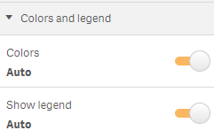
Properties --> Presentation --> select Stacked and from Colors and Legend --> Enable Colors Auto as shown below.

HTH
Thanks,
Naresh