Unlock a world of possibilities! Login now and discover the exclusive benefits awaiting you.
- Qlik Community
- :
- All Forums
- :
- Visualization and Usability
- :
- Using a pie chart to display the conditional break...
Options
- Subscribe to RSS Feed
- Mark Topic as New
- Mark Topic as Read
- Float this Topic for Current User
- Bookmark
- Subscribe
- Mute
- Printer Friendly Page
Turn on suggestions
Auto-suggest helps you quickly narrow down your search results by suggesting possible matches as you type.
Showing results for
Creator
2020-06-16
04:52 PM
- Mark as New
- Bookmark
- Subscribe
- Mute
- Subscribe to RSS Feed
- Permalink
- Report Inappropriate Content
Using a pie chart to display the conditional breakdown of data that has been filtered (urgent)
Hi!
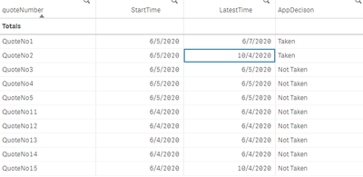
I have the following table:
And I have a calendar to pick a date range. I'm trying to count how many of the quotes that started in the range were taken within the date range. So for example, right now I have 6/4-6/7 selected. There are a total of 10 quotes that started in that date range. Of those 10, only 1 was taken within 6/4-6/7. So I want the pie chart to show 1 taken and 9 not taken. Is that possible? Or do I have to change something when I load this table? This is what I have in my load script:
Temp:
LOAD
    eventId,
    TimeStamp(TimeStamp#(eventDateTime, 'YYYY-MM-DD hh:mm:ss.fff')) as eventDateTime,
    Date(floor(TimeStamp#(eventDateTime, 'YYYY-MM-DD hh:mm:ss.fff'))) as eventDate,
    eventName,
    eventType,
    systemId,
    environment,
    "userId",
    userFirstName,
    userLastName,
    producerTransactionId,
    triggerDescription,
    quoteNumber,
    policyNumber,
    ratingReferenceNumber,
    agentNumber,
    applicationSignedState,
    licensingCheckResult,
    esignatureStatus,
    applicaitonDecision,
    if (applicaitonDecision = 'Approved', 1, 0) as Decision
FROM [lib://DataFiles/Mock Data (2).xlsx]
(ooxml, embedded labels, table is Sheet1);


A:
LOAD
Date(Min(eventDate)) as StartTime,
Date(Max(eventDate)) as LatestTime,
quoteNumber,
if (Sum(Decision) = 1, 'Taken', 'Not Taken') as AppDecison
Resident Temp Group By quoteNumber;
Thank you! I'm trying my best to learn and use Qlik
575 Views
0 Replies
Community Browser
