Unlock a world of possibilities! Login now and discover the exclusive benefits awaiting you.
- Qlik Community
- :
- Forums
- :
- Analytics
- :
- New to Qlik Analytics
- :
- Re: Wrong values displayed in bar chart and KPI (a...
- Subscribe to RSS Feed
- Mark Topic as New
- Mark Topic as Read
- Float this Topic for Current User
- Bookmark
- Subscribe
- Mute
- Printer Friendly Page
- Mark as New
- Bookmark
- Subscribe
- Mute
- Subscribe to RSS Feed
- Permalink
- Report Inappropriate Content
Wrong values displayed in bar chart and KPI (again)
Hello
I've posted something like this before, as seen here: Wrong values displayed in bar chart
But now I'm working in a similar but different project and the solution given in the above question isn't working for me.
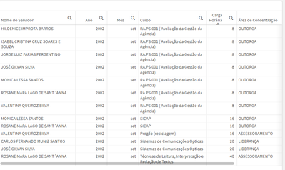
I have a table like this:
In which the dimensions are, in order of column, from left to right: [Nome do servidor], [Data.autoCalendar.Year], [Data.autoCalendar.Month], [Nome Evento], [Carga Horária], [Área de Concentração]
Here's my bar chart:
Here's my expression for the KPI:
(Count({$} Aggr(distinct [Nome Evento], [Nome do servidor], [Data.autoCalendar.Year], [Data.autoCalendar.Month], [Carga Horária])))
Here's my expression for the bar chart:
(Count({$} Aggr(distinct [Nome do servidor], [Data.autoCalendar.Year], [Data.autoCalendar.Month], [Nome Evento], [Carga Horária])))
There are both month and year filters selected. The bar on the chart should display the number of records in the table: 13
But it's displaying a much lower value.
Also, the value is much higher than it should be when I use the following expression:
Sum({$} Aggr(Count(distinct [Nome Evento]), [Nome do servidor], [Data.autoCalendar.Year], [Data.autoCalendar.Month], [Carga Horária], [Área de Concentração]))
Why is that? How do I make it display the correct value?
- Mark as New
- Bookmark
- Subscribe
- Mute
- Subscribe to RSS Feed
- Permalink
- Report Inappropriate Content
In this situation, with the filters applied for a specific course and employee, the Count(distinct [Nome Evento]) column shows that there's 2 of one of the courses in single day, meaning the course took three days in which the duration on two of the days was of 2 hours and the duration of the third day was of 3 hours.
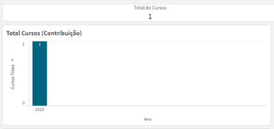
But in the KPI/Bar chart it's only showing one course:
How do I make all the records correctly display on the table?
I need to show all three lines.
- Mark as New
- Bookmark
- Subscribe
- Mute
- Subscribe to RSS Feed
- Permalink
- Report Inappropriate Content
I don't follow that last one.
You said that Nome Evento matched Curso. There is exactly one distinct Curso value for this selection, so the KPI correctly shows 1 and your issue is that the table shouldn't display multiple lines? You can probably fix this by changing the Hours field from a dimension to a measure so you get the total number of hours for the course.
- Mark as New
- Bookmark
- Subscribe
- Mute
- Subscribe to RSS Feed
- Permalink
- Report Inappropriate Content
You were right. Using Count(distinct [Nome Evento]) as my dimension expression on both the KPI and the bar chart solved it.
The problem was in my table. Once I removed the [Carga Horaria] column and added a measure like Sum([Carga Horária]) instead, my table started displaying the correct number of lines.
It was so simple, I still can't believe it.
Thank you
- Mark as New
- Bookmark
- Subscribe
- Mute
- Subscribe to RSS Feed
- Permalink
- Report Inappropriate Content
I'm sorry but even though I'd thought it was solved, it's not.
Some times the numbers in the kpi and the bar chart are correct and correspond to the number of lines in the table, but sometimes they're not.
Here's what the bar chart looks like for january 2002:
But the table is empty with those filters applied:
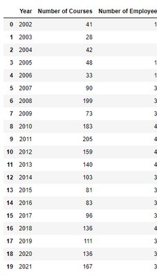
Also I did an analysis of the data using pandas in jupyter notebook and found out the numbers in the bar chart are wrong.
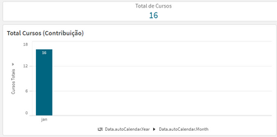
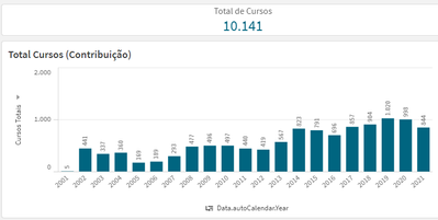
Here's what the bar chart looks like with no filters applied:
Here's what the number should be:
Here's the expression for the bar chart:
Count(distinct [Nome Evento])
What's wrong? How do I solve this?
- Mark as New
- Bookmark
- Subscribe
- Mute
- Subscribe to RSS Feed
- Permalink
- Report Inappropriate Content
I can't see what sort of filters you might have applied, so the issue may be related to filters. If it isn't, check that the table does not suppress zero/null values (under Data Handling I think) and that none of the dimensions have suppress null values checked. You can also just go to the selections screen and look at the listbox for Nome Evento - if there are indeed 16 distinct values in this scenario, you should see those 16 values listed there.
- Mark as New
- Bookmark
- Subscribe
- Mute
- Subscribe to RSS Feed
- Permalink
- Report Inappropriate Content
I checked the Include Null Values box for the employee column ([Nome do Servidor]) and it turns out there are null values in this column.
Here's what I mean:
But I don't want to take these into consideration when counting the courses in the KPI and bar chart. I only want to count the entries where at least the employee name, course name and year are filled.
Do I need to treat the null values at SQL level? Or can I do what I want just by using expressions and set analysis (I'm assuming)?
- Mark as New
- Bookmark
- Subscribe
- Mute
- Subscribe to RSS Feed
- Permalink
- Report Inappropriate Content
You could add a set analysis of e.g. {< [Nome do Servidor] = >} which would exclude the nulls in this field from your count (or whatever other aggregation).
- Mark as New
- Bookmark
- Subscribe
- Mute
- Subscribe to RSS Feed
- Permalink
- Report Inappropriate Content
I tried modifying the expression so it now looks like this:
Count({$ <[Nome do servidor] = {"*"}>} distinct [Nome Evento])
or even this:
Count({$ <[Nome do servidor] = Null>} distinct [Nome Evento])
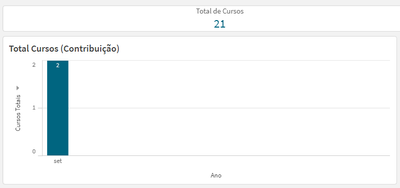
But the numbers still don't match. My KPI/bar chart now show me there's only 2 courses for august 2002. But in my table there's 4 records:
P.s.: [Nome do Servidor] = Employee name, [Nome Evento] = Course name
What am I doing wrong?
__________________________
Edit:
I see now that on the table there are 4 records because each of these courses were taken by a different person. But three people have taken the same course:
So the bar chart/KPI is only counting how many distinct courses there are, without taking into consideration that if two people have taken the same course, then it should count as two courses.
How can I make it so?
- Mark as New
- Bookmark
- Subscribe
- Mute
- Subscribe to RSS Feed
- Permalink
- Report Inappropriate Content
There are only two courses in your table, and that's what you're counting. One course has three lines because three different employees took it, seemingly.
- Mark as New
- Bookmark
- Subscribe
- Mute
- Subscribe to RSS Feed
- Permalink
- Report Inappropriate Content
But I need to count how many people have taken courses, not how many distinct courses were taken.
So if two different people take the same course, it should count as two courses taken in the bar chart.
Currently this is the expression for the bar chart:
Count(distinct {$ <[Nome do servidor] = {"*"}>} [Nome Evento])
But if I change it to:
Count({$ <[Nome do servidor] = {"*"}>} [Nome Evento])
Then this happens:
There are two courses that happened over a total of two days and they have different values for the hour duration ([Carga Horária]), but since in my table I'm only adding the hours for courses that are equal (i.e. everything the same except for the hour duration), a course that was taken over more than one day only appears once in the table. And it should only count once in the bar chart too.
So here's my problem:
- If I count distinct courses names, then whenever two different people have taken the same course, it only gets counted once whereas I need it to be counted twice.
- If I count courses names without taking into consideration that they need to be distinct, then whenever a course has a count of more than one (everything the same except the hour duration of the course) then it only shows once in the table whereas in the bar chart it adds the courses counts and displays that.
Ideal Solution:
If two people have taken the same course:
- Table shows 2 records
- Bar chart shows 2 courses were taken
If one person took a course that happened over a period of 3 days, but that only shows up once in the table with the duration of all three days added:
- Table shows 1 record
- Bar chart shows 1 course was taken (instead of 3)
Combining the two situations: If two people have taken the same course and one of these people has taken a second course that lasted 2 days:
- Table shows 3 records
- Bar chart shows 3 courses were taken (instead of either 2 or 4)
Is this possible? How can I achieve this?
