Unlock a world of possibilities! Login now and discover the exclusive benefits awaiting you.
- Qlik Community
- :
- Forums
- :
- Analytics
- :
- New to Qlik Analytics
- :
- Re: Wrong values displayed in bar chart and KPI (a...
- Subscribe to RSS Feed
- Mark Topic as New
- Mark Topic as Read
- Float this Topic for Current User
- Bookmark
- Subscribe
- Mute
- Printer Friendly Page
- Mark as New
- Bookmark
- Subscribe
- Mute
- Subscribe to RSS Feed
- Permalink
- Report Inappropriate Content
Wrong values displayed in bar chart and KPI (again)
Hello
I've posted something like this before, as seen here: Wrong values displayed in bar chart
But now I'm working in a similar but different project and the solution given in the above question isn't working for me.
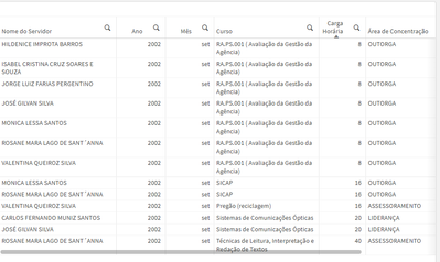
I have a table like this:
In which the dimensions are, in order of column, from left to right: [Nome do servidor], [Data.autoCalendar.Year], [Data.autoCalendar.Month], [Nome Evento], [Carga Horária], [Área de Concentração]
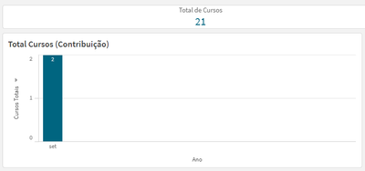
Here's my bar chart:
Here's my expression for the KPI:
(Count({$} Aggr(distinct [Nome Evento], [Nome do servidor], [Data.autoCalendar.Year], [Data.autoCalendar.Month], [Carga Horária])))
Here's my expression for the bar chart:
(Count({$} Aggr(distinct [Nome do servidor], [Data.autoCalendar.Year], [Data.autoCalendar.Month], [Nome Evento], [Carga Horária])))
There are both month and year filters selected. The bar on the chart should display the number of records in the table: 13
But it's displaying a much lower value.
Also, the value is much higher than it should be when I use the following expression:
Sum({$} Aggr(Count(distinct [Nome Evento]), [Nome do servidor], [Data.autoCalendar.Year], [Data.autoCalendar.Month], [Carga Horária], [Área de Concentração]))
Why is that? How do I make it display the correct value?
- « Previous Replies
- Next Replies »
- Mark as New
- Bookmark
- Subscribe
- Mute
- Subscribe to RSS Feed
- Permalink
- Report Inappropriate Content
So you're trying to count the number of distinct combinations of employees and courses? You could just do that, e.g.
Count(distinct {$ <[Nome do servidor] = {"*"}>} [Nome Evento] & '-' & [Nome do servidor])
Note that the dash is intended to prevent unintentional merging of similar keys, e.g. Nome evento = 1 and Nome servidor = 11 would concatenate into the same value of evento 11 and servidor 1. You can use any separator, ideally one that's not present in your actual data (dash, pipe, semicolon, whatever)
- Mark as New
- Bookmark
- Subscribe
- Mute
- Subscribe to RSS Feed
- Permalink
- Report Inappropriate Content
Yes, that's precisely what I'm trying to count. Your expression worked perfectly for the bar chart, thank you!I've checked it against the results from my analysis with pandas and the results match.
However the KPI is showing the wrong number.
In this example I'm using the filter for the year of 2014:
2014 has 103 different combinations of employees and courses. If I add all the numbers in the bar chart it amounts to 103. But the KPI is displaying the number 101 instead. Why?
Here's the formula I'm using for the KPI now:
Count(distinct {$ <[Nome do servidor] = {"*"}>} [Nome Evento] & '==' & [Nome do servidor])
- Mark as New
- Bookmark
- Subscribe
- Mute
- Subscribe to RSS Feed
- Permalink
- Report Inappropriate Content
I have no way of knowing why the numbers would be different. You'll have to check the unique combinations. At a guess, you may have a combination of employee and course that applies to two different months for a multi-day course, so the bar chart would count it for each month while the KPI would not.
- Mark as New
- Bookmark
- Subscribe
- Mute
- Subscribe to RSS Feed
- Permalink
- Report Inappropriate Content
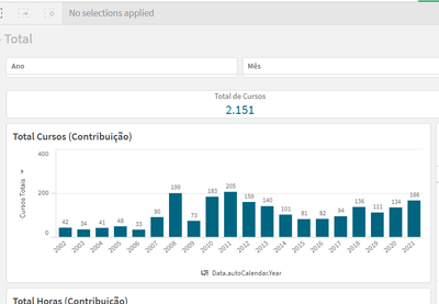
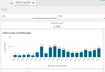
Also, using the above expression, the bar chart no longer takes into consideration the selection.
The numbers are right when there are no filters for employees applied. But when I select one or more employee, nothing happens.
Here's the bar chart with no filters applied:
And here's the bar chart when an employee is selected:
And regarding the KPI, you were right, it had something to do with the month. Once I changed the expression to take the month into consideration regarding the unique combination the KPI displayed the correct number.
Here's what the expression for the KPI looks like now:
Count(distinct {$ <[Nome do servidor] = {"*"}>} [Nome Evento] & '==' & [Nome do servidor] & '==' & [Data.autoCalendar.Month])
But back to the first problem, why isn't it taking the employee filter into consideration? How I can I make it so?
- Mark as New
- Bookmark
- Subscribe
- Mute
- Subscribe to RSS Feed
- Permalink
- Report Inappropriate Content
Nevermind. I managed to solve it by including *before = in my set analysis expression.
So now my bar chart and KPI expression now looks like this:
Count(distinct {$ <[Nome do servidor] *= {"*"}>} [Nome Evento] & '==' & [Nome do servidor] & '==' & [Data.autoCalendar.Month])
- « Previous Replies
- Next Replies »


