Unlock a world of possibilities! Login now and discover the exclusive benefits awaiting you.
- Qlik Community
- :
- All Forums
- :
- Visualization and Usability
- :
- Re: change the sign of a measure only for the disp...
- Subscribe to RSS Feed
- Mark Topic as New
- Mark Topic as Read
- Float this Topic for Current User
- Bookmark
- Subscribe
- Mute
- Printer Friendly Page
- Mark as New
- Bookmark
- Subscribe
- Mute
- Subscribe to RSS Feed
- Permalink
- Report Inappropriate Content
change the sign of a measure only for the display
Hi all,
I'd like to make a bar chart 'number of colleagues by profile' by displaying the number next to the bar.
The bar must be negative as it is compared with another chart but the displayed number must be positive.
How can I handle this in QS?
Thanks a lot
- « Previous Replies
-
- 1
- 2
- Next Replies »
Accepted Solutions
- Mark as New
- Bookmark
- Subscribe
- Mute
- Subscribe to RSS Feed
- Permalink
- Report Inappropriate Content
This is exactly what this article talks about:
Step by step guide:
Note: For the following example I got a sample data containing Population by Age data from the US census. It has 3 columns, Age Range, Male population and Female population.
- Drag and drop a bar chart to your sheet.
- Add a dimension. I’ll add Age Range to mine.
- Add two expressions. I need one expression to display female’s population and a second one for males.
At this point, my chart looks like this: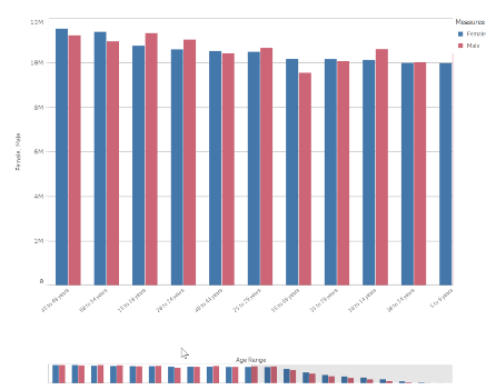
- Next, we will adjust the bar chart sorting and appearance.
Sort the chart according to your data. For this data set my best option is to sort Age Range using load order, to do so, move Age Range to the top and then uncheck all the sorting options to sort on load order.
In the Appearance section of the chart property panel, switch Presentation to Horizontal and Stacked and set Value labels to Auto.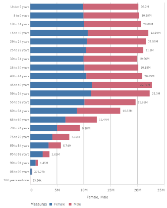
- Now we need to figure out how to “move the y axis to the center of the chart". To do so I’ll transform the data to make Female population negative by changing my expression to: Sum(FemalePopulation)*-1
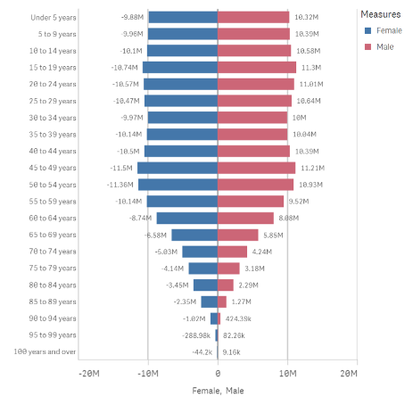
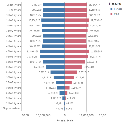
- My chart looks almost right but there’s still a detail that doesn't fits well in the picture above. Note that the value labels for Female Population are displayed as negative numbers. While technically correct, it doesn't work for this chart, I need it to be displayed as positive vales as well.
As a general note remember we can set up the format for positive and negative values for any expression. Format argument in the Num function can take 2 parameters, first one indicates how to format the number if it is >0 and the second piece if number <0.
=num(sum(x), 'postivenumberFormat;negativenumberFormat')
As I want negative and positive number to look exactly the same I could use the following format arguments:
num(sum(FemalePopulation)*-1,’#,##0;#,##0’)
- Mark as New
- Bookmark
- Subscribe
- Mute
- Subscribe to RSS Feed
- Permalink
- Report Inappropriate Content
Hi Thierry,
I am sorry, but i don't think this is possible as with the standard functionality.
If you multiple the the expression by -1 will turn it negative, but as far as I am aware value labels will always give you the Value of the expression.
It maybe possible via an extention?
Mark
- Mark as New
- Bookmark
- Subscribe
- Mute
- Subscribe to RSS Feed
- Permalink
- Report Inappropriate Content
thx... sometimes I miss QlikView ![]()
- Mark as New
- Bookmark
- Subscribe
- Mute
- Subscribe to RSS Feed
- Permalink
- Report Inappropriate Content
Hi,
I think maybe changing the number format for the measure would work, something like this:
This would result in numbers on the bars shown as negative with no decimal point. You can of course change the number resolution, like this:
Maybe this will help, good luck!
Micha
- Mark as New
- Bookmark
- Subscribe
- Mute
- Subscribe to RSS Feed
- Permalink
- Report Inappropriate Content
- Mark as New
- Bookmark
- Subscribe
- Mute
- Subscribe to RSS Feed
- Permalink
- Report Inappropriate Content
Have you tried with a dual?
Something like:
Dual(Fabs(<your expression>), <your expression>)
or
Dual((<your expression>)*-1, <your expression>)
- Mark as New
- Bookmark
- Subscribe
- Mute
- Subscribe to RSS Feed
- Permalink
- Report Inappropriate Content
thx.. good to know. but in my case the 2 measures (pos and neg) are different. In your example, it's the same.
- Mark as New
- Bookmark
- Subscribe
- Mute
- Subscribe to RSS Feed
- Permalink
- Report Inappropriate Content
almost.. the expression is negative.
if I add a "-" in the format, I'll have : " -- " . ![]()
thx for your reply
- Mark as New
- Bookmark
- Subscribe
- Mute
- Subscribe to RSS Feed
- Permalink
- Report Inappropriate Content
This is exactly what this article talks about:
Step by step guide:
Note: For the following example I got a sample data containing Population by Age data from the US census. It has 3 columns, Age Range, Male population and Female population.
- Drag and drop a bar chart to your sheet.
- Add a dimension. I’ll add Age Range to mine.
- Add two expressions. I need one expression to display female’s population and a second one for males.
At this point, my chart looks like this:
- Next, we will adjust the bar chart sorting and appearance.
Sort the chart according to your data. For this data set my best option is to sort Age Range using load order, to do so, move Age Range to the top and then uncheck all the sorting options to sort on load order.
In the Appearance section of the chart property panel, switch Presentation to Horizontal and Stacked and set Value labels to Auto.
- Now we need to figure out how to “move the y axis to the center of the chart". To do so I’ll transform the data to make Female population negative by changing my expression to: Sum(FemalePopulation)*-1

- My chart looks almost right but there’s still a detail that doesn't fits well in the picture above. Note that the value labels for Female Population are displayed as negative numbers. While technically correct, it doesn't work for this chart, I need it to be displayed as positive vales as well.
As a general note remember we can set up the format for positive and negative values for any expression. Format argument in the Num function can take 2 parameters, first one indicates how to format the number if it is >0 and the second piece if number <0.
=num(sum(x), 'postivenumberFormat;negativenumberFormat')
As I want negative and positive number to look exactly the same I could use the following format arguments:
num(sum(FemalePopulation)*-1,’#,##0;#,##0’)
- Mark as New
- Bookmark
- Subscribe
- Mute
- Subscribe to RSS Feed
- Permalink
- Report Inappropriate Content
make a changes in number format in the properties of a chart
- « Previous Replies
-
- 1
- 2
- Next Replies »
