Unlock a world of possibilities! Login now and discover the exclusive benefits awaiting you.
- Qlik Community
- :
- All Forums
- :
- Visualization and Usability
- :
- Re: color by expression - QlikSense
- Subscribe to RSS Feed
- Mark Topic as New
- Mark Topic as Read
- Float this Topic for Current User
- Bookmark
- Subscribe
- Mute
- Printer Friendly Page
- Mark as New
- Bookmark
- Subscribe
- Mute
- Subscribe to RSS Feed
- Permalink
- Report Inappropriate Content
color by expression - QlikSense
Hi all,
i am struggeling with a simple line chart. It shows revenue over month - so "Month" would be one dimension. It has two expressions. The one calculates revenue for the current year. The other calculates revenue for the previous year. All no problem.
What i want - and until now couldnt get to: I want the line representing the current year to have a specific color (lets say, red) and the line representing the previous year to have another specific color (lets say, gray).
Can anyone help and explain how this can be done in SENSE ?
Thanks!
K
- « Previous Replies
- Next Replies »
- Mark as New
- Bookmark
- Subscribe
- Mute
- Subscribe to RSS Feed
- Permalink
- Report Inappropriate Content
Hi Philipp,
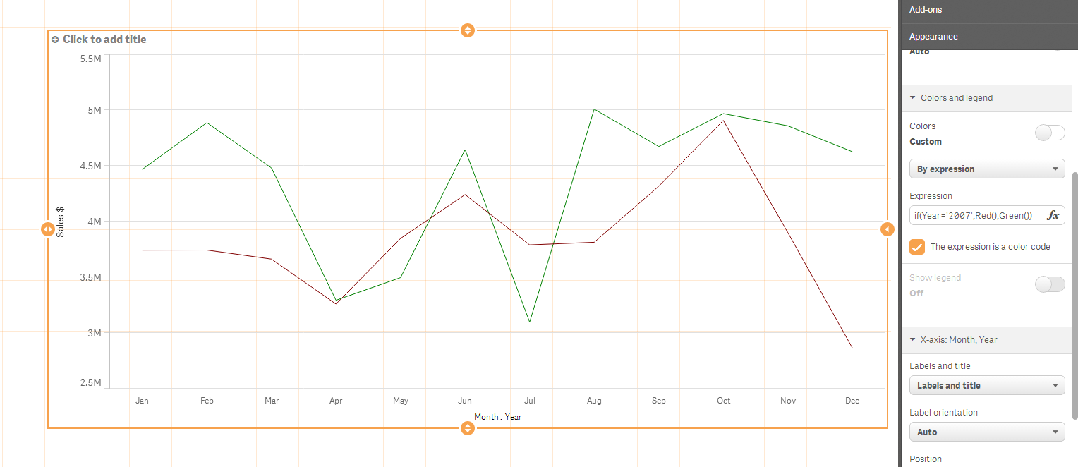
Left-click the line chart while in edit mode. The properties of the chart will show up on the right side of your screen. Click on Appearance --> Colors and legend --> And deselect the option where it says auto colors ON. Select "By expression" in the menu box that appears, and underneath that you can enter in a expression that can customize the color of the line chart.
Example:
IF(YearField = '2012', Red(), Green())
Cheers,
Sean
- Mark as New
- Bookmark
- Subscribe
- Mute
- Subscribe to RSS Feed
- Permalink
- Report Inappropriate Content
Thanks Sean.
Unfortunately this does not seem to do the job, as my dimension "Month" is not unique to a year. So if i set an expression like you suggested, it does not do anything in the chart...
- Mark as New
- Bookmark
- Subscribe
- Mute
- Subscribe to RSS Feed
- Permalink
- Report Inappropriate Content
I'd recommend you use a second colour in your if statement. I believe
It is possible your data doesn't contain any information where Year = 2014, Qlik Sense doesn't know what colour to use. This should work:
if(Year='2014',Red(),Green())

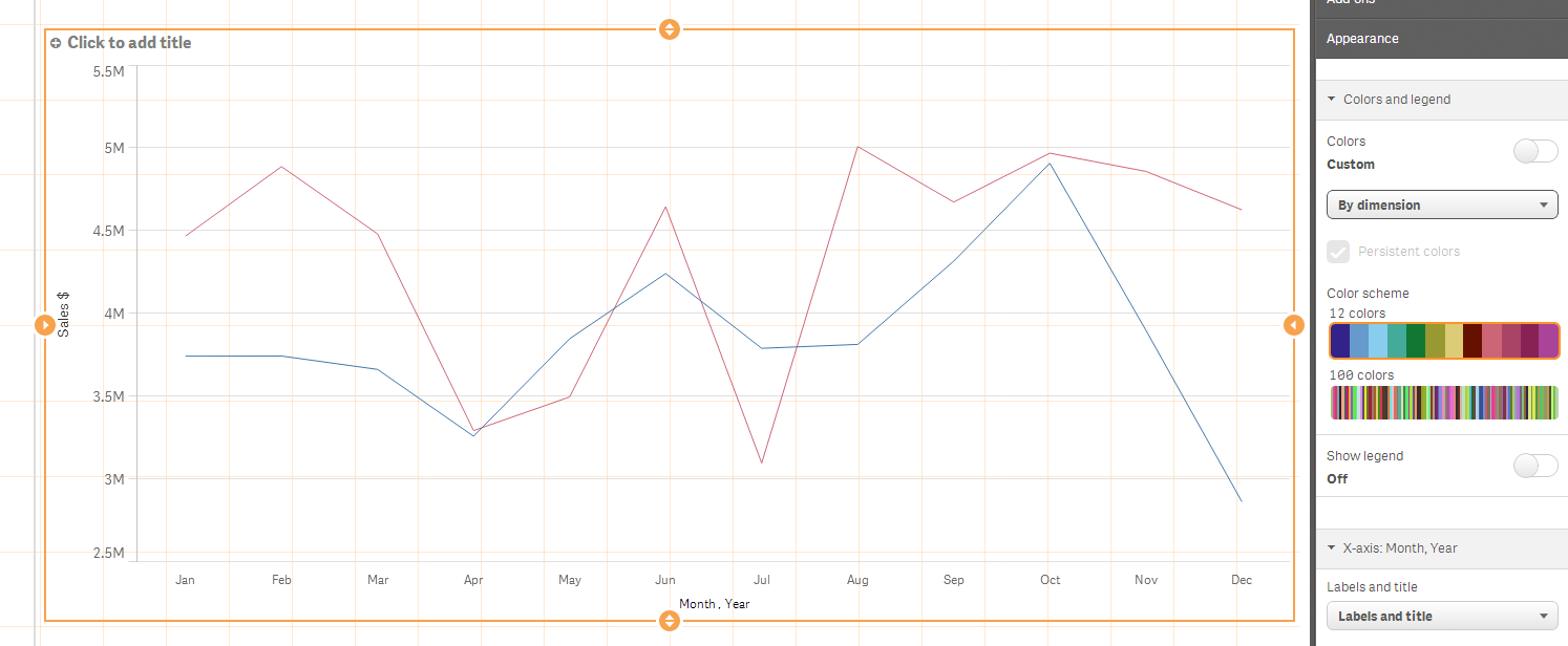
If you don't care which colour is used just that the colours are different between the years, you could colour "By Dimension".

- Mark as New
- Bookmark
- Subscribe
- Mute
- Subscribe to RSS Feed
- Permalink
- Report Inappropriate Content
Sean's idea worked in this example. Can you share any more details on your app ? Can you share the QVF ?

- Mark as New
- Bookmark
- Subscribe
- Mute
- Subscribe to RSS Feed
- Permalink
- Report Inappropriate Content
Here is an sample app showing this.
- Mark as New
- Bookmark
- Subscribe
- Mute
- Subscribe to RSS Feed
- Permalink
- Report Inappropriate Content
Hi Josh,
thanks for your feedback.
this works fine if you have years selected.
I dont want to have anything selected - i would like to use two expressions, one pointing to current year, the other to previous year ... when i do this i seem to lose the option to color code the lines...
In 11 it was easy as you could just set a color directly on every expression...
any idea how i can get this done ?
- Mark as New
- Bookmark
- Subscribe
- Mute
- Subscribe to RSS Feed
- Permalink
- Report Inappropriate Content
Hi Philipp,
Not sure if I understand the question, you want something like: If(Year=Year(Today()),Red(),Green())
Or maybe If(Year=Max(TOTAL Year),Red(),Green())
Regards
- Mark as New
- Bookmark
- Subscribe
- Mute
- Subscribe to RSS Feed
- Permalink
- Report Inappropriate Content
The color 'by expression' doesn't refer to each expression individually.
What i would recommend as a workaround is to 'pivot' your data so that the expressions become a dimension and the values of the expression become a single expression
Data
Dim1,Expr1,Expr2
A,10,1
B,11,2
C,12,3
And pivot it in the script to:
Dim1,Expression,Value
A,Expr1,10
A,Expr2,1
B,Expr1,11
B,Expr2,2
C,Expr1,10
C,Expr2,3
then use 2 dimensions (like josh's example) and in the expression use if( Expression='Expr1', <color codes, if(Expression='Expr2', <colorcodes>)
make sense ?
- Mark as New
- Bookmark
- Subscribe
- Mute
- Subscribe to RSS Feed
- Permalink
- Report Inappropriate Content
Hi, I've seen a few issues around applying specific colours to charts in Sense and wanted to offer an alternative solution. This works well if there are a limited number of dimensions you want to display (e.g. last four years data with each year coloured in gradients of gray with the current year in red, or sales broken down by product category with a total sales amount also displayed in specific colours)
This can be achieved using a synthetic dimension

1. Create the dimension as a synthetic dimension using ValueList. Note: define the dimensions using a useful reference (e.g. 'Current Year') rather than 'Dim1' since this will be displayed in the popups!
=ValueList('Dim1', 'Dim2', 'Dim3', 'Dim4')
2. Create a single measure with the value to be shown for each Dimension
if( ValueList('Dim1', 'Dim2', 'Dim3', 'Dim4')='Dim1', SUM({<Year={2011}>}Sales),
if( ValueList('Dim1', 'Dim2', 'Dim3', 'Dim4')='Dim2', SUM({<Year={2012}>}Sales),
if( ValueList('Dim1', 'Dim2', 'Dim3', 'Dim4')='Dim3', SUM({<Year={2013}>}Sales),
if( ValueList('Dim1', 'Dim2', 'Dim3', 'Dim4')='Dim4', SUM({<Year={2014}>}Sales)
))))
3. Set Color by Expression with the colours you want allocated to each Dimension
if( ValueList('Dim1', 'Dim2', 'Dim3', 'Dim4')='Dim1', argb(80,80,80,80),
if( ValueList('Dim1', 'Dim2', 'Dim3', 'Dim4')='Dim2', argb(160,80,80,80),
if( ValueList('Dim1', 'Dim2', 'Dim3', 'Dim4')='Dim3', argb(220,80,80,80),
if( ValueList('Dim1', 'Dim2', 'Dim3', 'Dim4')='Dim4', lightred()
))))
I've attached an application enhancing Josh Good's example. I hope this proves useful.
- « Previous Replies
- Next Replies »