Unlock a world of possibilities! Login now and discover the exclusive benefits awaiting you.
- Qlik Community
- :
- Forums
- :
- Analytics
- :
- New to Qlik Analytics
- :
- Re: how to create special chart
- Subscribe to RSS Feed
- Mark Topic as New
- Mark Topic as Read
- Float this Topic for Current User
- Bookmark
- Subscribe
- Mute
- Printer Friendly Page
- Mark as New
- Bookmark
- Subscribe
- Mute
- Subscribe to RSS Feed
- Permalink
- Report Inappropriate Content
how to create special chart
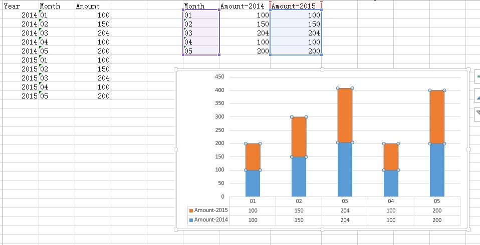
Left range data is original data, I want to create special stack chart as below, how to do it?
- Mark as New
- Bookmark
- Subscribe
- Mute
- Subscribe to RSS Feed
- Permalink
- Report Inappropriate Content
You can use a Bar Chart, and then add a second dimension. You should see a "grouped" bar chart, which shows two bars side by side for each X-axis value.
After you add the second dimension, you just have to enable the Stacked bar option in the Presentation tab in the right pane (object properties).
- Mark as New
- Bookmark
- Subscribe
- Mute
- Subscribe to RSS Feed
- Permalink
- Report Inappropriate Content
Hello Xinke - I assume this is for Qlik Sense? If so, please see attached example (.qvf file) of what Borja has described:
- Copy the .qvf file to C:\Users\<user profile>\Documents\Qlik\Sense\Apps and refresh your app
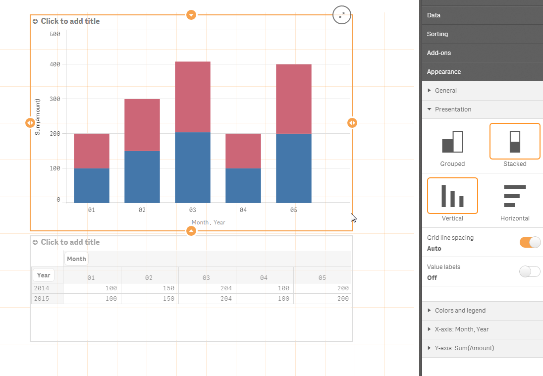
Note I also added a Pivot Table object under the chart to display the table - like you have presented in your screenshot.
Please mark the appropriate replies as CORRECT / HELPFUL so our team and other members know that your question(s) has been answered to your satisfaction.
Regards,
Mike Tarallo
Qlik
Mike Tarallo
Qlik
- Mark as New
- Bookmark
- Subscribe
- Mute
- Subscribe to RSS Feed
- Permalink
- Report Inappropriate Content
@mto , thanks for your excellent support.
Maybe I don't express my accurate issue, I create a new sample file to show what's my issue.
I want to calculate the stock balance, so I should calculate the data from first day to the last day of the dimension value.
Please refer to the attached excel file. thanks.
- Mark as New
- Bookmark
- Subscribe
- Mute
- Subscribe to RSS Feed
- Permalink
- Report Inappropriate Content
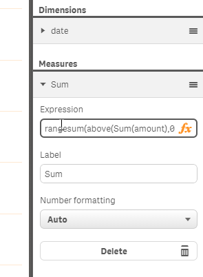
Hi xinke - I believe you mean cumulative?
Like this:

See attached example
Copy the .qvf file to C:\Users\<user profile>\Documents\Qlik\Sense\Apps and refresh Qlik Sense Desktop (F5)
You would do this using the rangesum() and above() functions as in:
rangesum(above(Sum(amount),0,12))
Look up rangesum() here
Please mark the appropriate replies as CORRECT / HELPFUL so our team and other members know that your question(s) has been answered to your satisfaction.
Regards,
Mike Tarallo
Qlik
Mike Tarallo
Qlik