Unlock a world of possibilities! Login now and discover the exclusive benefits awaiting you.
- Qlik Community
- :
- Forums
- :
- Analytics
- :
- New to Qlik Analytics
- :
- line chart with total
- Subscribe to RSS Feed
- Mark Topic as New
- Mark Topic as Read
- Float this Topic for Current User
- Bookmark
- Subscribe
- Mute
- Printer Friendly Page
- Mark as New
- Bookmark
- Subscribe
- Mute
- Subscribe to RSS Feed
- Permalink
- Report Inappropriate Content
line chart with total
Hello there,
This is Colin, I am new to Qlik Sense and cannot find an answer to my question.
There are two things I would like to do:
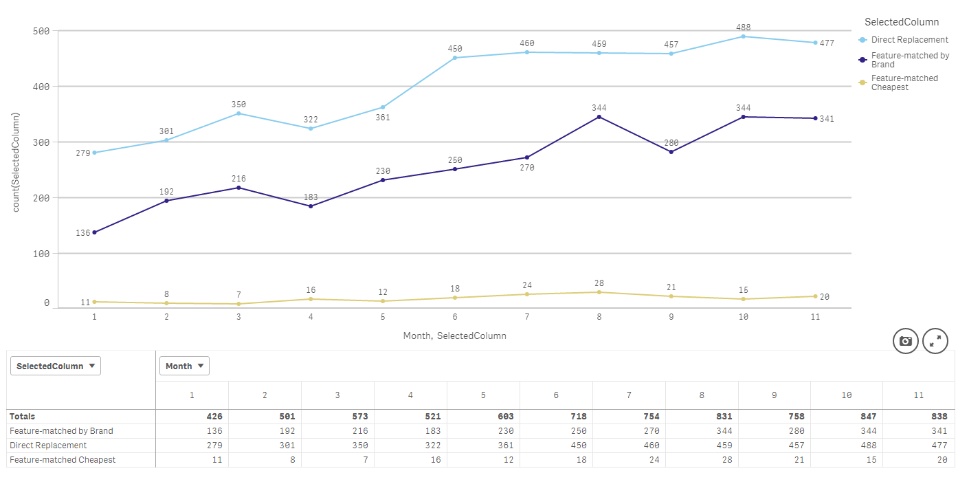
Firstly, I would like a new Line added to the top of the Line Chart to show the total of the individual selected columns each month.
This amount is shown in the Pivot Table in bold under Totals.
When I use the following, it gives me multiple totals when I only need one total.
rangesum( above( count(SelectedColumn),0,rowno()))
Secondly, I would like to duplicate this Line Chart (with the total now added) and show the Selected Columns/Datapoints as percentages of the total in each month.
My Data is in this Structure:
Excel:
| ValidationDate | Month | Year | SelectedColumn |
| 02/03/2016 | 3 | 2016 | Feature-matched by Brand |
| 02/03/2016 | 3 | 2016 | Feature-matched by Brand |
| 02/03/2016 | 3 | 2016 | Feature-matched by Brand |
Image:
I hope that this is sufficient and really look forward to hearing from you,
Many thanks,
Colin
- Tags:
- in qliksense
- Mark as New
- Bookmark
- Subscribe
- Mute
- Subscribe to RSS Feed
- Permalink
- Report Inappropriate Content
For first thing, try this
Add a new table in the script like this
LOAD * INLINE [
DIM
1
2
];
and then change your second dimension to this
Pick(DIM, SelectedColumn, 'Total')
Rest everything should stay the same.
For second thing, may be you just need this as your expression
Sum(Measure)/Sum(TOTAL <Month> Measure)
- Mark as New
- Bookmark
- Subscribe
- Mute
- Subscribe to RSS Feed
- Permalink
- Report Inappropriate Content
Hi Sunny,
Thank you very much for the response.
Apologies for the delay in responding. I have been trying to understand more about the solution.
Firstly, it worked!
Although I have no idea how it works.
Can you explain please?
I have looked up the following and am still in the dark:
Pick Function in QlikView - YouTube
In respect of the result, it gave me a Dimension Line showing the total of the individual selected columns which is great.
However as Line Charts can only use Two Dimensions, I could not add this new Total Line to the chart with the individual lines. Namely, I had two graphs instead of one.
The only way around this that I could find was here i.e. adding both graphs to the Storey and making one graph transparent. more here: Ability to overlay charts, text and images
Is there a way to add a third dimension to a Line Chart?
Thank you,
Colin
- Mark as New
- Bookmark
- Subscribe
- Mute
- Subscribe to RSS Feed
- Permalink
- Report Inappropriate Content
Would you be able to share a sample to show what you have to help you further?
- Mark as New
- Bookmark
- Subscribe
- Mute
- Subscribe to RSS Feed
- Permalink
- Report Inappropriate Content
Hi Sunny,
I have been able to solve this by changing the way the data is imported into qlik sense and will now close this query.
In the mean-time I will keep researching the Load Inline solution to see if I can understand it better.
Thanks,
Colin