Unlock a world of possibilities! Login now and discover the exclusive benefits awaiting you.
- Qlik Community
- :
- All Forums
- :
- QlikView App Dev
- :
- Bell Curve Problem
- Subscribe to RSS Feed
- Mark Topic as New
- Mark Topic as Read
- Float this Topic for Current User
- Bookmark
- Subscribe
- Mute
- Printer Friendly Page
- Mark as New
- Bookmark
- Subscribe
- Mute
- Subscribe to RSS Feed
- Permalink
- Report Inappropriate Content
Bell Curve Problem
Hello,
I am trying to create one bell curve chart.
Can you please help me this. Almost done i mess something.
I followed the Henric Cronström. Please help me guys.
The graph indicates
X-Axis --> Score
Y-Axis --> is Avg(Score) for bell curve
I want to show only Y-Axis with Auto generated like 0-100 values.
Please help me..
- « Previous Replies
-
- 1
- 2
- Next Replies »
- Mark as New
- Bookmark
- Subscribe
- Mute
- Subscribe to RSS Feed
- Permalink
- Report Inappropriate Content
Can you please have a look of my excel
In that, 2014 Data sheet i have original data. After that i created one pivot table for without Exclude values.
In this 2014 Data - Please see the name column, In that - I excluded two values
1) Key Message Delivery
2) Sales Objective Category
After that i copied that data, And then i created Main and Standard Demonstration.
Then i create the Normal Distribution which is our Line expression in Qlik.
Make sure, This whole i did in Excel only.
But, qlik i don;t know how to do that. Here, I want to show
1) X-Axis is score which come under the values of 100.
2) Y-Axis might be random with the suitable of Random values ( I mean Normal Distribution)
3) Measure is --> Average (Score, Normal Distribution)
Here, user want to use only Score, rep & name fields only.
I hope you can understand my issue, I apologize my English.
- Anil
- Mark as New
- Bookmark
- Subscribe
- Mute
- Subscribe to RSS Feed
- Permalink
- Report Inappropriate Content
Aah, I see.
I don't think you want a histogram at all... I suspect you want this:
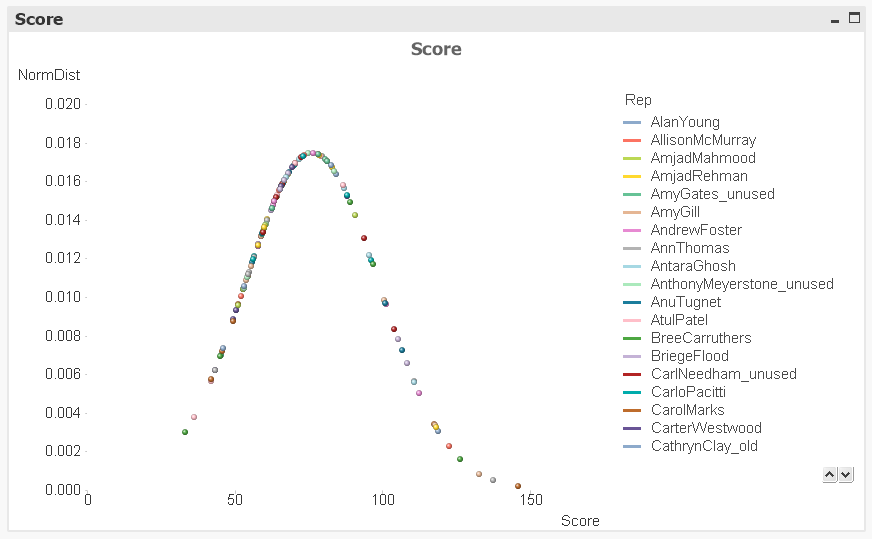
What I have done is the following:
- For each Rep, I calculate the average score over the year. (A rep has several scores.) This is your x-value in the above graph.
- Then I calculate the position this average score has in a normal distribution using NormDist(). This is your y-value in the above graph.
- Then I plot the two using a scatter chart. One Rep = one data point.
HIC
- Mark as New
- Bookmark
- Subscribe
- Mute
- Subscribe to RSS Feed
- Permalink
- Report Inappropriate Content
Henric,
Almost i reach the target.
Sorry for troubling, That is my miss understanding. Any way, I excludes two values. But, My max score is 100 only not that i have score with 80 only. After excluding those two fields might be X-axis should be Up to 100 / 80 only.
Avg({$<[2014 name] -= {'Key Message Delivery','Sales Objective Category'}>} AvgRepYearScore)
I use this scenario.
Updated : Did you get a chance to look this. I mean how to exclude those two values from this graph
Help me please
- « Previous Replies
-
- 1
- 2
- Next Replies »