Unlock a world of possibilities! Login now and discover the exclusive benefits awaiting you.
- Qlik Community
- :
- All Forums
- :
- QlikView App Dev
- :
- Remove Text in a Multi Bar Chart
- Subscribe to RSS Feed
- Mark Topic as New
- Mark Topic as Read
- Float this Topic for Current User
- Bookmark
- Subscribe
- Mute
- Printer Friendly Page
- Mark as New
- Bookmark
- Subscribe
- Mute
- Subscribe to RSS Feed
- Permalink
- Report Inappropriate Content
Remove Text in a Multi Bar Chart
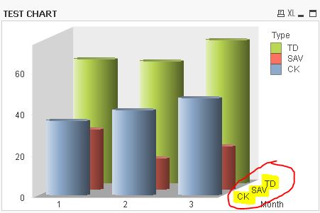
I have a multi bar chart with months across the bottom and mulitple bars for type totals by month. How do I get rid of the TYPE description (see highlighted and circled area below) from appearing on the chart. The legend on the side already denotes the colors for the types. The other notattion at the bottom of the chart is redundant. I have tried very option I can find in the properties and nothing allows me to keep the legend on the side and not show the labels at the bottom.
What am I missing??
I attached a copy of the qlik app for your reference.
Thanks for the help.
Ed T.
- Tags:
- new_to_qlikview
- Mark as New
- Bookmark
- Subscribe
- Mute
- Subscribe to RSS Feed
- Permalink
- Report Inappropriate Content
Chart Properties -> Dimensions -> select "Type" Dimension -> uncheck "Show Legend"
- Mark as New
- Bookmark
- Subscribe
- Mute
- Subscribe to RSS Feed
- Permalink
- Report Inappropriate Content
That doesn't work. Doing that will remove the legend at the top of the chart. I need to keep that but get rid of the wording I circled at the bottom of the chart.
- Mark as New
- Bookmark
- Subscribe
- Mute
- Subscribe to RSS Feed
- Permalink
- Report Inappropriate Content
Did you ever get a fix for this issue? I've been struggling with this same thing all day and can't find any answer so far that works.