Unlock a world of possibilities! Login now and discover the exclusive benefits awaiting you.
- Qlik Community
- :
- All Forums
- :
- QlikView App Dev
- :
- Showing data over the time
- Subscribe to RSS Feed
- Mark Topic as New
- Mark Topic as Read
- Float this Topic for Current User
- Bookmark
- Subscribe
- Mute
- Printer Friendly Page
- Mark as New
- Bookmark
- Subscribe
- Mute
- Subscribe to RSS Feed
- Permalink
- Report Inappropriate Content
Showing data over the time
Hi Qlikview community,
Still familiarizing with Qlikview. I have a simple chart that I need to create, which can easily be created by excel but haven't been able to figure out with Qlikview. It is a simple chart (e.g. scatter chart) to show data points over the time.
The data simply consists of 3 fields; Time Stamp, value 1, value 2.
While field 2 may contain many possible values, filed 3 is simply 4 possible values.
I'd like to simply create a chart with time stamp as dimension and value 1 as the expression. I don't need to average the value 1, but simply show them in the chart. Another chart is simply to show similar thing but with additional dimension (e.g. filed 3 as a second dimension).
What I did for the x- axis (dimension) is Aggr(Timestamp(ceil(Time Stamp),1/IntervalName), 'DD-MMM-hh:mm'), [Time Stamp])
but it appears Qlikview always requires aggregation function on the expression side.
Is there a way to simply show the relationship between the time and value 2 in the chart without aggregation function?
Also, can I do this with x/y or scatter chart instead of line chart?
Message was edited by: Fikri Shihab
- Mark as New
- Bookmark
- Subscribe
- Mute
- Subscribe to RSS Feed
- Permalink
- Report Inappropriate Content
Hey there,
Can you share with us a sample of your Excel data so we can see what you want? Please try to describe better your issue, because its not that clear what you want to achieve.
Regards,
MB
- Mark as New
- Bookmark
- Subscribe
- Mute
- Subscribe to RSS Feed
- Permalink
- Report Inappropriate Content
Hi,
Sample data is attached and below is the expected chart that I created in Excel. 
- Mark as New
- Bookmark
- Subscribe
- Mute
- Subscribe to RSS Feed
- Permalink
- Report Inappropriate Content
Hi,
some visualizations of your data might be:


tabSN:
LOAD RecNo() as ID,
    Timestamp#([Time Stamp],'DD/MM/YYYY hh:mm') as [Time Stamp],
    [User Name],
    Region,
    [Signal Quality]
FROM [https://community.qlik.com/servlet/JiveServlet/download/1122478-245214/Sample%20SN_data%20for%20Qlik...] (txt, codepage is 1252, embedded labels, delimiter is ',', msq);
hope this helps
regards
Marco
- Mark as New
- Bookmark
- Subscribe
- Mute
- Subscribe to RSS Feed
- Permalink
- Report Inappropriate Content
Hi Marco,
This is really helpful. Many Thanks to you!
- Mark as New
- Bookmark
- Subscribe
- Mute
- Subscribe to RSS Feed
- Permalink
- Report Inappropriate Content
glad it helped.
please close your thread if your question is answered:
Qlik Community Tip: Marking Replies as Correct or Helpful
thanks
regards
Marco
- Mark as New
- Bookmark
- Subscribe
- Mute
- Subscribe to RSS Feed
- Permalink
- Report Inappropriate Content
Hi Marco,
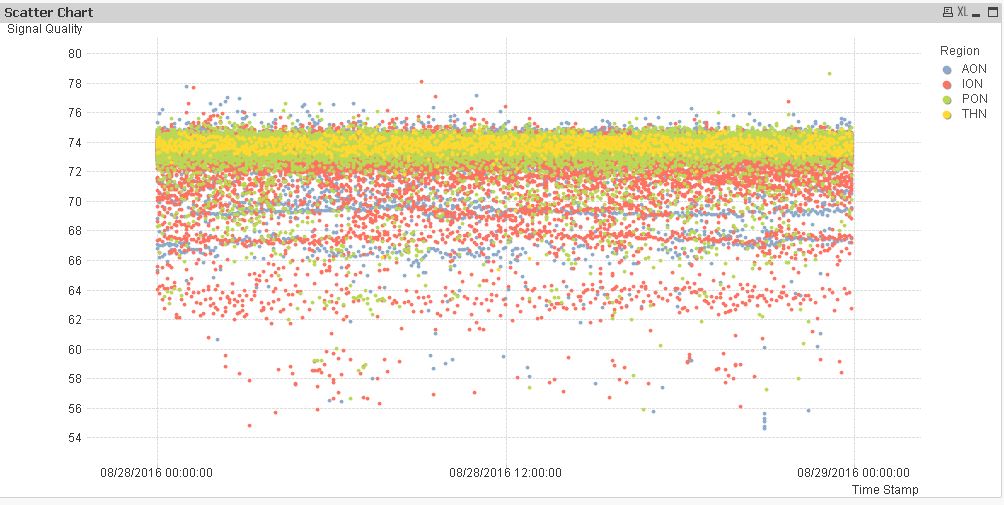
I know this is working but I am trying to to replicate exactly using the sample and hint provided.
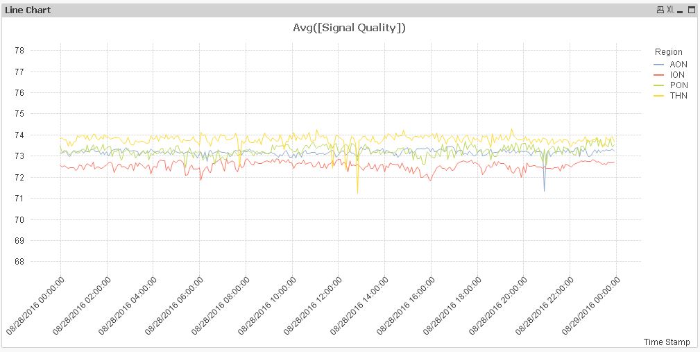
No problem with line chart as did before. Using aggregation (Avg) in the expression.
Below are the steps that I did for scatter chart:
- Select scatter chart
- Used ID as dimension
- Region as a second dimension
- X axis - Time Stamp (no aggregation)
- Y-axis - Signal quality (no aggregation)
- Change to advance mode
- This is what shows up - changing the x axis to time stamp (using Number tab) did not change the chart

Something must be missing on my end. Sorry if this is too obvious for you
Also, it took very long to complete the above process.
My real data is over million records. Is there any way to expedite or simplify?
Thank you,
Fikri
- Mark as New
- Bookmark
- Subscribe
- Mute
- Subscribe to RSS Feed
- Permalink
- Report Inappropriate Content
Hi,

try deselecting the "Forced 0" option on the Axes tab
( and maybe add some Static Min and Max expressions like Min([Time Stamp]) and Max([Time Stamp]) )
hope this helps
regards
Marco
- Mark as New
- Bookmark
- Subscribe
- Mute
- Subscribe to RSS Feed
- Permalink
- Report Inappropriate Content
Thanks, I finally managed to get it working
- Mark as New
- Bookmark
- Subscribe
- Mute
- Subscribe to RSS Feed
- Permalink
- Report Inappropriate Content
Glad it worked.
Please close your thread if your question is answered?
Qlik Community Tip: Marking Replies as Correct or Helpful
thanks
regards
Marco