Unlock a world of possibilities! Login now and discover the exclusive benefits awaiting you.
- Qlik Community
- :
- All Forums
- :
- QlikView App Dev
- :
- % on a gauge chart
- Subscribe to RSS Feed
- Mark Topic as New
- Mark Topic as Read
- Float this Topic for Current User
- Bookmark
- Subscribe
- Mute
- Printer Friendly Page
- Mark as New
- Bookmark
- Subscribe
- Mute
- Subscribe to RSS Feed
- Permalink
- Report Inappropriate Content
% on a gauge chart
Hi,
Please see attached app.
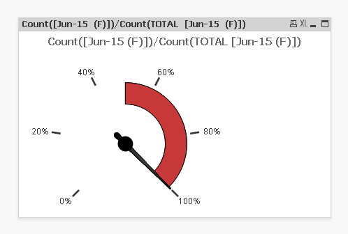
Just wanting the chart to show 'Jun-15 (F)' performance on the gauge chart but doesn't seem to be doing it. The needle should be right up the other end at 100%. Seems to be down to the value in the table box which comes through as 1 as opposed to 100%.
I can't get the % to come up on the scale of the gauge chart either. Currently just shows a number (e.g 20).
Really appreciate some help.
Chris
- Tags:
- new_to_qlikview
- « Previous Replies
-
- 1
- 2
- Next Replies »
Accepted Solutions
- Mark as New
- Bookmark
- Subscribe
- Mute
- Subscribe to RSS Feed
- Permalink
- Report Inappropriate Content
- Mark as New
- Bookmark
- Subscribe
- Mute
- Subscribe to RSS Feed
- Permalink
- Report Inappropriate Content
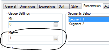
You need to fix your max from 100 to 1
- Mark as New
- Bookmark
- Subscribe
- Mute
- Subscribe to RSS Feed
- Permalink
- Report Inappropriate Content
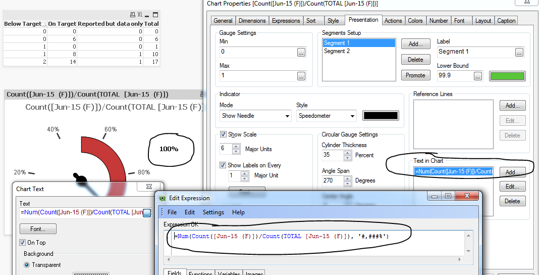
On the Guage Chart Presentation tab set the Gauge setting Max to 1 instead of 100.
Its numeric is actually 1, which when displayed as % will show as 100%
- Mark as New
- Bookmark
- Subscribe
- Mute
- Subscribe to RSS Feed
- Permalink
- Report Inappropriate Content
Hi,
Thank you. That's worked.
One more question. We want the text in the chart to show performance, i.e 100%.
Can you highlight what the expression would be?
Chris
- Mark as New
- Bookmark
- Subscribe
- Mute
- Subscribe to RSS Feed
- Permalink
- Report Inappropriate Content
Looking for text in chart saying 100%? See below if this helps:
- Mark as New
- Bookmark
- Subscribe
- Mute
- Subscribe to RSS Feed
- Permalink
- Report Inappropriate Content
excellent..thanks
- Mark as New
- Bookmark
- Subscribe
- Mute
- Subscribe to RSS Feed
- Permalink
- Report Inappropriate Content
No problem 
- Mark as New
- Bookmark
- Subscribe
- Mute
- Subscribe to RSS Feed
- Permalink
- Report Inappropriate Content
Sunindia
And now you are Guru !!!
- Mark as New
- Bookmark
- Subscribe
- Mute
- Subscribe to RSS Feed
- Permalink
- Report Inappropriate Content
Yup I am, I am glad you noticed . Although I am no match to you and other experts, I have managed to gather points in the process of helping and learning from others.
- Mark as New
- Bookmark
- Subscribe
- Mute
- Subscribe to RSS Feed
- Permalink
- Report Inappropriate Content
Hi Bill
Yeh!!
One other query... how do you get a line chart to populate in Qlikview? Often get this propbem where you simply slect the data in excel and it produces a line chart; however, trying to do the same in Qlikview is very complicated.
Chris
- « Previous Replies
-
- 1
- 2
- Next Replies »