Unlock a world of possibilities! Login now and discover the exclusive benefits awaiting you.
- Qlik Community
- :
- All Forums
- :
- QlikView App Dev
- :
- Re: percent calculation based on a condition
- Subscribe to RSS Feed
- Mark Topic as New
- Mark Topic as Read
- Float this Topic for Current User
- Bookmark
- Subscribe
- Mute
- Printer Friendly Page
- Mark as New
- Bookmark
- Subscribe
- Mute
- Subscribe to RSS Feed
- Permalink
- Report Inappropriate Content
percent calculation based on a condition
Hi.
another post asking for assistance.
I attach an excel file containing 2 columns: FLD_RESOLUTIONRESOLVEDGROUP and H_CREATORGROUP.
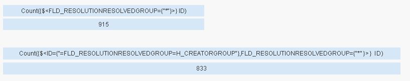
what i am trying to do is calculate the % where the resolved group is the same as the create group. Its for a first time fix rate i am trying to calculate. i think its a basic count where resolved group is equal to create group.
the other rules are:
- i want to ignore the rows that dont have a resolved group - as these tickets are still open. they shouldn't form any part of the calculation.
- I need 2 separate % figures - one for 'SMT NMC' group, one for 'SMT M2M Service Desk' group.
- then an overall % figure for the 2 groups combined where they are the creator group.
in excel, i could easily do this, but am still getting to grips with the format and logic of qlikview.
I need to know whether this is better to put this into a load script to then assign it to a gauge, or to do it as an expression within the gauge chart properties?
Any assistance would be appreciated
Thanks in advance
Accepted Solutions
- Mark as New
- Bookmark
- Subscribe
- Mute
- Subscribe to RSS Feed
- Permalink
- Report Inappropriate Content
Hi,
maybe this helps
LOAD RecNo() as ID,
    FLD_RESOLUTIONRESOLVEDGROUP,
    H_CREATORGROUP
FROM [https://community.qlik.com/servlet/JiveServlet/download/1131511-247273/escalations.xlsx] (ooxml, embedded labels, table is Sheet1);
regards
Marco
- Mark as New
- Bookmark
- Subscribe
- Mute
- Subscribe to RSS Feed
- Permalink
- Report Inappropriate Content
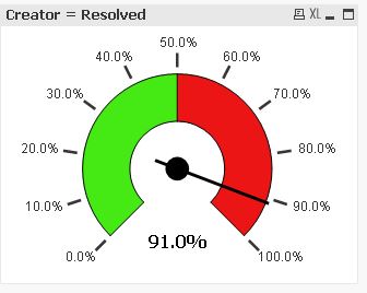
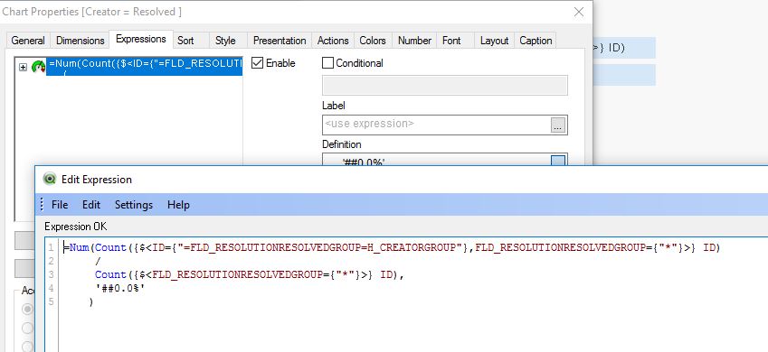
ok, i got this working but when i select a different date (based on when a ticket was created), the gauge moves to and stays at 97% no matter which month i use. The overall % is 90% for all rows in the spreasheet, which of course is correct.
Just to give you more info - i only extracted a limited set of data attached to this query, but if you can imagine there is a create date associated with each row, this is what i would like to filter on to get a % for that month.
hopefully that gives you enough info to assist me further?
- Mark as New
- Bookmark
- Subscribe
- Mute
- Subscribe to RSS Feed
- Permalink
- Report Inappropriate Content
please post a sample app including some (mock up) data and your expected result.
thanks
regards
Marco
- Mark as New
- Bookmark
- Subscribe
- Mute
- Subscribe to RSS Feed
- Permalink
- Report Inappropriate Content
Hi Marco,
i managed to get it working.
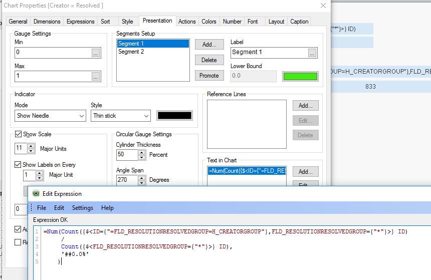
Thank you very much. The only thing i am struggling with is getting the % figure to appear in the bottom middle of the chart - as per yours.
I can get the % figure to display, but it appears in the top right of the chart. looks unsightly.
Any advice?
Thanks
- Mark as New
- Bookmark
- Subscribe
- Mute
- Subscribe to RSS Feed
- Permalink
- Report Inappropriate Content
Hi,
I used the "text in chart" function to generate the percentage figure.
You can reposition it by holding CTRL+Shift and dragging the red square containing the figure to another place:

hope this helps
regards
Marco
- Mark as New
- Bookmark
- Subscribe
- Mute
- Subscribe to RSS Feed
- Permalink
- Report Inappropriate Content
i didnt know about the CTRL+Shift function - this has solved my problem.
once again, thank you for your assistance
- Mark as New
- Bookmark
- Subscribe
- Mute
- Subscribe to RSS Feed
- Permalink
- Report Inappropriate Content
thank you for sharing the answer. very help ful for learning
- Mark as New
- Bookmark
- Subscribe
- Mute
- Subscribe to RSS Feed
- Permalink
- Report Inappropriate Content
you're welcome.
Glad it helped
regards
Marco