Unlock a world of possibilities! Login now and discover the exclusive benefits awaiting you.
- Subscribe to RSS Feed
- Mark as New
- Mark as Read
- Bookmark
- Subscribe
- Printer Friendly Page
- Report Inappropriate Content
With the Qlik Sense April 2020 release, the Org Chart was added to the Qlik Visualization bundle. The Org chart provides a way to visualize hierarchies in your data. In this blog post, I will review how easy it is to create an Org chart provided you have the hierarchical data structure in your data model. Below is a snapshot from an Excel file that was loaded. It has the employees within a company and who each person reports to.
The things to note in this file are:
- Every employee has a unique Employee ID.
- The Manager ID is the Employee ID of the employee’s manager.
This spreadsheet is designed to go 5 levels deep (EmpName 1 through EmpName5) but additional columns can be added or removed as needed. Other supporting employee data can also be added to the data model to use in the org chart or in other charts in the app.
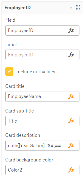
To begin, add the Org chart to a sheet. The Org chart takes 2 dimensions and 1 measure. The first dimension added is EmployeeID. In the Org chart, each employee will have their own card. In the properties for the EmployeeID dimension, other information that you would like to show on the card for each employee can be added.
In this example, the card title has been set to EmployeeName, the sub-title to the employee’s title and the card description to the employee’s salary. There are some colors loaded in the data model so the field, Color2, was selected coloring the cards by the employee’s title. The second dimension added to the Org chart is the Reports To field. This field stores the EmployeeID of the employee’s manager like the ManagerID field. There is also the option to add a measure. In this example, a measure was not added. If a measure is added, it will be visible when you hover over a card. That’s it – that is all that needs to be done to add an Org chart to your Qlik Sense app.
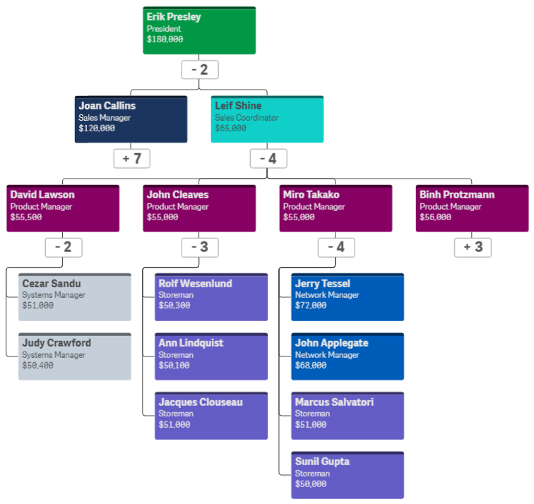
Now, let’s take a look at the Org chart. By default, the Org chart will show 2 levels when you come to the sheet.
If an employee is a manager, there will be a number under their card indicating the number of employees that report directly to them. Clicking on that number will open the cards of their direct report(s). When there is a plus sign (+) that means that there are cards that are not visible. Once the cards of a manager are opened, it will turn into a minus sign (-) to indicate that the card is opened. This is visible in the image below.
The Org chart provides an easy way to see the hierarchical structure within an organization. Users can zoom in and out in the chart as needed and Qlik Sense will handle closing cards if newly opened cards may overlap or get in the way. Check out this chart and other new features of the Qlik Sense April 2020 release in the resources listed below.
Demo: What's New - Qlik Sense April 2020
Video: What’s New – Qlik Sense April 2020
Video: April 2020 Feature Demonstration
Blog: Qlik Data Analytics Product Release - April 2020
Thanks,
Jennell
You must be a registered user to add a comment. If you've already registered, sign in. Otherwise, register and sign in.


