Hi, Everyone!
Today I'm gonna tell you one of the QV mysteries - creating a vertical chart with less/more bars in a straight table.
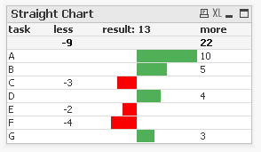
So, if you are interesting with something like this:
Please, make an effort to read the text below.
For instance you have a data:
LOAD * Inline
[task,val
A,10
B,5
C,-3
D,4
E,-2
F,-4
G,3];
1. Load it and create a Straight Table with Task dimension;
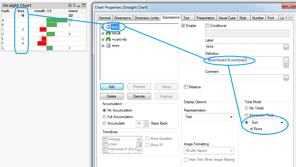
2. Create an expressions "less" and "more" which will sum negative and positive values of Val field. Use the Sum of Rows in Total Mode to show a partial sum:
3. Create one more expression and change the display option from "Text" to "Linear Gauge" and set the parameters of it:
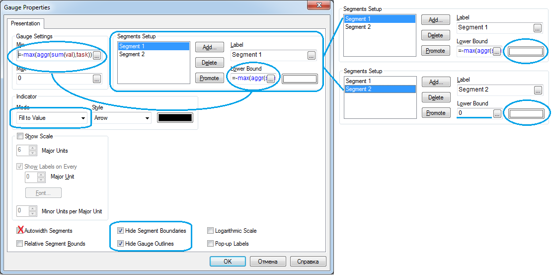
So, you need to create two segments with white color and set an expression of minimum value in Min Value and Lower Bound of the first segment. Switch off the Autowidth Segments. Hide boundaries and outlines.
4. Now, here is a magic. We will create a red bars not with a segment setup but with a background of cells of our new expression.
Go to the new expression and find a background color option. Set an expression which will color our cells in red if they are under the zero.
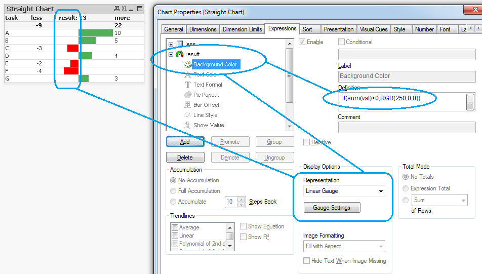
The picture above is for paragraphs 3 and 4.
If you did it right you will see a red background overlapped with white segment. Red bars completed.
5. Green bars are easier, there is no need of background color. It will be enough to create two segments from 0 to max and set a correct colors:
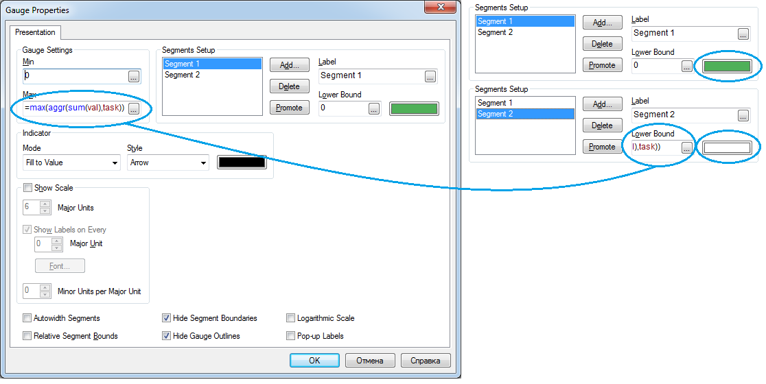
Note: Red bars and Green bars are two separated expressions with adjacent zero line.
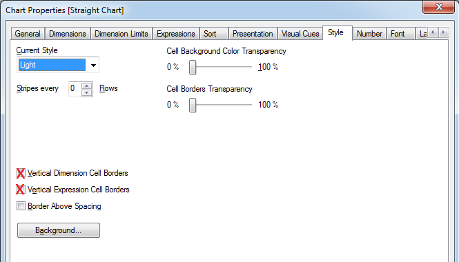
6. The last one is to hide borders and make some cosmetical things:
That's it. Straight-Vertical-Chart is completed. Yes, there is a little defect when your negative value will be the last of the table (red thin background line will be visible through cell). But it shouldn't make a big sense.
Hope you'll find it usefull and may be it will save your time!
If you like the post - please rate it or leave a comment!
Thank you!