Unlock a world of possibilities! Login now and discover the exclusive benefits awaiting you.
Jul 21, 2017 2:37:26 PM
Sergey_Shuklin
Hello, Everyone!
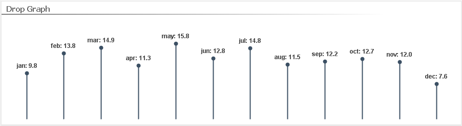
Today we gonna create this little fella:
Looks pretty cool and unusual. Let's get started!
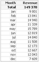
For instance we have such input data:
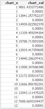
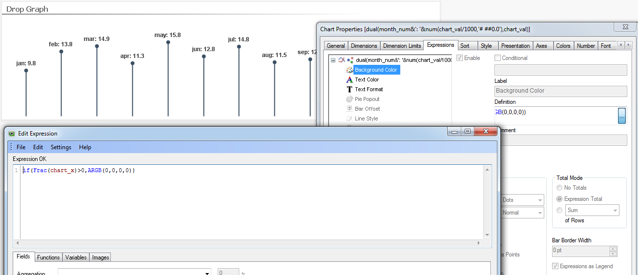
Step 1. Convert months text values to numbers and add rows with value equal 0.00001:
Where "chart_x" it's our months converted to numbers, "chart_val" - it's Revenue with additional 0.00001 value.
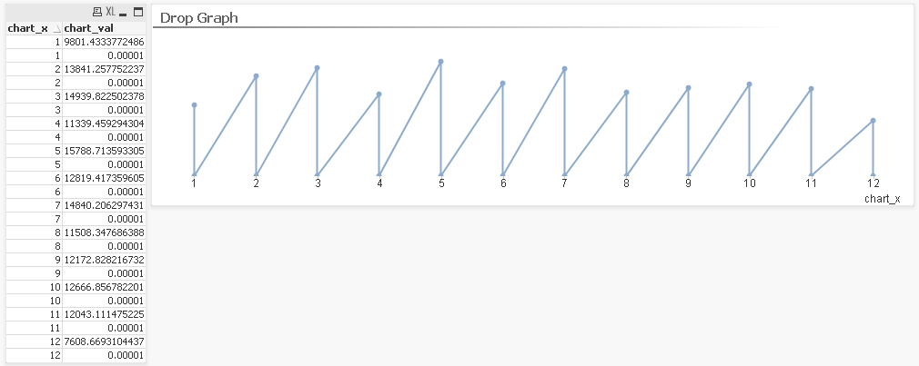
Step 2. Create a Line Chart:
Note: You should turn on "Continuous" option in Dimension Axis zone at the Axes tab.
Step 3. Go to the Background Color option of the expression and use this condition to color our lines:
if(Frac(chart_x)>0,ARGB(0,0,0,0))
That's all!
I'd also made some cosmetical things to make it looks prettier. You can find them at the attachement.
Hope you like it and if it's so - please, share your opinion and rate this document. Thanks!