Unlock a world of possibilities! Login now and discover the exclusive benefits awaiting you.
- Qlik Community
- :
- Forums
- :
- Forums by Product
- :
- Products (A-Z)
- :
- Qlik Sense
- :
- Documents
- :
- How to Create the Magic Quadrant Chart
- Move Document
- Delete Document
- Subscribe to RSS Feed
- Mark as New
- Mark as Read
- Bookmark
- Subscribe
- Printer Friendly Page
- Report Inappropriate Content
How to Create the Magic Quadrant Chart
- Move Document
- Delete Document and Replies
- Mark as New
- Bookmark
- Subscribe
- Mute
- Subscribe to RSS Feed
- Permalink
- Report Inappropriate Content
How to Create the Magic Quadrant Chart
How to Create the Magic Quadrant
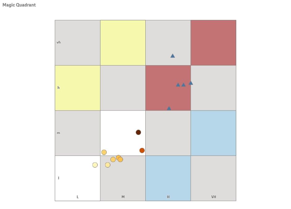
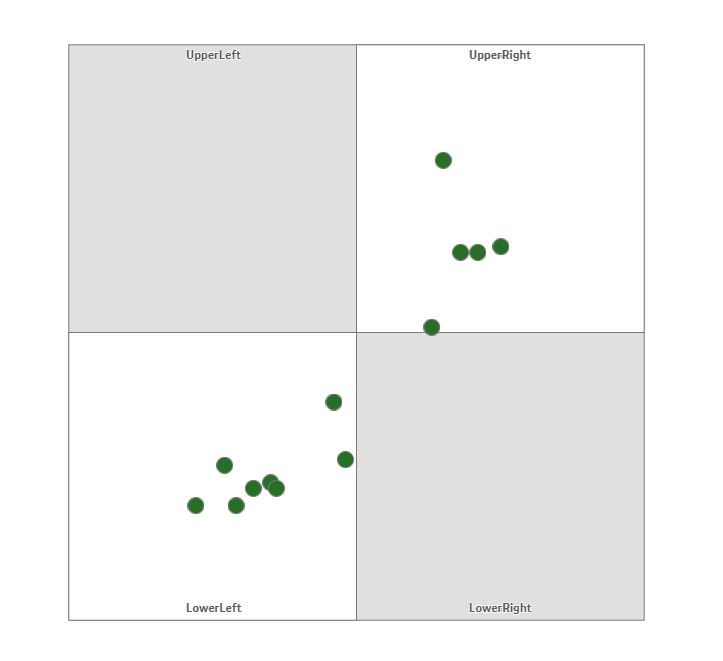
A magic quadrant chart is possible with the use of the basic map chart and various layers. This will use the basic map chart in the included charts. This will also use point layers for the symbols and area layers for the grid. It has endless capabilities for use!
- Add the map chart.
- In Map Settings set the Base map to NONE.
- Set Projection to User Defined Degrees.
- Turn Off Legend in Legend Setting.
- Turn off Scale Bar in Presentation Settings.
- Add area layers for box.
- Add a layer titled box.
- Dimension equals 1.
- Location equals: ='[[[0,0],[100,0],[100,100],[0,100]]]'
- Add area layers for Grid.
- If using a 4 quadrant plane use the following:
- Add a layer titled Grid.
- Dimension equals 1.
- Location equals: ='['& '[[0,0],[50,0],[50,50],[0,50]],' & '[[50,50],[100,50],[100,100],[50,100]]' & ']'
- If using a 16 quadrant plane use the following:
- You need to add 4 grid layers.
- Each dimension is equal to 1.
- Locations are as follows:
- If using a 4 quadrant plane use the following:
Grid1: ='['&'[[0,0],[25,0],[25,25],[0,25]],' &'[[25,25],[50,25],[50,50],[25,50]]'& ']'
Grid2: ='['&'[[50,0],[50,25],[75,25],[75,0]],' &'[[75,25],[100,25],[100,50],[75,50]]'& ']'
Grid3: ='['&'[[0,50],[25,50],[25,75],[0,75]],' &'[[25,75],[25,100],[50,100],[50,75]]'& ']'
Grid4: ='['&'[[50,50],[75,50],[75,75],[50,75]],'&'[[75,75],[100,75],[100,100],[75,100]]'& ']'
- Set Grid and Box Colors to desired colors.
- For your dots or bubbles on the grid, add a point layer
- Use a unique dimension for the point layer.
- If you need separate type shapes, limit your dimension and set shape in settings.
- As location you need to have two separate fields with values that range from 0-100
- Set the “Y” value as the Latitude.
- Set the “X” value as the Longitude.
- If desired color by a particular method.
- Use a unique dimension for the point layer.
Quadrant Labels
For Labels you will need to add another point layer.
- Add point layer.
- Dimension is Label.
- Location is as follows:
- LabelY as Latitude.
- LabelX as Longitude.
- Make bubble size 0 and opacity far left.
- Under general options set show labels to ON and Centered.
- Inline load with coordinates is as follows:
4 Quadrant
QuadrantLabels:
load * Inline [
Label, LabelX, LabelY
UpperRight, 75, 98
UpperLeft, 25, 98
LowerRight, 75, 2
LowerLeft, 25, 2
];
16 Quadrant
load * Inline [
Label, LabelX, LabelY
X4, 87.5, 2
X3, 62.5, 2
X2, 37.5, 2
X1, 12.5, 2
Y1, 2,12.5
Y2, 2,37.5
Y3, 2,62.5
Y4, 2,87.5
];

- Move Comment
- Delete Comment
- Mark as Read
- Mark as New
- Bookmark
- Permalink
- Report Inappropriate Content
Cool! Example with data here, second sheet: https://community.qlik.com/t5/Qlik-Sense-Documents-Videos/Top-10-Visualization-tips-QlikWorld-2020/t...
- Move Comment
- Delete Comment
- Mark as Read
- Mark as New
- Bookmark
- Permalink
- Report Inappropriate Content
Yes! This was part of the inspiration to do this guide. That entire app is incredible. I really enjoy learning from your work @Patric_Nordstrom, thanks for all you do!
- Move Comment
- Delete Comment
- Mark as Read
- Mark as New
- Bookmark
- Permalink
- Report Inappropriate Content
Dear all,
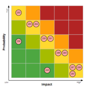
here is also an example to display indicators in quadrants. This example shows a risk map provided by LeapLytics:
The extension can be downloaded (https://developer.qlik.com/garden/5fd6531adae7960011eb30ec) and tested. Colors etc. could be changed.
Regards,
Bjoern

