- Move Document
- Delete Document and Replies
- Mark as New
- Bookmark
- Subscribe
- Mute
- Subscribe to RSS Feed
- Permalink
- Report Inappropriate Content
Qlik Sense vs Power BI & Tableau
Qlik Sense vs Power BI & Tableau.
- Move Comment
- Delete Comment
- Mark as Read
- Mark as New
- Bookmark
- Permalink
- Report Inappropriate Content
I have updated this report. Quite a few changes have been made to the layout and new sections have been added. The main sections are
- Introduction
- Ratings
- Screen Shots
- Comments on Sense, Power BI and Tableau (Quick Sight I will leave until an improved release)
>>> Main report completed
- Additional comments
- Power BI Cloud vs Qlik Sense Cloud (still to be done)
- In depth comparison between Power BI and Sense filtering
- Move Comment
- Delete Comment
- Mark as Read
- Mark as New
- Bookmark
- Permalink
- Report Inappropriate Content
Thank you Robert, for a great comparison. Please keep it up. I am really interested in following what happens in this area and I believe Qlik has some work to do in terms of keeping up from business point of view, since their product has everything it takes to be competitive, not sure about pricing and marketing strategy.
- Move Comment
- Delete Comment
- Mark as Read
- Mark as New
- Bookmark
- Permalink
- Report Inappropriate Content
why do you say that a Pivot is not possible in PowerBI? (Matrix)
Thanks for posting BTW .. please keep it up-to-date for a while
- Move Comment
- Delete Comment
- Mark as Read
- Mark as New
- Bookmark
- Permalink
- Report Inappropriate Content
Hi Amien
Because the Matrix is no more than a report layout. The user can not interact and change the matrix as required. Like with the Qlik Pivot Table. Where the dimension order can be changed, as can the column width, show or hide data etc. So a PBI expert would be needed to change the matrix layout in any way.
The actual developers of Power BI are aware that the matrix is very limited at present and plan future improvements.
- Move Comment
- Delete Comment
- Mark as Read
- Mark as New
- Bookmark
- Permalink
- Report Inappropriate Content
Hi Kamran
I hope to have the time to complete a comparison of both cloud products including pricing before too much longer.
- Move Comment
- Delete Comment
- Mark as Read
- Mark as New
- Bookmark
- Permalink
- Report Inappropriate Content
I finally got to see/read document, Qlik Sense Rocks  great job Robert.
- Move Comment
- Delete Comment
- Mark as Read
- Mark as New
- Bookmark
- Permalink
- Report Inappropriate Content
Power BI have just released an improved draft for a new Matrix (similar to a Pivot table) . This is a big improvement on the old Matrix. I have added a new section comparing the Qlik Sense Pivot Table to the improved Matrix.
I have also added a new section on color options. I still haven't compared the Power BI cloud to Qlik Sense. I'm waiting for Qlik to release some improved file uploading features for the cloud.
- Move Comment
- Delete Comment
- Mark as Read
- Mark as New
- Bookmark
- Permalink
- Report Inappropriate Content
Useful!! thanks!
- Move Comment
- Delete Comment
- Mark as Read
- Mark as New
- Bookmark
- Permalink
- Report Inappropriate Content
Great article. I am trying to pick between Qlik Sense, Tableau, and Power BI for my company, and it is a tough call. I'm leaning toward QS since it seems to be the easiest to use by far. I thought of a couple things that weren't mentioned in the article that I think are important:
- One weakness that seems unique to Qlik Sense is that you can't change a visualization's type after the fact. For example, if you make a bar chart and then decide it might be better as a pie chart or scatter plot, you have to delete it and start over. Granted, with the availability of master items to promote expression reuse and Qlik Sense's general ease of use, it wouldn't take long to build a whole new graph, but still - in Tableau or PBI (or even Excel), it's literally one or two clicks to change the chart type.
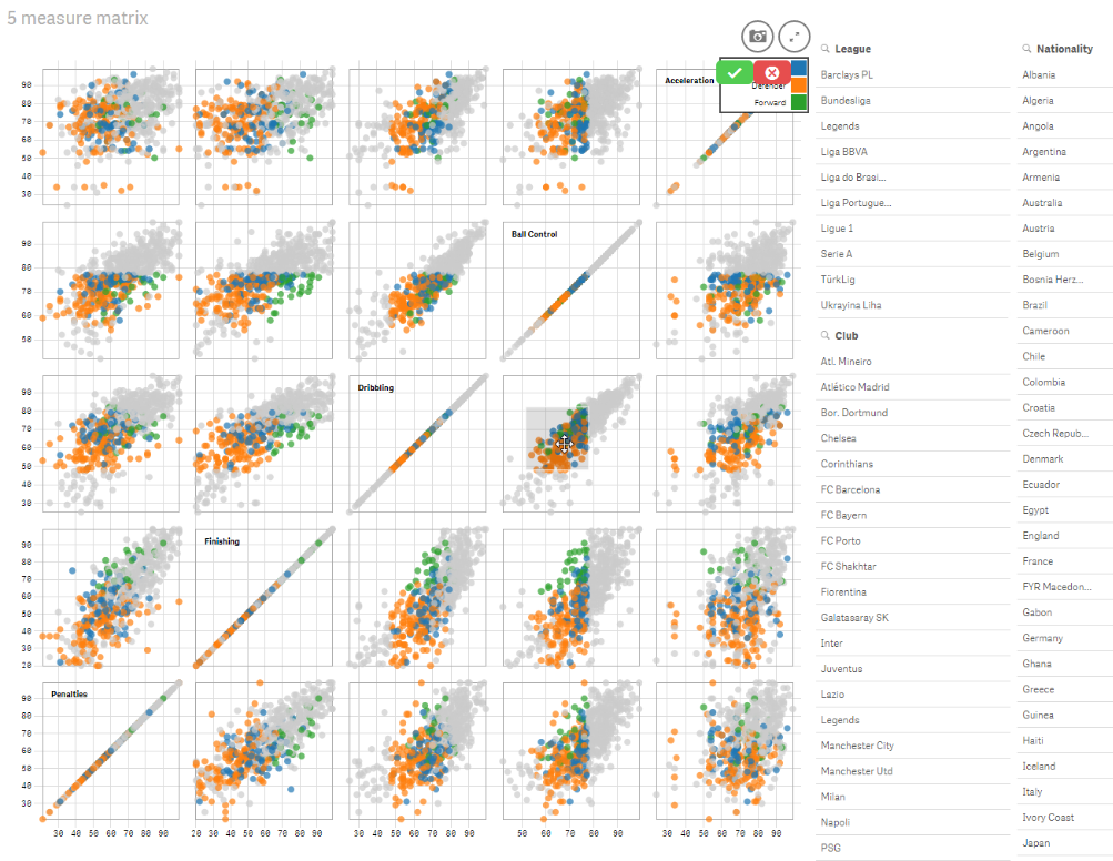
- One strength that seems unique to Tableau is the ability to generate arrays of graphs. An example of what I'm talking about is in the 6th slide here: 8 Ways Power BI Falls Short (slide title: "You Can't Compare Several Categories"). Does anyone know if QS or PBI has an answer to that? I'm trying to tell myself that such a capability encourages overly complicated visualizations and isn't really necessary, but I keep wondering if I will need it down the line and kick myself for not choosing Tableau.
- Move Comment
- Delete Comment
- Mark as Read
- Mark as New
- Bookmark
- Permalink
- Report Inappropriate Content
Hi Michael,
1. You can do this in Qlik Sense. Just drag a different chart type over an existing chart and click Convert. Voila!
2. Small-multiples are certainly possible in Qlik Sense. There are even a few extensions on Qlik Branch that takes this to new levels:
- Scatterplot matrix: Qlik Branch
- Data Overviewer: Qlik Branch