Unlock a world of possibilities! Login now and discover the exclusive benefits awaiting you.
- Qlik Community
- :
- All Forums
- :
- QlikView Administration
- :
- Re: Good looking Management Console
- Subscribe to RSS Feed
- Mark Topic as New
- Mark Topic as Read
- Float this Topic for Current User
- Bookmark
- Subscribe
- Mute
- Printer Friendly Page
- Mark as New
- Bookmark
- Subscribe
- Mute
- Subscribe to RSS Feed
- Permalink
- Report Inappropriate Content
Good looking Management Console
Hi Everyone,
Recently we handed over all the Management Console duties to our support team and yesterday, the support guys asked me a question.
Why QMC looks so ugly?
I love QlikView, but they were right too so I could not disagree with them. Those old school icons in QMC does set you back in this modern age of flat UI.
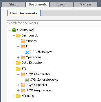
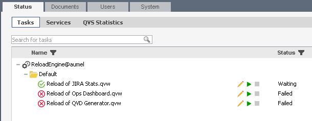
So, I went to bed late last night and this is how our QMC looks this morning.

Reload Tasks

I have attached set of icons in this post, all you have to do is..
Copy icons from QMC folder to the following destination
C:\Program Files\QlikView\Management Service\QMC\Images
And copy icons from QMCCommon to the following folder
C:\Program Files\QlikView\Management Service\QMCCommon\Images
You can customize the look and feel your own way, you can find lots of interesting icons for free at http://www.flaticon.com/
in coming days, I am planning to change every icons.
What are your thoughts / feedback on this?
Thanks.
- Mark as New
- Bookmark
- Subscribe
- Mute
- Subscribe to RSS Feed
- Permalink
- Report Inappropriate Content
I think the QlikView QMC is not the most sexy thing to look at (just like most other administration interfaces).
But I also think that if you or your support team has time to bother with this, you don't have enough work, your customer is paying you too much or you have set your priorities wrong ![]() .
.
- Mark as New
- Bookmark
- Subscribe
- Mute
- Subscribe to RSS Feed
- Permalink
- Report Inappropriate Content
Thank you for your concern okg ![]()
If you were referring to those failed tasks then don't worry.. we have not set our priorities wrong, those failed tasks were created to fail so i can show the error icon in screenshot.
And no our customers don't pay us too much lol.. I did this on weekend and it It did not take me more then 30 minutes to download those icons and copy paste them in QMC.
I like things prettier, so if 30 minutes of my time going to give some comfort to the support guys then y not ![]()
- Mark as New
- Bookmark
- Subscribe
- Mute
- Subscribe to RSS Feed
- Permalink
- Report Inappropriate Content
I take it you did see me not being too serious on a Saturday afternoon approving forum messages ![]() .
.
Anyway,
The work experience of the administrator of course does get improved with a better interface ![]() .
.
I think we could make this topic a suggestion for during our Server/Publisher training ![]() . Thanks for the idea!
. Thanks for the idea!
- Mark as New
- Bookmark
- Subscribe
- Mute
- Subscribe to RSS Feed
- Permalink
- Report Inappropriate Content
Of course and its a breeze when you have too many documents, sub folders and tasks.
I will update the post here once I renovate the entire management console in coming weekends ![]()
- Mark as New
- Bookmark
- Subscribe
- Mute
- Subscribe to RSS Feed
- Permalink
- Report Inappropriate Content
I like it, very nice ![]()
Gives the UI a fresh feel which is badly needed.