Unlock a world of possibilities! Login now and discover the exclusive benefits awaiting you.
- Qlik Community
- :
- All Forums
- :
- QlikView App Dev
- :
- Re: 3 split expressions on a chart
- Subscribe to RSS Feed
- Mark Topic as New
- Mark Topic as Read
- Float this Topic for Current User
- Bookmark
- Subscribe
- Mute
- Printer Friendly Page
- Mark as New
- Bookmark
- Subscribe
- Mute
- Subscribe to RSS Feed
- Permalink
- Report Inappropriate Content
3 split expressions on a chart
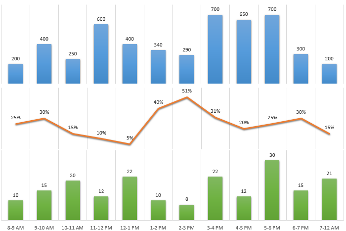
All - do you if there is a way to configure the axis to achieve the image below? I know you can split it with two expressions, but not sure about the third one.. 
- Tags:
- combo
- split axis
- Mark as New
- Bookmark
- Subscribe
- Mute
- Subscribe to RSS Feed
- Permalink
- Report Inappropriate Content
Is this you are expecting?
- Mark as New
- Bookmark
- Subscribe
- Mute
- Subscribe to RSS Feed
- Permalink
- Report Inappropriate Content
If the y axis is unimportant, thn you could use offsets for the blue bar and the red line. Click the + next to the respective expressions (Chart Properrties | Expressions) and enter a value or expression for the offset. If that value or expression is a contant, it will shift the bar / line up accodring to the value. And, of course, hide the y axis.
- Mark as New
- Bookmark
- Subscribe
- Mute
- Subscribe to RSS Feed
- Permalink
- Report Inappropriate Content
Yes exactly what I'm looking for.
- Mark as New
- Bookmark
- Subscribe
- Mute
- Subscribe to RSS Feed
- Permalink
- Report Inappropriate Content
Could you advise on how you achieved this or provide sample qvw. Thanks in advance!