Unlock a world of possibilities! Login now and discover the exclusive benefits awaiting you.
- Qlik Community
- :
- All Forums
- :
- QlikView App Dev
- :
- Active vs Terminated Policy
- Subscribe to RSS Feed
- Mark Topic as New
- Mark Topic as Read
- Float this Topic for Current User
- Bookmark
- Subscribe
- Mute
- Printer Friendly Page
- Mark as New
- Bookmark
- Subscribe
- Mute
- Subscribe to RSS Feed
- Permalink
- Report Inappropriate Content
Active vs Terminated Policy
Hi everyone, I have following table
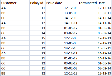
I need to create a chart to show the number of policy Active vs Terminated year wise.I attached a sample file which has Two different bar chart,I want to show both two chart in single chart.anyone please help me in this.Its really urgent
- Tags:
- active
- terminated
- vs
Accepted Solutions
- Mark as New
- Bookmark
- Subscribe
- Mute
- Subscribe to RSS Feed
- Permalink
- Report Inappropriate Content
There were many duplicate records in the source , i think because the YEAR field was meant to show all combinations.
I removed the duplication with the following script with load distinct and resident loads.
overall this is similar to a 'canonical date' approach which is very commonly used. here is the reference
http://community.qlik.com/blogs/qlikviewdesignblog/2014/02/17/canonical-date
As for data volumes, the table is longer but its mostly just repetitive information (same customer, policy and year) and less fields. Overall Uniqueness does not grow very much yielding a less impact to RAM then the number of rows suggest.
----------------------
temp:
LOAD
Customer,
// [Issue date] as Date,
Issue_Year as Year,
[Policy Id]
FROM
(biff, embedded labels, table is Sheet1$);
Data:
load Distinct
*,
'Issue' as Type
resident temp;
drop table temp;
temp:
Load
Customer,
// [Terminated Date] as Date,
terminated_year as Year,
[Policy Id]
FROM
(biff, embedded labels, table is Sheet1$);
Concatenate (Data)
Load
Distinct
*,
'Terminated' as Type
Resident temp;
drop table temp;
- Mark as New
- Bookmark
- Subscribe
- Mute
- Subscribe to RSS Feed
- Permalink
- Report Inappropriate Content
In the load script load the data into 2 separate tables:
Issue Data
Terminated Data
For both these tables rename the ...Year as just [Year] so they link to [Year] in your Tab-1 table
- Mark as New
- Bookmark
- Subscribe
- Mute
- Subscribe to RSS Feed
- Permalink
- Report Inappropriate Content
Fact:
Load
Customer & '|' & [Policy Id] as Key,
Customer,
[Policy Id],
Date(Date#([Issue date],'DD-MM-YY')) as [Issue date],
Date(Date#([Terminated Date],'DD-MM-YY')) as [Terminated Date]
Inline
[
Customer, Policy Id, Issue date, Terminated Date
AA, 11, 12-12-08, 12-12-13
AA, 12, 14-11-11, 14-11-16
AA, 13, 14-11-11, 14-12-14
AA, 15, 12-12-08, 12-12-13
BB, 11, 13-05-08, 12-12-13
BB, 11, 01-05-12, 14-11-16
BB, 12, 13-05-08, 13-05-11
BB, 12, 12-12-13, 12-12-13
BB, 13, 01-05-12, 01-05-16
CC, 11, 03-02-08, 03-02-14
CC, 11, 14-12-10, 14-12-14
CC, 12, 14-12-10, 13-05-11
CC, 12, 03-02-12, 01-05-16
CC, 14, 03-02-12, 03-02-14
];
IssueDate:
Mapping Load Key, [Issue date] Resident Fact;;
TermniateDate:
Mapping Load Key, [Terminated Date] Resident Fact;
DateBridge:
Load Key,'Issue' as DataType, ApplyMap('IssueDate',Key,'Unknown') as LinkedDate Resident Fact;
Load Key,'Terminate' as DataType, ApplyMap('TermniateDate',Key,'Unknown') as LinkedDate Resident Fact;
Join
Load LinkedDate, Year(LinkedDate) as LinkedYear Resident DateBridge;
EXIT Script;
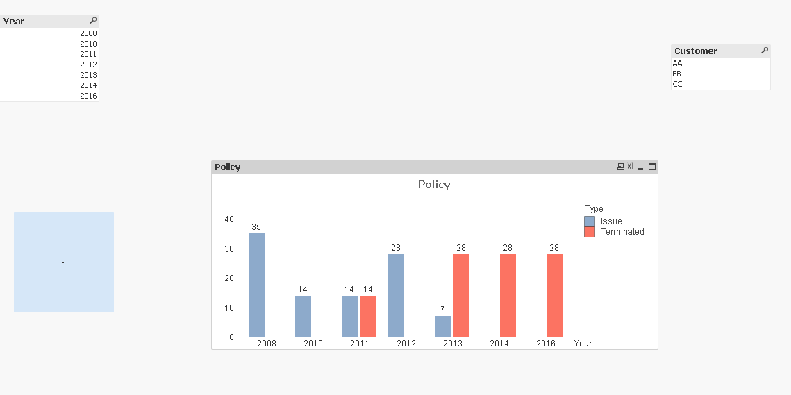
Create a bar Chart
Dimension
LinkedYear
Expression
COUNT({<DataType = {'Issue'}>}DISTINCT [Policy Id])
COUNT({<DataType = {'Terminate'}>}DISTINCT [Policy Id])
- Mark as New
- Bookmark
- Subscribe
- Mute
- Subscribe to RSS Feed
- Permalink
- Report Inappropriate Content
It show wrong data.. any other solution,its really urgent
- Mark as New
- Bookmark
- Subscribe
- Mute
- Subscribe to RSS Feed
- Permalink
- Report Inappropriate Content
I changed your table structure slightly to have a Date (and Year) and a Type (terminated or issued).
This gives you the dimensions you need to do this.
Your chart dimensions will be Year and Type and the expression is count(distinct policy Id)
Data:
LOAD Customer,
[Issue date] as Date,
Issue_Year as Year,
[Policy Id],
'Issue' as Type
FROM
(biff, embedded labels, table is Sheet1$);
Concatenate (Data)
Load Customer,
[Terminated Date] as Date,
terminated_year as Year,
[Policy Id],
'Terminated' as Type
FROM
(biff, embedded labels, table is Sheet1$);
- Mark as New
- Bookmark
- Subscribe
- Mute
- Subscribe to RSS Feed
- Permalink
- Report Inappropriate Content
the resulted chart didnt show correct value....
- Mark as New
- Bookmark
- Subscribe
- Mute
- Subscribe to RSS Feed
- Permalink
- Report Inappropriate Content
I dont think this is the right way to do concatenation will increase the size of the table,My actual table has data more than 5 lacs,it will increase the size,and resulted chart value is not correct anyway..
- Mark as New
- Bookmark
- Subscribe
- Mute
- Subscribe to RSS Feed
- Permalink
- Report Inappropriate Content
What is the result you expected?
Provide in Straight Table please
- Mark as New
- Bookmark
- Subscribe
- Mute
- Subscribe to RSS Feed
- Permalink
- Report Inappropriate Content
There were many duplicate records in the source , i think because the YEAR field was meant to show all combinations.
I removed the duplication with the following script with load distinct and resident loads.
overall this is similar to a 'canonical date' approach which is very commonly used. here is the reference
http://community.qlik.com/blogs/qlikviewdesignblog/2014/02/17/canonical-date
As for data volumes, the table is longer but its mostly just repetitive information (same customer, policy and year) and less fields. Overall Uniqueness does not grow very much yielding a less impact to RAM then the number of rows suggest.
----------------------
temp:
LOAD
Customer,
// [Issue date] as Date,
Issue_Year as Year,
[Policy Id]
FROM
(biff, embedded labels, table is Sheet1$);
Data:
load Distinct
*,
'Issue' as Type
resident temp;
drop table temp;
temp:
Load
Customer,
// [Terminated Date] as Date,
terminated_year as Year,
[Policy Id]
FROM
(biff, embedded labels, table is Sheet1$);
Concatenate (Data)
Load
Distinct
*,
'Terminated' as Type
Resident temp;
drop table temp;