Unlock a world of possibilities! Login now and discover the exclusive benefits awaiting you.
- Qlik Community
- :
- All Forums
- :
- QlikView App Dev
- :
- Aggr with something like above in dimension?
- Subscribe to RSS Feed
- Mark Topic as New
- Mark Topic as Read
- Float this Topic for Current User
- Bookmark
- Subscribe
- Mute
- Printer Friendly Page
- Mark as New
- Bookmark
- Subscribe
- Mute
- Subscribe to RSS Feed
- Permalink
- Report Inappropriate Content
Aggr with something like above in dimension?
Hi,
i m trying to visualise fractiles from data like this:
| ID | Score | Value |
| 1 | 1 | 0 |
| 2 | 1 | 0 |
| 3 | 1 | 0 |
| 4 | 1 | 0 |
| 5 | 1 | 0 |
| 6 | 2 | 1 |
| 7 | 2 | 0 |
| 8 | 2 | 0 |
| 9 | 2 | 0 |
| 10 | 2 | 0 |
| 11 | 3 | 1 |
| 12 | 3 | 1 |
| 13 | 3 | 0 |
| 14 | 3 | 0 |
| 15 | 3 | 0 |
| 16 | 4 | 1 |
| 17 | 4 | 1 |
| 18 | 4 | 1 |
| 19 | 4 | 0 |
| 20 | 4 | 0 |
| 21 | 5 | 1 |
| 22 | 5 | 1 |
| 23 | 5 | 1 |
| 24 | 5 | 0 |
| 25 | 5 | 0 |
| 26 | 6 | 1 |
| 27 | 6 | 1 |
| 28 | 6 | 0 |
| 29 | 6 | 1 |
| 30 | 6 | 1 |
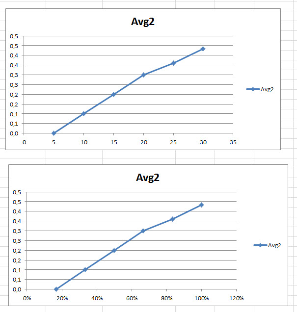
I want to get an graph like
or
It's easy to get something like
| Score | count | Avg |
| 1 | 5 | 0 |
| 2 | 5 | 0,2 |
| 3 | 5 | 0,4 |
| 4 | 5 | 0,6 |
| 5 | 5 | 0,6 |
| 6 | 5 | 0,8 |
but i ve no idea how to calculated the data to get something like
| Score | count2 | count2_2 | Avg2 |
| 1 | 5 | 17% | 0,0 |
| 2 | 10 | 33% | 0,1 |
| 3 | 15 | 50% | 0,2 |
| 4 | 20 | 67% | 0,3 |
| 5 | 25 | 83% | 0,4 |
| 6 | 30 | 100% | 0,4 |
and to use the count2 or count2_2 as a dimension.
Any ideas?
Thanks a lot,
Gert
- Mark as New
- Bookmark
- Subscribe
- Mute
- Subscribe to RSS Feed
- Permalink
- Report Inappropriate Content
FOR COUNT2, WRITE EXPRESSION
rangesum(Above(sum(count),0,rowno()))
- Mark as New
- Bookmark
- Subscribe
- Mute
- Subscribe to RSS Feed
- Permalink
- Report Inappropriate Content
Hi,
thanks for your answers, but:
the "problem" isn't the calcuation in a straigth table, the problem is to use the data in an graph like this:
(sorry, the graphs weren't shown)
so I need the values in an calculated dimension...
Gert
- Mark as New
- Bookmark
- Subscribe
- Mute
- Subscribe to RSS Feed
- Permalink
- Report Inappropriate Content
See attached qvw
talk is cheap, supply exceeds demand
- Mark as New
- Bookmark
- Subscribe
- Mute
- Subscribe to RSS Feed
- Permalink
- Report Inappropriate Content
Thanks a lot 🙂
- Mark as New
- Bookmark
- Subscribe
- Mute
- Subscribe to RSS Feed
- Permalink
- Report Inappropriate Content
Hi,
sorry, clicked to fast 😉
num(...) in the dimension doesn't calculate the "correct" (or better "wished";-)) value:
count2 is calculated and represents the x - value,
avg2 the y - value.
see example2.xlsx...
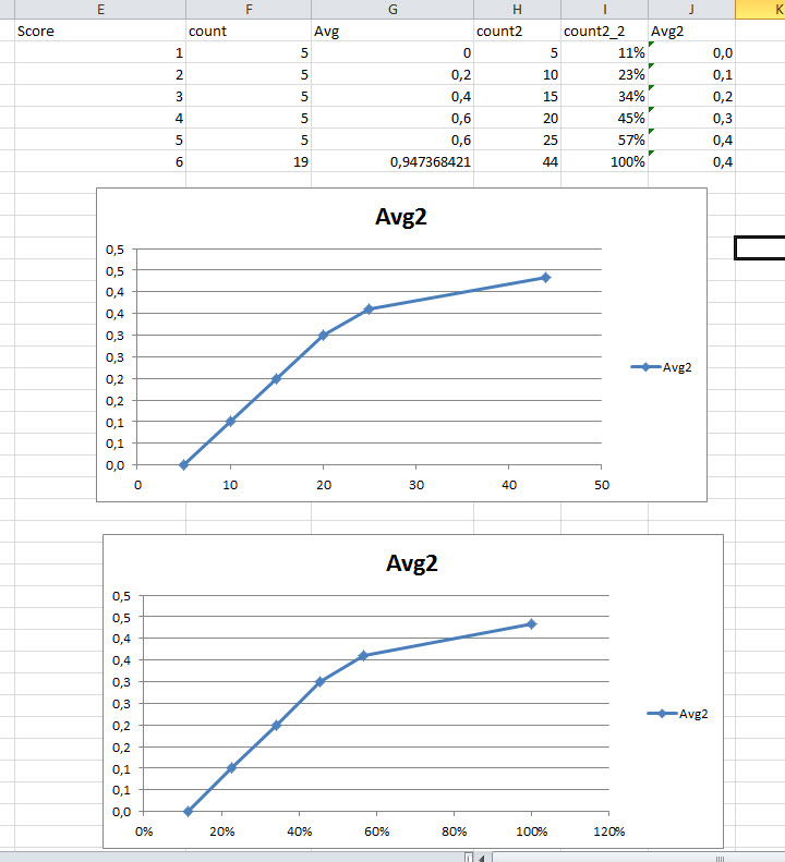
any ideas?
Greets
Gert
- Mark as New
- Bookmark
- Subscribe
- Mute
- Subscribe to RSS Feed
- Permalink
- Report Inappropriate Content
Hi,
no one with another idea?
Gert