Unlock a world of possibilities! Login now and discover the exclusive benefits awaiting you.
- Qlik Community
- :
- All Forums
- :
- QlikView App Dev
- :
- Alignment of charts layered on each other works fi...
- Subscribe to RSS Feed
- Mark Topic as New
- Mark Topic as Read
- Float this Topic for Current User
- Bookmark
- Subscribe
- Mute
- Printer Friendly Page
- Mark as New
- Bookmark
- Subscribe
- Mute
- Subscribe to RSS Feed
- Permalink
- Report Inappropriate Content
Alignment of charts layered on each other works fine in one dashboard but not in other even if the objects have been copied over
Hi,
Looking for help/guidance on following scenario where axes alignment is off ....
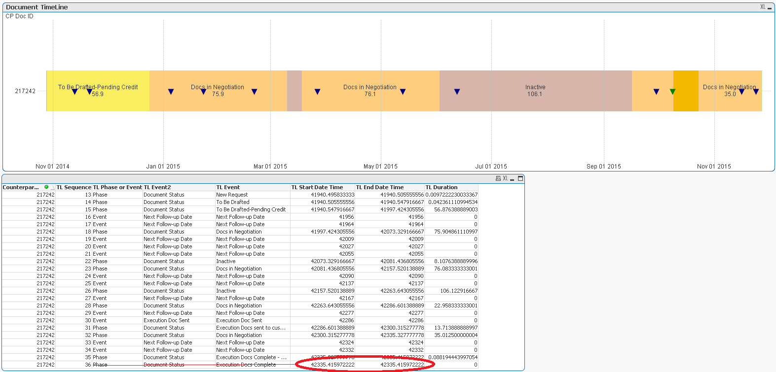
I have two charts that I've layered on each other. In one dashboard application I've only records related to CP Doc ID 217242 and in other there are multiple records in the application but only 217242 is selected.
I've included screen shots from both dashboards.
Aligned charts....

Individual charts
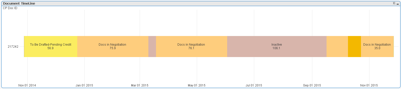
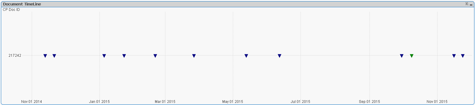
Axes are not aligned in the charts even though they were copied over from the dashboard they were perfectly aligned.
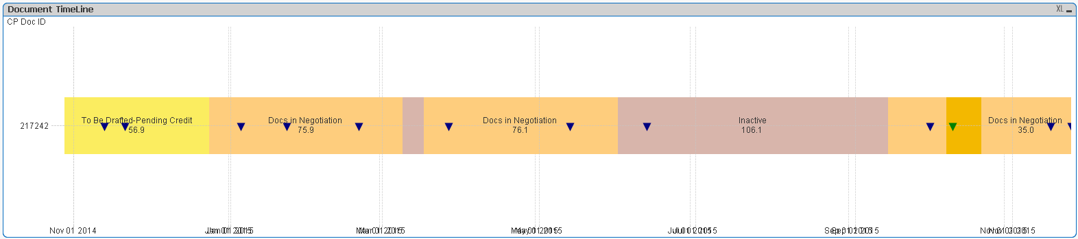
in the misaligned the first grid line seems to be aligned but following are all off.....
Thanks & Regards,
Vijay
- Mark as New
- Bookmark
- Subscribe
- Mute
- Subscribe to RSS Feed
- Permalink
- Report Inappropriate Content
It'd help if you posted the application.
If you copy a chart from one workbook to another and something changes within the chart, it's usually because there's a difference in the data between the two workbooks. The chart will immediately reflect the changes in data as soon as you copy it over. Can you make sure set analysis in the chart isn't ignoring selections, i.e. with {1}?
- Mark as New
- Bookmark
- Subscribe
- Mute
- Subscribe to RSS Feed
- Permalink
- Report Inappropriate Content
Hi,
Thanks for the pointer in the reply. I was thinking along the same line of reasoning. Let me check on that, unfortunately, I'm unable to attach the QVW. I'll update on findings and/or additional points that may help.
Regards,
Vijay
- Mark as New
- Bookmark
- Subscribe
- Mute
- Subscribe to RSS Feed
- Permalink
- Report Inappropriate Content
I found the reason
it is combination of how I was structuring my data and the formulas for Expression, Bar Offset, and/or Axes Step Min/Max.
Let me explain what happened here using the screenshots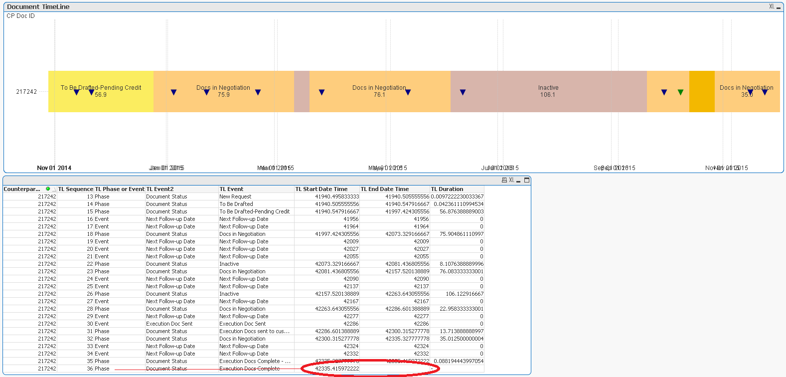
Formula for each of those uses Start Date and End Date in some fashion of Min or Max. As seen from screen shot above that End Date does not have value for the last row and that caused alignment due to different overall start and end for two charts (Bar and Symbol)
Once I had made sure that min sequence # will have start date time and max sequence # record will have end date time, the alignment issue went away
Here some formula for reference to explanation above
Following is Bar Offset Formula that I have
date(
if(IsNull(above(Only([Counterparty Document: Document ID]))), Min({<[Counterparty Document: Document ID], [TL Sequence]>}[TL Start Date Time]),
RangeMax(0,Min({<[Counterparty Document: Document ID], [TL Sequence]>}[TL Start Date Time])-
RangeMax(above(Max({<[Counterparty Document: Document ID], [TL Sequence]>}[TL End Date Time]),1,rowno()-1))))
)
Following was Expression for Symbol Chart
=If(GetSelectedCount([Counterparty Document: Document ID]) = 1,
Num(Max({<[Counterparty Document: Document ID]={"$(vGetSelectedCPDocID)"}, [TL Phase or Event]={'Event'}, [TL Sequence]>}[TL End Date Time]),'#.#'),
Num(Max({<[Counterparty Document: Document ID], [TL Phase or Event]={'Event'}, [TL Sequence]>}[TL End Date Time]),'#.#')
)
Following is screen shot after I had made sure that max seq rec will have End Date Time
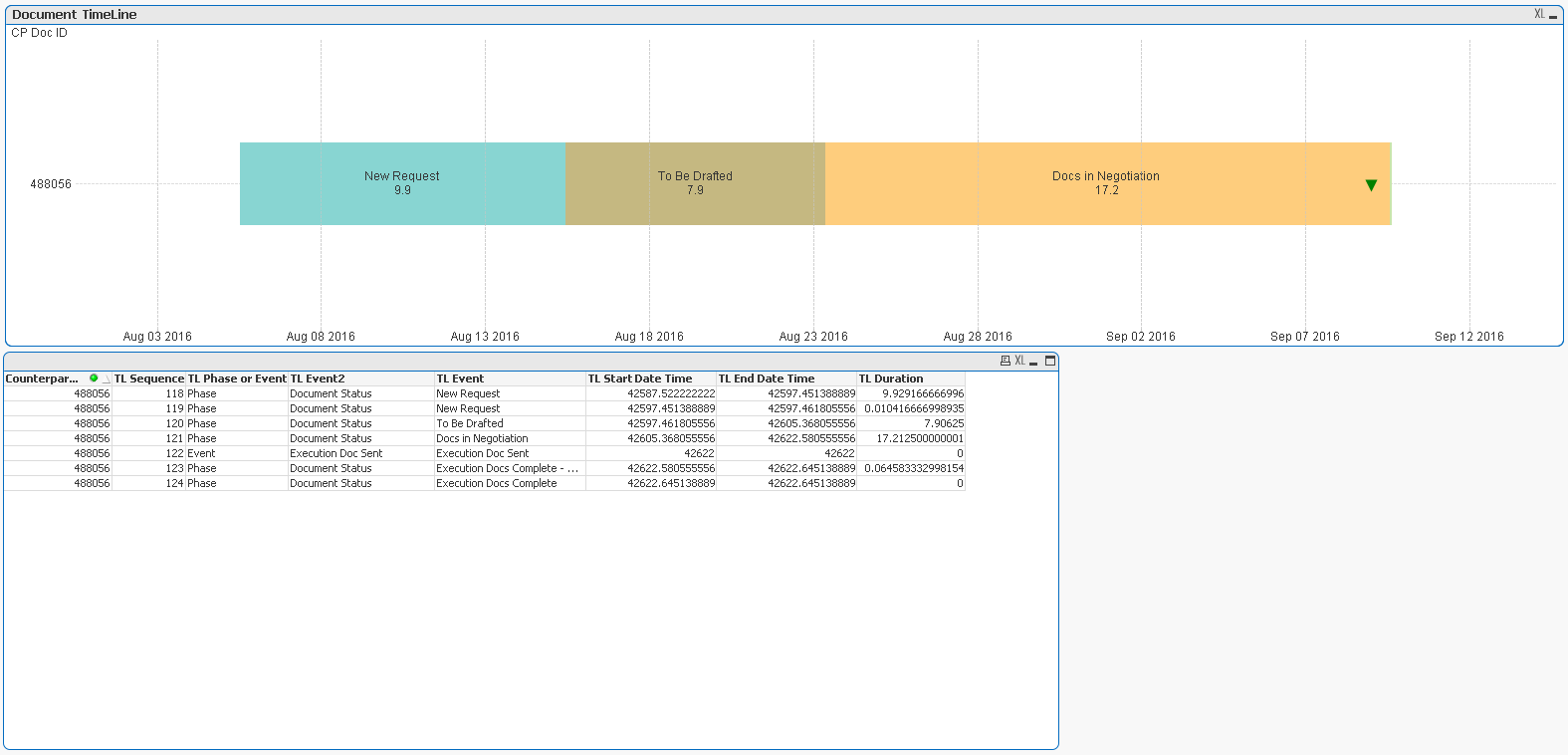
I hope this will help.
Regards,
Vijay