Unlock a world of possibilities! Login now and discover the exclusive benefits awaiting you.
- Qlik Community
- :
- All Forums
- :
- QlikView App Dev
- :
- Re: Average Sales based on month selection
- Subscribe to RSS Feed
- Mark Topic as New
- Mark Topic as Read
- Float this Topic for Current User
- Bookmark
- Subscribe
- Mute
- Printer Friendly Page
- Mark as New
- Bookmark
- Subscribe
- Mute
- Subscribe to RSS Feed
- Permalink
- Report Inappropriate Content
Average Sales based on month selection
Hi All,
I want to show YTD Sales Average for Dept1 in a pivot table with month selection as shown below:
| Month | Sales | YTD Avg Sales |
| Jan-16 | 10 | 10 |
| Feb-16 | 20 | 15 |
| Mar-16 | 30 | 20 |
| Apr-16 | 40 | 25 |
| May-16 | 50 | 30 |
| Jun-16 | 60 | 35 |
| Jul-16 | 70 | 40 |
| Aug-16 | 80 | 45 |
| Sep-16 | 90 | 50 |
| Oct-16 | 100 | 55 |
Please help me. Thanks in advance.
- « Previous Replies
-
- 1
- 2
- Next Replies »
Accepted Solutions
- Mark as New
- Bookmark
- Subscribe
- Mute
- Subscribe to RSS Feed
- Permalink
- Report Inappropriate Content
Use Exp:
Aggr(Rangeavg(Above( sum({<Month>}Sales),0,RowNo())), Dept,Month)
- Mark as New
- Bookmark
- Subscribe
- Mute
- Subscribe to RSS Feed
- Permalink
- Report Inappropriate Content
Replace your Dept dimension with Month like in attached sample.
- Mark as New
- Bookmark
- Subscribe
- Mute
- Subscribe to RSS Feed
- Permalink
- Report Inappropriate Content
Hi Tresco,
Thanks for the reply.
My chart is with Dept,Sales,YTD Sales.
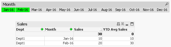
For Dept1 and Jan-16 selection , I want to show YTD Sales 10,
For Dept1 and Feb-16 selection , I want to show YTD Sales 15,
For Dept1 and Mar-16 selection , I want to show YTD Sales 20,
For Dept1 and Apr-16 selection , I want to show YTD Sales 25.
Please help me !
- Mark as New
- Bookmark
- Subscribe
- Mute
- Subscribe to RSS Feed
- Permalink
- Report Inappropriate Content
Jack 061685 wrote:
Hi Tresco,
Thanks for the reply.
My chart is with Dept,Sales,YTD Sales.
For Dept1 and Jan-16 selection , I want to show YTD Sales 10,
And you are not selecting the month to see the result. I am a bit confused.
- Mark as New
- Bookmark
- Subscribe
- Mute
- Subscribe to RSS Feed
- Permalink
- Report Inappropriate Content
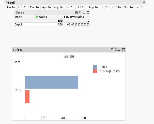
Yes. Selecting the month. But I want to show Dept dimension in the chart/table.
- Mark as New
- Bookmark
- Subscribe
- Mute
- Subscribe to RSS Feed
- Permalink
- Report Inappropriate Content
This is not what you want. Then what do you want it to be like with the same selection?
- Mark as New
- Bookmark
- Subscribe
- Mute
- Subscribe to RSS Feed
- Permalink
- Report Inappropriate Content
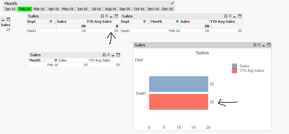
I want to show for Feb-16 selection,
Dept1, Sales 20, YTD Sales 15.
- Mark as New
- Bookmark
- Subscribe
- Mute
- Subscribe to RSS Feed
- Permalink
- Report Inappropriate Content
You can try this attachment,

Susovan
- Mark as New
- Bookmark
- Subscribe
- Mute
- Subscribe to RSS Feed
- Permalink
- Report Inappropriate Content
Use Exp:
Aggr(Rangeavg(Above( sum({<Month>}Sales),0,RowNo())), Dept,Month)
- Mark as New
- Bookmark
- Subscribe
- Mute
- Subscribe to RSS Feed
- Permalink
- Report Inappropriate Content
Hi Susovan,
For Feb-16 your solution showing YTD Avg Sales 20. But it should show 15.
- « Previous Replies
-
- 1
- 2
- Next Replies »