Unlock a world of possibilities! Login now and discover the exclusive benefits awaiting you.
- Qlik Community
- :
- All Forums
- :
- QlikView App Dev
- :
- Re: Average hours per workday
- Subscribe to RSS Feed
- Mark Topic as New
- Mark Topic as Read
- Float this Topic for Current User
- Bookmark
- Subscribe
- Mute
- Printer Friendly Page
- Mark as New
- Bookmark
- Subscribe
- Mute
- Subscribe to RSS Feed
- Permalink
- Report Inappropriate Content
Average hours per workday
Hi all,
I'm relatively new to QlikView and was wondering if there is a method to aggregate all workdays to an average working hours, and then show them in a Gantt-chart style.
I've searched the community already and couldn't find the answer, probably because I can't formulate my question adequately.
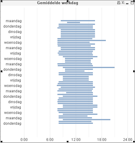
I already got the following: It shows all dates in day names date(<datefield goes here> 'WWWW') over an period of some weeks.

The expression is a simple SUM of total work time (end-start time) with an offset on the start time.
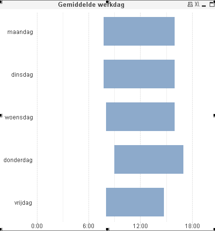
But what i want is the following (I made a selection of last week data)

The data is in Dutch and represents the weekdays monday-friday.
I sure hope it's possible!
Kind regards,
Job van den Berg
Accepted Solutions
- Mark as New
- Bookmark
- Subscribe
- Mute
- Subscribe to RSS Feed
- Permalink
- Report Inappropriate Content
- Mark as New
- Bookmark
- Subscribe
- Mute
- Subscribe to RSS Feed
- Permalink
- Report Inappropriate Content
For your dimension:
text(WeekDay(YourDateField))
- Mark as New
- Bookmark
- Subscribe
- Mute
- Subscribe to RSS Feed
- Permalink
- Report Inappropriate Content
try this, networkdays returns the number of working days (Monday-Friday)
networkdays ('2007-02-19', '2007-03-01') returns 9
- Mark as New
- Bookmark
- Subscribe
- Mute
- Subscribe to RSS Feed
- Permalink
- Report Inappropriate Content
date(<datefield goes here> 'WWWW') will only change the formatting of the date to the day name. The underlying values are still the individual dates. What you need is a weekday field as dimension. You can create that in the script:
MapDays:
mapping load * inline [
Weekday, Name
0, Maandag
1, Dinsdag
2, Woensdag
3, Donderdag
4, Vrijdag
];
WorkDays:
Load
Date
, StartTime
, EndTime
, interval(EndTime-StartTime,'hh:mm') as WorkHours
, applymap('MapDays',weekday(Date)) as Weekday
from ...mysource...;
talk is cheap, supply exceeds demand
- Mark as New
- Bookmark
- Subscribe
- Mute
- Subscribe to RSS Feed
- Permalink
- Report Inappropriate Content
Maybe an aggregation like
AVG(
AGGR(
SUM(time),
yourdimension
)
)
- Mark as New
- Bookmark
- Subscribe
- Mute
- Subscribe to RSS Feed
- Permalink
- Report Inappropriate Content
Hi.
The problem is that date() function changes the text format of dual data type (date is dual, both text and numeric). The numerical date remains unchanged. So you see separate dimension value for each maandag (QV distinguishes the values by numeric part).
To solve the problem you should have the numeric values of each maandag to be equal. The functions like Month, WeekDay etc. do that. Then you can use Date() function to set the format you like:
=Date(WeekDay(Date), 'WWWW')