Unlock a world of possibilities! Login now and discover the exclusive benefits awaiting you.
- Qlik Community
- :
- All Forums
- :
- QlikView App Dev
- :
- Axes question
- Subscribe to RSS Feed
- Mark Topic as New
- Mark Topic as Read
- Float this Topic for Current User
- Bookmark
- Subscribe
- Mute
- Printer Friendly Page
- Mark as New
- Bookmark
- Subscribe
- Mute
- Subscribe to RSS Feed
- Permalink
- Report Inappropriate Content
Axes question
How can I make the years on the x axis closer together?
- Tags:
- axes
- Mark as New
- Bookmark
- Subscribe
- Mute
- Subscribe to RSS Feed
- Permalink
- Report Inappropriate Content
By having more years or making a smaller chart?
I'm pretty sure I'm not understanding the question.
- Mark as New
- Bookmark
- Subscribe
- Mute
- Subscribe to RSS Feed
- Permalink
- Report Inappropriate Content
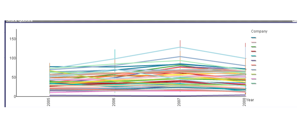
So sorry! It was very broad. I have a line/combo chart with the year 2005 to 2010 along the x axis. There is so much data though that it cuts off 2010 and so I want to make the chart smaller by having the years closer to each other. For some reason if I just make it smaller, it cuts off all the dates after 2005. Also, by making it smaller, it doesn't allow for the legend of companies to be clicked on because the data is past the legend. Sorry if this is even more confusing! I appreciate your help
- Mark as New
- Bookmark
- Subscribe
- Mute
- Subscribe to RSS Feed
- Permalink
- Report Inappropriate Content
I probably still don't understand, but I typically have my date fields vertical on the X-axis, which might allow 2010 to show. You can also click on the chart, then Ctrl-Shift, and elements of the chart will be highlighted with red boxes that you can drag and drop and resize. Perhaps some moving and resizing of the chart elements will allow all of your data to display. If I'm still way off on what you're asking, you could post a picture of what you're talking about. That would probably make it obvious.
- Mark as New
- Bookmark
- Subscribe
- Mute
- Subscribe to RSS Feed
- Permalink
- Report Inappropriate Content
- Mark as New
- Bookmark
- Subscribe
- Mute
- Subscribe to RSS Feed
- Permalink
- Report Inappropriate Content
And the data itself goes through 2010? OK, I admit, I have no idea why it doesn't display out to 2010. I'm also unclear what's going on with the multicolor vertical lines. I think I remember seeing weirdness like that in a combo chart when I did something wrong, maybe had too many dimensions?
If you'd set a maximum visible number on the presentation tab to 4, that might cause it to look like this. If you're using a continuous axis and have a static min and max defined, that might cause it to look like this.
Sometimes when my chart has gotten messed up and I can't figure out why, I start over. I create a new chart and start adding my features to it until I see it go bad, and then I know what caused the problem.
I'm sorry. I get the feeling I'm not going to be any help.
- Mark as New
- Bookmark
- Subscribe
- Mute
- Subscribe to RSS Feed
- Permalink
- Report Inappropriate Content
no problem. I know it looks like a mess, but it's just because there are so many companies and figures. When you click on one company it looks like it is supposed to. It is a stock chart. The dimension is Year. There is a line chart expression: Avg(Close) and then a stock expression that has (high low and close). It's ok, it is complicated. There is just a weird line that goes past the legend when i try to make it smaller and it disables the legend so weird!
- Mark as New
- Bookmark
- Subscribe
- Mute
- Subscribe to RSS Feed
- Permalink
- Report Inappropriate Content
Is it possible that you post a small sample app so, so someone might be able to figure out what the problem is by looking at the settings etc. ?
- Mark as New
- Bookmark
- Subscribe
- Mute
- Subscribe to RSS Feed
- Permalink
- Report Inappropriate Content
If you still want to get your years closer together - as in your original question - I would - as John said - click on your chart then hold down ctrl + shift and when you see the red lines - start playing with the horizontal size. A combination of that and normal resizing might just do the trick.