Unlock a world of possibilities! Login now and discover the exclusive benefits awaiting you.
- Qlik Community
- :
- All Forums
- :
- QlikView App Dev
- :
- Bar Chart Color Based on the Condition
- Subscribe to RSS Feed
- Mark Topic as New
- Mark Topic as Read
- Float this Topic for Current User
- Bookmark
- Subscribe
- Mute
- Printer Friendly Page
- Mark as New
- Bookmark
- Subscribe
- Mute
- Subscribe to RSS Feed
- Permalink
- Report Inappropriate Content
Bar Chart Color Based on the Condition
Hi Qlikers,
I want to Fill a Color in Bar Chart Based on Conditional,
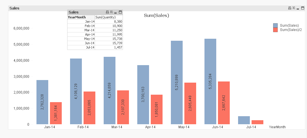
Here in the Bar Chart image with ,
One Dimension - YearMonth
Expressions: 1.Sum(Sales)
2.Sum(Sales)/2
In the Second Expression Bar, i need to include Sum(Quantity) as Green Color. Means For example in Jan-14 Value is '1381164' as its showing red .In that bar itself till Sum(Quantity) Value '8,380' it should be in green.
Thanks in advance,
Hirish
- « Previous Replies
-
- 1
- 2
- Next Replies »
Accepted Solutions
- Mark as New
- Bookmark
- Subscribe
- Mute
- Subscribe to RSS Feed
- Permalink
- Report Inappropriate Content
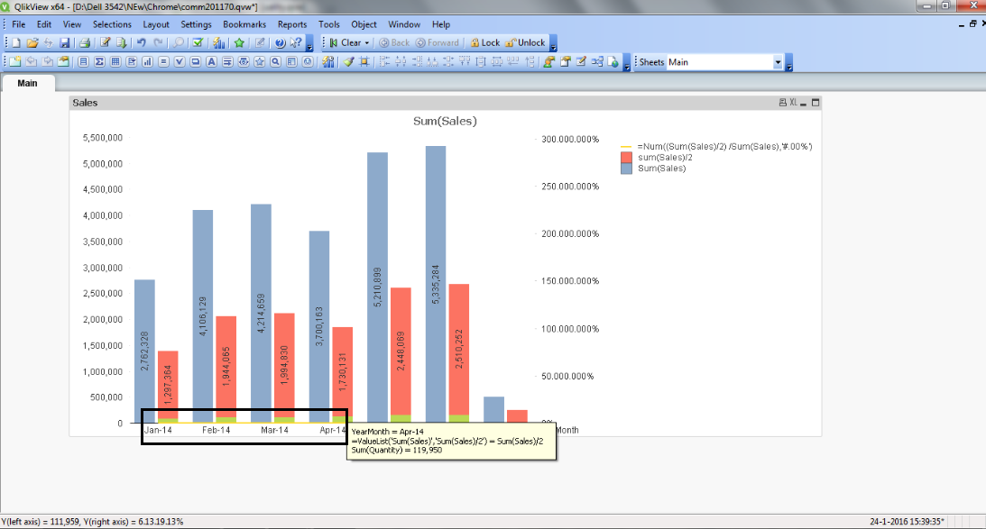
8,380 is less then 0.1% of 1,3811,164 so you won't be able to any green in the red bar. To demonstrate the technique I divided the sales by 100. See attached example.
talk is cheap, supply exceeds demand
- Mark as New
- Bookmark
- Subscribe
- Mute
- Subscribe to RSS Feed
- Permalink
- Report Inappropriate Content
Hi,
Here in the above chart it self i need to add relative Percentage of two bars as line,I mentioned as another Expression But its displaying at the bottom of the chart as highlighted,
And As i mouse over on the chart its showing complete Expression as above ,How to avoid it , I want to see only numbers for color associated and on the Second bar i want to get the total of the two colors when i hover at top is this possible.
PFA,
Thanks in Advance,
Hirish
- Mark as New
- Bookmark
- Subscribe
- Mute
- Subscribe to RSS Feed
- Permalink
- Report Inappropriate Content
hi
rename the expression to desired name.
it will display that name only
- Mark as New
- Bookmark
- Subscribe
- Mute
- Subscribe to RSS Feed
- Permalink
- Report Inappropriate Content
Hi,
PFA file for solution.
Regards,
jagan.
- Mark as New
- Bookmark
- Subscribe
- Mute
- Subscribe to RSS Feed
- Permalink
- Report Inappropriate Content
will this work?
- Mark as New
- Bookmark
- Subscribe
- Mute
- Subscribe to RSS Feed
- Permalink
- Report Inappropriate Content
Hi jagan,
There at Fourth expression if i Kept Values on the data points the figures are shows as 50% , But its displayed at the bottom of the Chart where its not shown with respect to axes.
-Hirish
- Mark as New
- Bookmark
- Subscribe
- Mute
- Subscribe to RSS Feed
- Permalink
- Report Inappropriate Content
Hi Balraj,
No its not as desired. As Explained above!
-Hirish
- Mark as New
- Bookmark
- Subscribe
- Mute
- Subscribe to RSS Feed
- Permalink
- Report Inappropriate Content
Hi,
You have selected % and Sum(Sales)/2 as Right Axes in Axes, Sum(Sales)/2 is having a huge number when compared to %, so give Right Axes only %, this will fix. Refer attached file.
Regards,
Jagan.
- Mark as New
- Bookmark
- Subscribe
- Mute
- Subscribe to RSS Feed
- Permalink
- Report Inappropriate Content
kindly Share the Attachement!
- « Previous Replies
-
- 1
- 2
- Next Replies »