Unlock a world of possibilities! Login now and discover the exclusive benefits awaiting you.
- Qlik Community
- :
- All Forums
- :
- QlikView App Dev
- :
- Re: Bar Chart color issue.............
- Subscribe to RSS Feed
- Mark Topic as New
- Mark Topic as Read
- Float this Topic for Current User
- Bookmark
- Subscribe
- Mute
- Printer Friendly Page
- Mark as New
- Bookmark
- Subscribe
- Mute
- Subscribe to RSS Feed
- Permalink
- Report Inappropriate Content
Bar Chart color issue.............
Hi Experts,
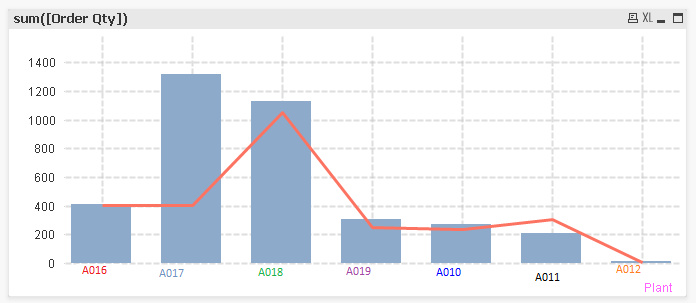
How to give different color in BAR chart Dimension.........
PFA,.....
Thanks in Advance..............
- « Previous Replies
-
- 1
- 2
- Next Replies »
- Mark as New
- Bookmark
- Subscribe
- Mute
- Subscribe to RSS Feed
- Permalink
- Report Inappropriate Content
Sorry, it´s not possible.
The label colors for dimensions are set by graph, not by row/column
- Mark as New
- Bookmark
- Subscribe
- Mute
- Subscribe to RSS Feed
- Permalink
- Report Inappropriate Content
Hi Clever,
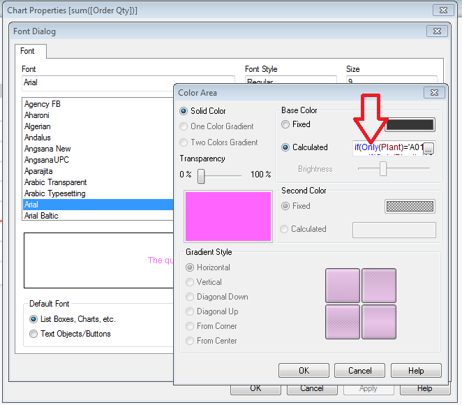
It's possible but only one color......
Properties -----> Axis Tab----> Dimensions Axis ----> Font ---->Color
But i don't know is it possible or not multiple color's..............
- Mark as New
- Bookmark
- Subscribe
- Mute
- Subscribe to RSS Feed
- Permalink
- Report Inappropriate Content
That´s what I was saying  you can set it by graph, choosing one color
- Mark as New
- Bookmark
- Subscribe
- Mute
- Subscribe to RSS Feed
- Permalink
- Report Inappropriate Content
If you want a different colour from each bar then you can choose Multicoloured on the colour properties tab. If you want to control the colour of a specific bar then you use the background colour property on the bar expression.
- Mark as New
- Bookmark
- Subscribe
- Mute
- Subscribe to RSS Feed
- Permalink
- Report Inappropriate Content
But we have Calculated expression.. i.e also not working..
- Mark as New
- Bookmark
- Subscribe
- Mute
- Subscribe to RSS Feed
- Permalink
- Report Inappropriate Content
You can only set the font colour for
- dimension axis
- measure axis
- data labels
You might be able to change the colour of the data labels dynamically using the expression properties.
- Mark as New
- Bookmark
- Subscribe
- Mute
- Subscribe to RSS Feed
- Permalink
- Report Inappropriate Content
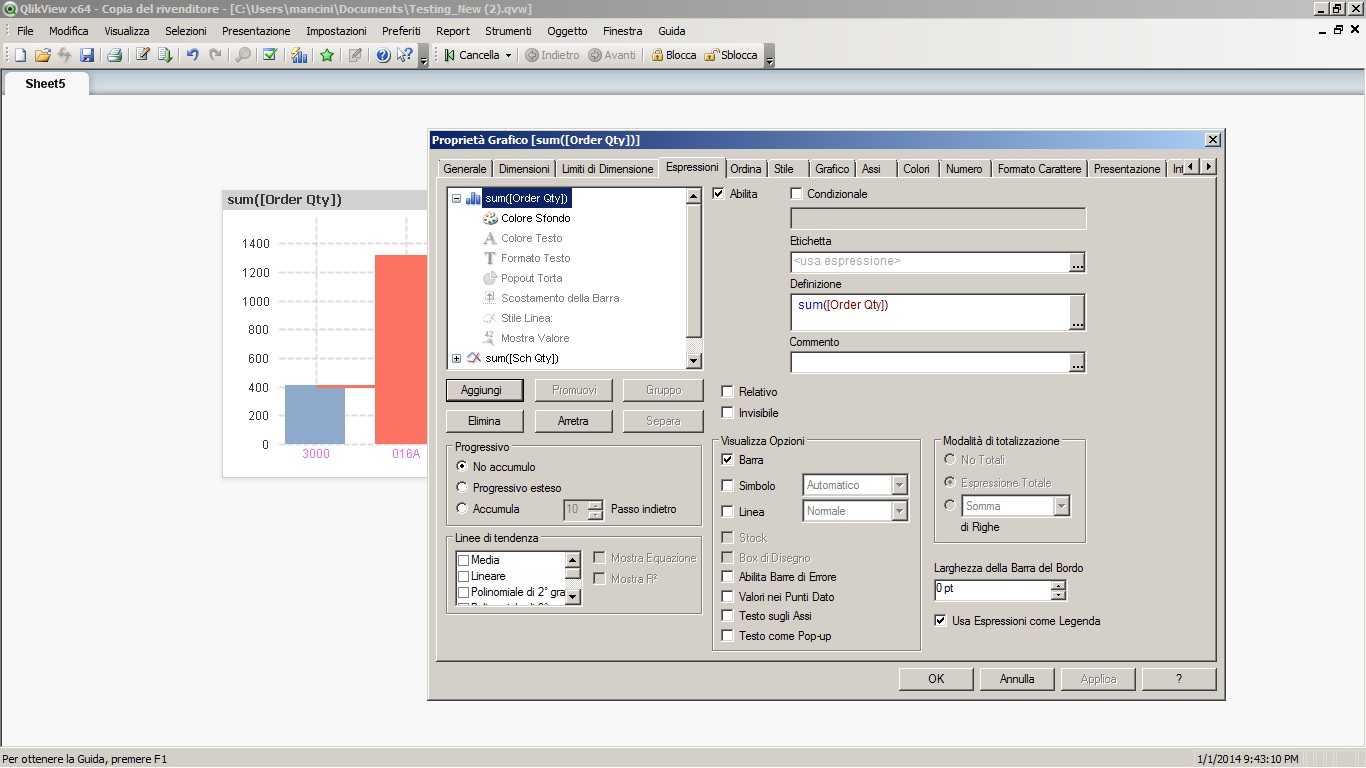
That will do the bars, but not the labels. If the bar colour expression is not working please post it here as text and we can debug.
The only way you will get coloured labels is by having each as text in chart. You would have to ensure that there was never any chance of new plants appearing or any being excluded by selections.
Just another observation, you should probably set the line on the chart to be symbols (eg. circles) instead of a line - as there is no linear relationship between plants.
Hope that helps,
Steve
- Mark as New
- Bookmark
- Subscribe
- Mute
- Subscribe to RSS Feed
- Permalink
- Report Inappropriate Content
Hi All,
Thanks for Explanation...............
- Mark as New
- Bookmark
- Subscribe
- Mute
- Subscribe to RSS Feed
- Permalink
- Report Inappropriate Content
- « Previous Replies
-
- 1
- 2
- Next Replies »