Unlock a world of possibilities! Login now and discover the exclusive benefits awaiting you.
- Qlik Community
- :
- All Forums
- :
- QlikView App Dev
- :
- Re: Bar chart with revenues by customers - can you...
- Subscribe to RSS Feed
- Mark Topic as New
- Mark Topic as Read
- Float this Topic for Current User
- Bookmark
- Subscribe
- Mute
- Printer Friendly Page
- Mark as New
- Bookmark
- Subscribe
- Mute
- Subscribe to RSS Feed
- Permalink
- Report Inappropriate Content
Bar chart with revenues by customers - can you add a small box with total sum?
Hi,
I have a question about setting up two analyses on charts
1) % share of product X sales in total sales to each customer
X axis - customers
Y axis - bar chart with % share of sales of selected / filtered product in total sales of this customer
I have a list box with product names - if i click on "Product A" - i want to see what % share Product A has in total sales to each customer. I don't want to see what is the % split of my total revenue on this product by customers has but rather what % share does "Product A" have in total sales to customer X, Y, Z etc...
I have data colums like "sales value", "customer", "product" etc.
Is there any way to do that?
2) Bar chart with revenues by customers - can you add a small box showing total figure for the chart?
Let's assume that I have a bar chart that shows revenues (USD mn) by sales regions which which de-group into customer segments and those de-group into individual customers.
So X axis - regions/segments/customers, Y axis - revenues
Is there any way to always have a small box on the chart with the total revenues of my company (or region or segment) even as I go into details with a cyclic group filter?
So for example on a chart with revenues by sales regions I want to see a box with total revenues for my company but if i drill done to region 1 with split by customer segments i want this box to show total revenues for segment (or for example average revenues per segment / region). Is there any way to do that? Perhaps with two boxes - one with a chart and one with separate table?
Many thanks!
Accepted Solutions
- Mark as New
- Bookmark
- Subscribe
- Mute
- Subscribe to RSS Feed
- Permalink
- Report Inappropriate Content
Hi CaptainP,
The its 'Text in chart' option. Right click chart > properties > presentation . in the bottom right you can see an add option where you can use your own expressions/texts and whose results will be displayed on the chart as text.
You can change background color, font, positioning etc.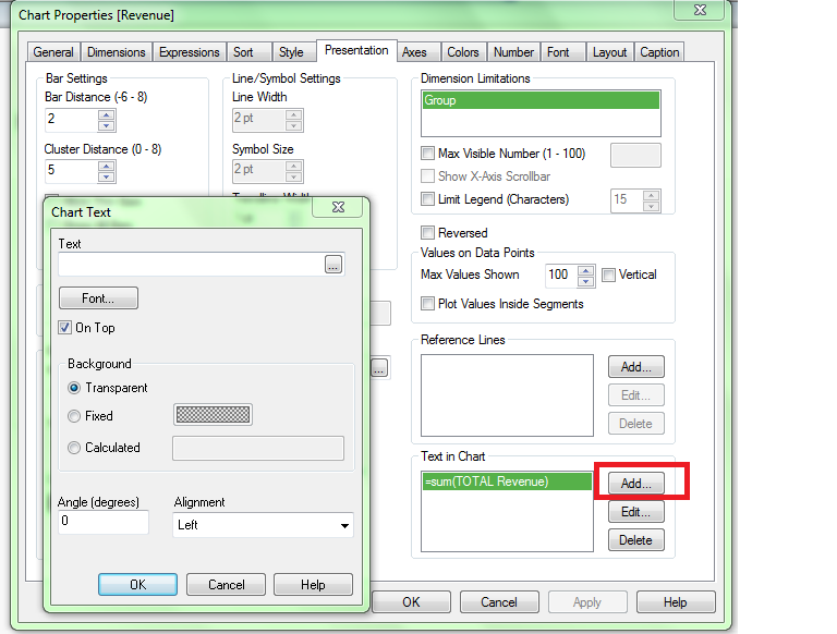
For the first chart is this want you want
| ID | Customer | Product | Sales | |
| 1 | A | Bat | 10 | 17% |
| 2 | A | Bike | 20 | 33% |
| 3 | A | Tire | 30 | 50% |
| 4 | B | Bat | 45 | 34% |
| 5 | B | Tire | 56 | 43% |
| 6 | B | Bike | 30 | 23% |
| 7 | C | Bat | 30 | 86% |
| 8 | C | Tire | 5 | 14% |
The first value 17% is calculated by 10/(10+20+30). If so please check out the attached file. I added two dimensions and created a legend for each Product.
thanks
- Mark as New
- Bookmark
- Subscribe
- Mute
- Subscribe to RSS Feed
- Permalink
- Report Inappropriate Content
Hi,
Please check out the attached file and see if it meets your needs. I have two sheets one for each requirement
Thanks
AJ
- Mark as New
- Bookmark
- Subscribe
- Mute
- Subscribe to RSS Feed
- Permalink
- Report Inappropriate Content
Ajay,
thanks a lot!
Sheet 2 is perfect - exactly what i wanted. By the way - what exactly do i need to do to turn on those green fields  ?
?
Sheet 1 is not exactly what I'm looking for
Lets take the below example
| ID | Customer | Product | Sales |
| 1 | A | Bat | 10 |
| 2 | A | Bike | 20 |
| 3 | A | Tire | 30 |
| 4 | B | Bat | 45 |
| 5 | B | Tire | 56 |
| 6 | B | Bike | 30 |
| 7 | C | Bat | 30 |
| 8 | C | Tire | 5 |
I want to see what % share Tyres have in total sales to customer C (total sales to C customer). Or what % share bat has in tota sales to customer B.
Thanks
T
- Mark as New
- Bookmark
- Subscribe
- Mute
- Subscribe to RSS Feed
- Permalink
- Report Inappropriate Content
For the green box, go into the chart properties -> Presentation tab -> Text in Chart (In the bottom right corner). You can reposition that box by holding CTRL and Shift when the chart is selected
- Mark as New
- Bookmark
- Subscribe
- Mute
- Subscribe to RSS Feed
- Permalink
- Report Inappropriate Content
Hi CaptainP,
The its 'Text in chart' option. Right click chart > properties > presentation . in the bottom right you can see an add option where you can use your own expressions/texts and whose results will be displayed on the chart as text.
You can change background color, font, positioning etc.
For the first chart is this want you want
| ID | Customer | Product | Sales | |
| 1 | A | Bat | 10 | 17% |
| 2 | A | Bike | 20 | 33% |
| 3 | A | Tire | 30 | 50% |
| 4 | B | Bat | 45 | 34% |
| 5 | B | Tire | 56 | 43% |
| 6 | B | Bike | 30 | 23% |
| 7 | C | Bat | 30 | 86% |
| 8 | C | Tire | 5 | 14% |
The first value 17% is calculated by 10/(10+20+30). If so please check out the attached file. I added two dimensions and created a legend for each Product.
thanks
- Mark as New
- Bookmark
- Subscribe
- Mute
- Subscribe to RSS Feed
- Permalink
- Report Inappropriate Content
Ajay,
perfect. That's what I wanted.
One last question regarding the green box  Is there a way to get this data formatted?
So instead of having value "12345,5678" to display "12 345"?
Thanks,
regards,
CaptainP
- Mark as New
- Bookmark
- Subscribe
- Mute
- Subscribe to RSS Feed
- Permalink
- Report Inappropriate Content
Sure. Go to the expression and change it to(click the expression and then edit) :
num(sum(TOTAL Revenue),'#,##0.00')
This will format your number say you have like 222345 to 222,345.00. You can play around with the '#,##0.00' part of it to suit your needs.
Thanks