Unlock a world of possibilities! Login now and discover the exclusive benefits awaiting you.
- Qlik Community
- :
- All Forums
- :
- QlikView App Dev
- :
- Bar graph without stacked values
- Subscribe to RSS Feed
- Mark Topic as New
- Mark Topic as Read
- Float this Topic for Current User
- Bookmark
- Subscribe
- Mute
- Printer Friendly Page
- Mark as New
- Bookmark
- Subscribe
- Mute
- Subscribe to RSS Feed
- Permalink
- Report Inappropriate Content
Bar graph without stacked values
HI All
Another Newbie question
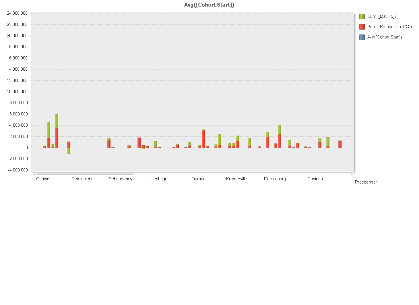
I have a chart which is set as a bar. There are three dimensions and three expressions. When the chart shows the axis are correct but I can only get a stacked graph with the expressions in and I would like for there to be a bar per expression for comparison purposes. How do I set this up?
Another thing I am trying to do is set-up a datagrid at the bottom of the chart as you can do in Excel- is there a way to do this?
Thanks

Accepted Solutions
- Mark as New
- Bookmark
- Subscribe
- Mute
- Subscribe to RSS Feed
- Permalink
- Report Inappropriate Content
In the dimensions tab try too remove one of the dimensions, so you only have one dimension left.
- Mark as New
- Bookmark
- Subscribe
- Mute
- Subscribe to RSS Feed
- Permalink
- Report Inappropriate Content

- Mark as New
- Bookmark
- Subscribe
- Mute
- Subscribe to RSS Feed
- Permalink
- Report Inappropriate Content
I have it as grouped- and it still has my series stacked on top of each other- and thus my question. How do I get it to treat each expression as a bar instead of stacking them as the grouped function does not seem to work
- Mark as New
- Bookmark
- Subscribe
- Mute
- Subscribe to RSS Feed
- Permalink
- Report Inappropriate Content
In the expressions tap are they ungrouped?
- Mark as New
- Bookmark
- Subscribe
- Mute
- Subscribe to RSS Feed
- Permalink
- Report Inappropriate Content
Nope- should they be?
- Mark as New
- Bookmark
- Subscribe
- Mute
- Subscribe to RSS Feed
- Permalink
- Report Inappropriate Content
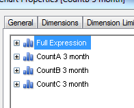
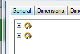
Well, if they are grouped I dont think u can switch between Grouped/Stacked in the Style tab, unless you have one expression outside the group also. Further more u should not be able to show what u posted, so probably it is something else, but just be sure in the expresions tab it should look like this:

and NOT like this:

- Mark as New
- Bookmark
- Subscribe
- Mute
- Subscribe to RSS Feed
- Permalink
- Report Inappropriate Content
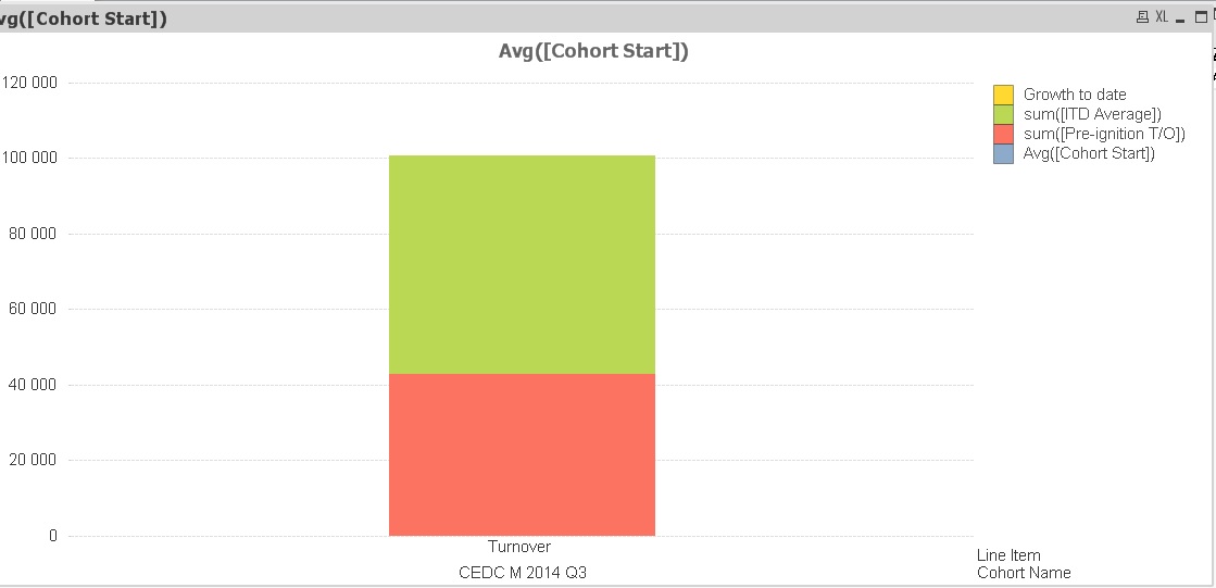
And why I am so confused- with the above settings I get this graph- stacked bars instead of side by side.

- Mark as New
- Bookmark
- Subscribe
- Mute
- Subscribe to RSS Feed
- Permalink
- Report Inappropriate Content
In the dimensions tab try too remove one of the dimensions, so you only have one dimension left.
- Mark as New
- Bookmark
- Subscribe
- Mute
- Subscribe to RSS Feed
- Permalink
- Report Inappropriate Content
That works, but then it means that this lacks the ability to do some of the graphs I currently do in Excel. I'll have to play some more and see if I can get this to work like I need it to.