Unlock a world of possibilities! Login now and discover the exclusive benefits awaiting you.
- Qlik Community
- :
- All Forums
- :
- QlikView App Dev
- :
- Re: Calculating percentage in the bar chart
- Subscribe to RSS Feed
- Mark Topic as New
- Mark Topic as Read
- Float this Topic for Current User
- Bookmark
- Subscribe
- Mute
- Printer Friendly Page
- Mark as New
- Bookmark
- Subscribe
- Mute
- Subscribe to RSS Feed
- Permalink
- Report Inappropriate Content
Calculating percentage in the bar chart
Hello Everyone,
I'm working on a Bar chart, where i have 3 expressions:
Total = Sum(ID)
Filled = Sum(Filled)
Util. % = Filled/TOtal
When i represent in a bar chart, the Util% bar is very short to view, since its corresponding values (Total & Filled) were high.
I wanna set max. value of the "Util.%"as the "Total value" such that the "Util.%" bar is visible.
Please find the attached qvw.
Accepted Solutions
- Mark as New
- Bookmark
- Subscribe
- Mute
- Subscribe to RSS Feed
- Permalink
- Report Inappropriate Content
- Mark as New
- Bookmark
- Subscribe
- Mute
- Subscribe to RSS Feed
- Permalink
- Report Inappropriate Content
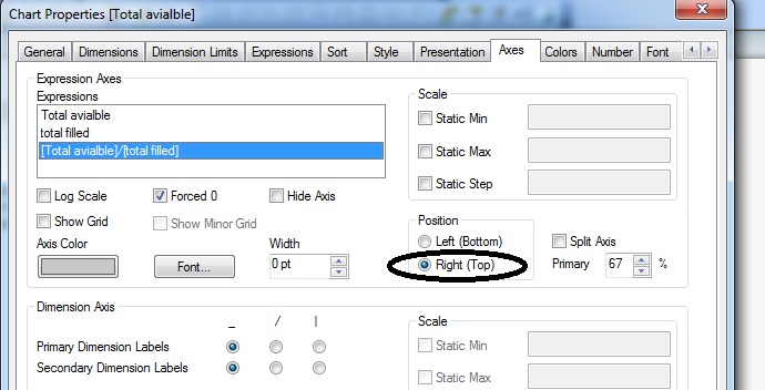
Go to Axes tab
Choose third expression, and check (Right/Top)
- Mark as New
- Bookmark
- Subscribe
- Mute
- Subscribe to RSS Feed
- Permalink
- Report Inappropriate Content
Hi,
Go to axes tab and select Position of expression as right/left
- Mark as New
- Bookmark
- Subscribe
- Mute
- Subscribe to RSS Feed
- Permalink
- Report Inappropriate Content
Hi It worked.
Thank you.
Can you please tell me what does the "Right(Top)" bottom does.
- Mark as New
- Bookmark
- Subscribe
- Mute
- Subscribe to RSS Feed
- Permalink
- Report Inappropriate Content
Hi It worked.
Thank you.
Can you please tell me what does the "Right(Top)" bottom does.
- Mark as New
- Bookmark
- Subscribe
- Mute
- Subscribe to RSS Feed
- Permalink
- Report Inappropriate Content
It basically represents the values on Y axis, but to the right side. By default chart represents the Y axis values on left side. Generally when we have two expressions( one with numerical values & one with %) , we divide either of the expression on right or left. If we show both expression on same axis side % value will always be have small values so the same issue which you faced right now will occur.
- Mark as New
- Bookmark
- Subscribe
- Mute
- Subscribe to RSS Feed
- Permalink
- Report Inappropriate Content
You can change (top/bottom right/left) axe for each expression.
Play around with this parameter and see what happens
Be Qlik