Unlock a world of possibilities! Login now and discover the exclusive benefits awaiting you.
- Qlik Community
- :
- All Forums
- :
- QlikView App Dev
- :
- Re: Can I organize dimensions in ad-hoc reporting
- Subscribe to RSS Feed
- Mark Topic as New
- Mark Topic as Read
- Float this Topic for Current User
- Bookmark
- Subscribe
- Mute
- Printer Friendly Page
- Mark as New
- Bookmark
- Subscribe
- Mute
- Subscribe to RSS Feed
- Permalink
- Report Inappropriate Content
Can I organize dimensions in ad-hoc reporting
We have implemented ad-hoc reporting where the user gets to pick from a list of dimensions and metrics. We are going to expand our usage and want to give the user a TON of dimensions (40+) to choose from but this is aesthetically unpleasant and difficult to use if we just put them in a big scroll box.
Has anyone ever 'grouped' dimensions in order to create a better user experience? For example if we have 40 dimensions that are part of 4 groups, just those 4 groups would show, and the user would 'expand' one of those groups and pick one or two dimensions from group one, then expand group 2 and choose one from group two, etc. etc.
I haven't been able to find anything like this in any of the QV demos so hoping someone has given it a try. Thanks!
-Mitch
- « Previous Replies
-
- 1
- 2
- Next Replies »
Accepted Solutions
- Mark as New
- Bookmark
- Subscribe
- Mute
- Subscribe to RSS Feed
- Permalink
- Report Inappropriate Content
- Mark as New
- Bookmark
- Subscribe
- Mute
- Subscribe to RSS Feed
- Permalink
- Report Inappropriate Content
Hi,
you can create a Hierarchy of Dimensions, like Parent and Child, it can be done
Regards
Alan
- Mark as New
- Bookmark
- Subscribe
- Mute
- Subscribe to RSS Feed
- Permalink
- Report Inappropriate Content
would you like to send on the groups and the dimensions and I will mock up the code to suit?
- Mark as New
- Bookmark
- Subscribe
- Mute
- Subscribe to RSS Feed
- Permalink
- Report Inappropriate Content
Hi Mitch,
See below example, let me know if this helps
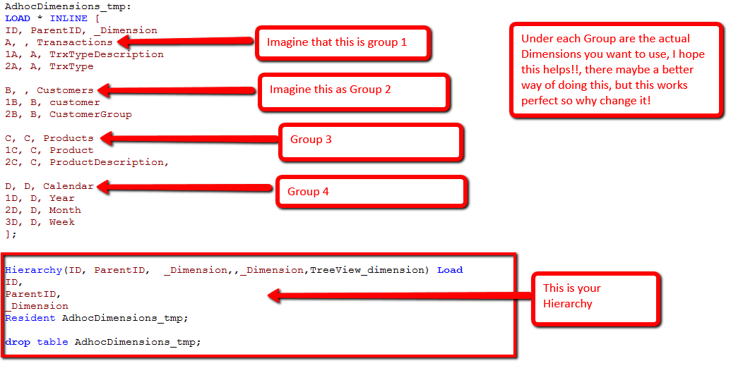
Use the above as a guide and you will be fine
- Mark as New
- Bookmark
- Subscribe
- Mute
- Subscribe to RSS Feed
- Permalink
- Report Inappropriate Content
Mitch,
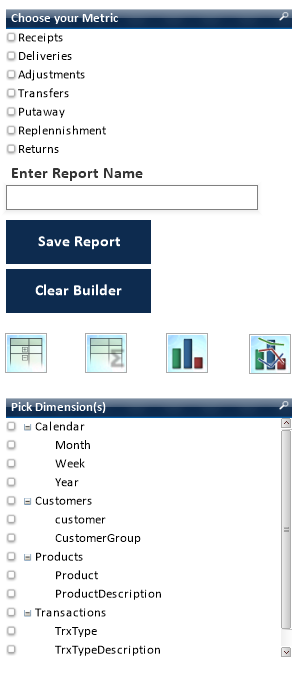
With the above code, here is how my app looks with that Hierarchy
Is this what you need
- Mark as New
- Bookmark
- Subscribe
- Mute
- Subscribe to RSS Feed
- Permalink
- Report Inappropriate Content
Above is a sample App.
hence the reason it's not sorted correctly!!
- Mark as New
- Bookmark
- Subscribe
- Mute
- Subscribe to RSS Feed
- Permalink
- Report Inappropriate Content
Alan, this sir, is perfect. You da man! Thanks!
- Mark as New
- Bookmark
- Subscribe
- Mute
- Subscribe to RSS Feed
- Permalink
- Report Inappropriate Content
Glad to help Mitch
Regards
Alan
- Mark as New
- Bookmark
- Subscribe
- Mute
- Subscribe to RSS Feed
- Permalink
- Report Inappropriate Content
Hi,
I have also implemented one Ad-hoc report.But there is one issue like, there are almost more than 40-45 dimensions.
User can dynamically select it. But if the user selects more dimensions than the report size then it automatically increases the table size.I dont wants to increase the table size.
Is there any solution for this.
Thanks in Advance..!!!!
- Mark as New
- Bookmark
- Subscribe
- Mute
- Subscribe to RSS Feed
- Permalink
- Report Inappropriate Content
Limit your Pick Dimension field by adding calculation condition with certain value. Use GetSelectedCount([Pick Dimension(s)]) function to find number of values selected in a field.
Hope this helps!
- « Previous Replies
-
- 1
- 2
- Next Replies »