Unlock a world of possibilities! Login now and discover the exclusive benefits awaiting you.
- Qlik Community
- :
- All Forums
- :
- QlikView App Dev
- :
- Change Color of Chart Background or x-axis labels
- Subscribe to RSS Feed
- Mark Topic as New
- Mark Topic as Read
- Float this Topic for Current User
- Bookmark
- Subscribe
- Mute
- Printer Friendly Page
- Mark as New
- Bookmark
- Subscribe
- Mute
- Subscribe to RSS Feed
- Permalink
- Report Inappropriate Content
Change Color of Chart Background or x-axis labels
Hi,
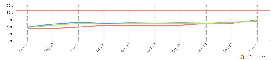
I have a line chart with three different colored data lines. See attached pic.
From 'Sept-13' onwards, I need to show a service change by either changing the font colour of the Date X-Axis from September onwards or maybe change the background colour of the chart from then on. Is this possible?
Any suggestions or help appreciated.
Thanks,
Tom
- Mark as New
- Bookmark
- Subscribe
- Mute
- Subscribe to RSS Feed
- Permalink
- Report Inappropriate Content
Background - not possible.
Font color - looks like not possible either.
These properties are defined per chart and don't depend on dimensions values 
- Mark as New
- Bookmark
- Subscribe
- Mute
- Subscribe to RSS Feed
- Permalink
- Report Inappropriate Content
Have you seen this post?
- Mark as New
- Bookmark
- Subscribe
- Mute
- Subscribe to RSS Feed
- Permalink
- Report Inappropriate Content
Hi Tom,
For background yo need to change in Style tab the Area Background Style to other different than 'Minimun' (So Solid or Shadowed).
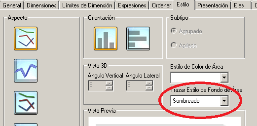
Then in the colours tab you can set the color for the Graphic Area.

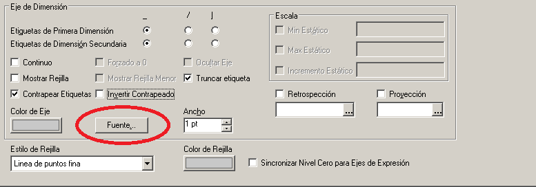
For the font colour of x-axis you can change the font properties for the dimension axis:
Hope this helps
- Mark as New
- Bookmark
- Subscribe
- Mute
- Subscribe to RSS Feed
- Permalink
- Report Inappropriate Content
Hi Tom,
have You tried to use Colormix1() function or Colormix2() ?
You can use wizard.
Regards,
Antonio
- Mark as New
- Bookmark
- Subscribe
- Mute
- Subscribe to RSS Feed
- Permalink
- Report Inappropriate Content
Hello Tom,
You can have the background color of the chart changed by using the "Background color option" under each expression.
To check this option see the attached image. in the definition add this expression.
if(Date='Jan 2014',LightBlue(),LightGreen()).
Thanks,
Shruthi Reddy
- Mark as New
- Bookmark
- Subscribe
- Mute
- Subscribe to RSS Feed
- Permalink
- Report Inappropriate Content
Sorry, I' didn't understand well your requirements, check attached file, using an expression showed only in the axis you can use the font color in this expression the change the color simulating the dimension value.
Probably you need an expression for each dimension, you can use GetCurrentField function to check what field is selected in the ciclic group and use conditional expressions to match the dimension selected.
- Mark as New
- Bookmark
- Subscribe
- Mute
- Subscribe to RSS Feed
- Permalink
- Report Inappropriate Content
Theres a neat little trick for this that we did in QS but I guess it could work in QV too
just create a bar expression, that is for say 100% after the first month that you want to highlight, hide its axes its value label and just set it so that it overlaps with each other