Unlock a world of possibilities! Login now and discover the exclusive benefits awaiting you.
- Qlik Community
- :
- All Forums
- :
- QlikView App Dev
- :
- Re: Change field parameter in Scatter chart withou...
- Subscribe to RSS Feed
- Mark Topic as New
- Mark Topic as Read
- Float this Topic for Current User
- Bookmark
- Subscribe
- Mute
- Printer Friendly Page
- Mark as New
- Bookmark
- Subscribe
- Mute
- Subscribe to RSS Feed
- Permalink
- Report Inappropriate Content
Change field parameter in Scatter chart without changing the field
Hello,
How can I change the x-axis parameter value, without changing the content of the field, but only in order to choose a value with fewer decimals to be considered in the scatter chart.
The scatter chart quickly finds all combinations between my x and y parameters, but the x-parameter has a numerical value with 2 decimals, and I only want to compare the values with 1 decimal in the scatter chart instead, without effecting all the other selections including the field itself. How can I do that?
- « Previous Replies
-
- 1
- 2
- Next Replies »
- Mark as New
- Bookmark
- Subscribe
- Mute
- Subscribe to RSS Feed
- Permalink
- Report Inappropriate Content
Will you please provide sample
- Mark as New
- Bookmark
- Subscribe
- Mute
- Subscribe to RSS Feed
- Permalink
- Report Inappropriate Content
Hi,
Can you provide a sample?
Rgds,
Dinu1
- Mark as New
- Bookmark
- Subscribe
- Mute
- Subscribe to RSS Feed
- Permalink
- Report Inappropriate Content
I think we need to see some examples including the expressions you are currently using.
-Rob
- Mark as New
- Bookmark
- Subscribe
- Mute
- Subscribe to RSS Feed
- Permalink
- Report Inappropriate Content
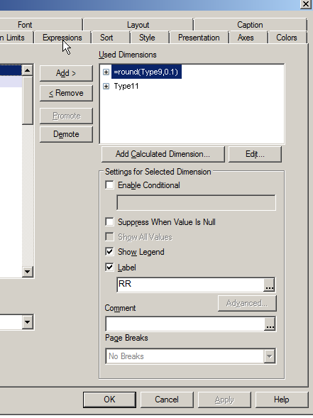
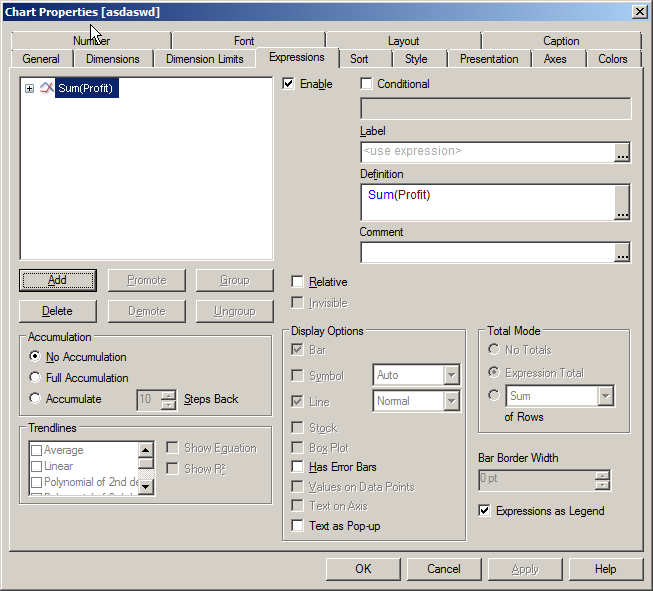
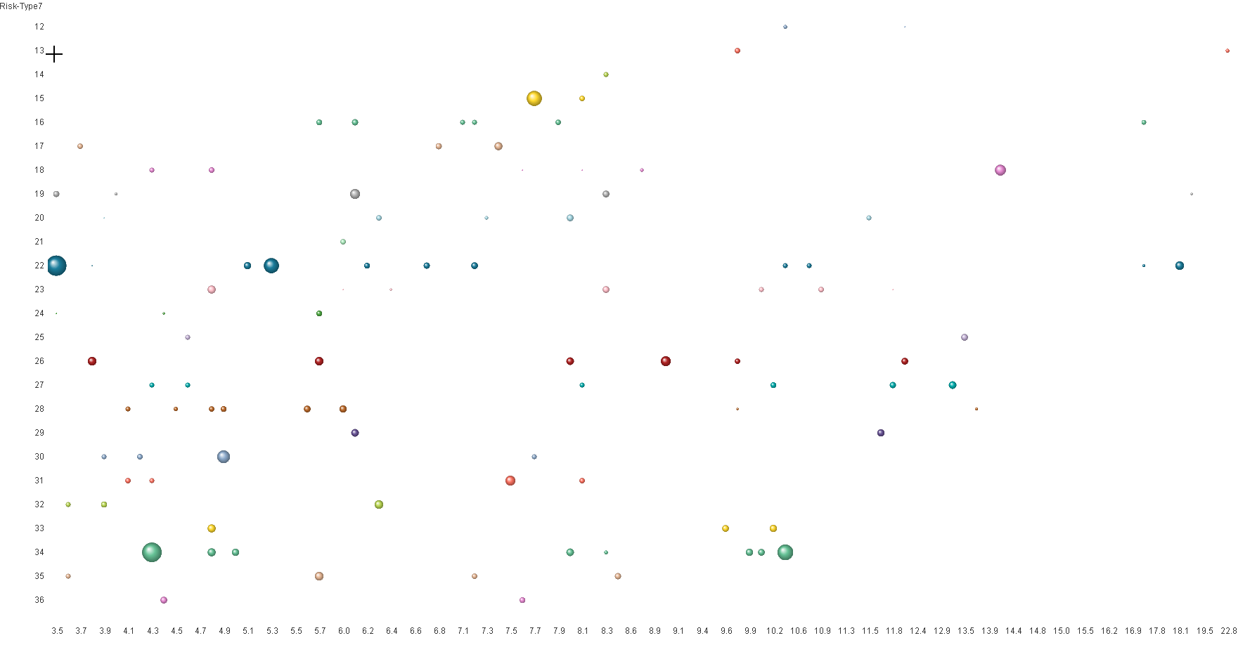
Here are 3 screenshots for the scatter chart that I initially wanted to post.
Rob: The rounding really helped, thank you, but it does not fully solve my problem yet.
This scatter chart below shows different results (expression: sum(Profit)), for only an instance of my parameters Type9 and Type11. What I really want is the results inside the scatter chart for intervals, such that the result will represent the sum(Profit) for maximum Type7 (Risk) and minimum Type11.
For instance: I want to see the result (sum(Profit)) if I would select max Type7 (y-axis, Risk) value of 22 (including all values below 22). And the same for Type11, I want to get the sum(Profit) for all combinations of minimum 10 and above.
Maybe this is logically not even possible using a scatter chart.
I have also a third parameter that I have not included yet, but I was hoping there was a way to solve this. Maybe I can represent intervals on the y- and x-axis instead of singular values, such as that a value of 20 on the y-axis (Type7, Risk), actually represents the entire range of values from 0 to 20, instead of just the value of 20.
I think you should understand me by now. The values are straight forward: 1,2,2,3,4.. for each parameter and the sum(Profit) is the simplest expression. Maybe I am not using the correct chart type?!?
- « Previous Replies
-
- 1
- 2
- Next Replies »