Unlock a world of possibilities! Login now and discover the exclusive benefits awaiting you.
- Qlik Community
- :
- All Forums
- :
- QlikView App Dev
- :
- Chart Background Color depending on date
- Subscribe to RSS Feed
- Mark Topic as New
- Mark Topic as Read
- Float this Topic for Current User
- Bookmark
- Subscribe
- Mute
- Printer Friendly Page
- Mark as New
- Bookmark
- Subscribe
- Mute
- Subscribe to RSS Feed
- Permalink
- Report Inappropriate Content
Chart Background Color depending on date
Hi all
I have a bar chart that give me data for the last 10 days (last day on the right). Last 10 days are selected thanks to set analysis (OK, it works)
I would like to have all the days pertaining to the same week as the last day to be in orange, values for other days in grey.
It works, no problem 
The only problem is that when I add the condition on the bar colors, my set analysis on 10 days is not taken in account and Qlikview displays a lot of days, not only the last 10 (see images below)
Any idea on why I have this behavior?
Thanks in advance
Hub
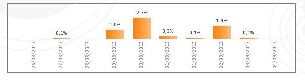
Without colors : 10 days thanks to set analysis
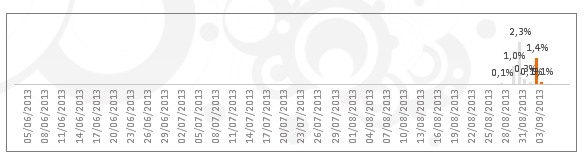
With Colors : lots of days but the last days are in orange because they belong to the same week
Formula used in Graph Properties > Expression > Background Color > Definition :
= if(Week(PeriodDate.Date)=Week($(vReportDate)), cOrangeStandard, cVeryLightGrey)
PeriodDate.Date is the date on the Y axis...
Accepted Solutions
- Mark as New
- Bookmark
- Subscribe
- Mute
- Subscribe to RSS Feed
- Permalink
- Report Inappropriate Content
Try
= if( only ({<YourSetExpressionToLimitTheWeeks>} Week(PeriodDate.Date))=Week($(vReportDate)), cOrangeStandard, cVeryLightGrey)
- Mark as New
- Bookmark
- Subscribe
- Mute
- Subscribe to RSS Feed
- Permalink
- Report Inappropriate Content
Try
= if( only ({<YourSetExpressionToLimitTheWeeks>} Week(PeriodDate.Date))=Week($(vReportDate)), cOrangeStandard, cVeryLightGrey)
- Mark as New
- Bookmark
- Subscribe
- Mute
- Subscribe to RSS Feed
- Permalink
- Report Inappropriate Content
Thanks swuehl!
First time I use the ONLY aggregation function, it took me some tries but finally got there thanks to your hint 🙂