Unlock a world of possibilities! Login now and discover the exclusive benefits awaiting you.
- Qlik Community
- :
- All Forums
- :
- QlikView App Dev
- :
- Chart Label changes
- Subscribe to RSS Feed
- Mark Topic as New
- Mark Topic as Read
- Float this Topic for Current User
- Bookmark
- Subscribe
- Mute
- Printer Friendly Page
- Mark as New
- Bookmark
- Subscribe
- Mute
- Subscribe to RSS Feed
- Permalink
- Report Inappropriate Content
Chart Label changes
Hi,
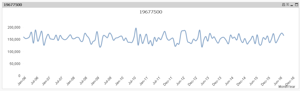
I have a requirement to make changes in the chart axis label to show 6 months apart. For eg : Dimension Axis to show months like Jan, July instead of Jan, Feb, March and so on. This can be achieved with continuous option in Axes however my chart changes when the continuous option is checked. See below pic. Expected result should be Jan-12, Jul-12, Jan-13, Jul-13 and so on.
- Mark as New
- Bookmark
- Subscribe
- Mute
- Subscribe to RSS Feed
- Permalink
- Report Inappropriate Content
Would you be able to share a sample to look at?
- Mark as New
- Bookmark
- Subscribe
- Mute
- Subscribe to RSS Feed
- Permalink
- Report Inappropriate Content
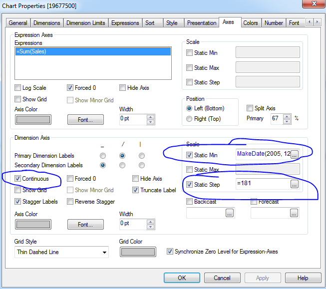
Or something like this?
Settings: Axes tab
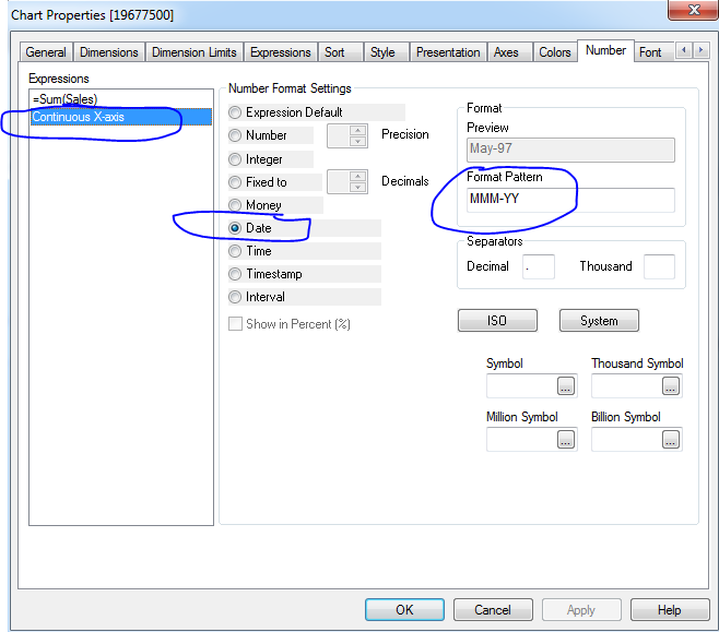
Number tab
- Mark as New
- Bookmark
- Subscribe
- Mute
- Subscribe to RSS Feed
- Permalink
- Report Inappropriate Content
Hi Malaika,
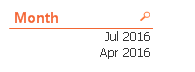
=if(Month([Project Actual Start Date])='Jul' or Month([Project Actual Start Date])='Apr',MonthName([Project Actual Start Date]))
Note:- I have only 2016 data so i got only those values.
it will give month year name like below.so write this in your dimension.