Unlock a world of possibilities! Login now and discover the exclusive benefits awaiting you.
Announcements
FLASH SALE: Save $500! Use code FLASH2026 at checkout until Feb 14th at 11:59PM ET. Register Now!
- Qlik Community
- :
- All Forums
- :
- QlikView App Dev
- :
- Chart Modification:
Options
- Subscribe to RSS Feed
- Mark Topic as New
- Mark Topic as Read
- Float this Topic for Current User
- Bookmark
- Subscribe
- Mute
- Printer Friendly Page
Turn on suggestions
Auto-suggest helps you quickly narrow down your search results by suggesting possible matches as you type.
Showing results for
Specialist III
2014-02-11
12:46 AM
- Mark as New
- Bookmark
- Subscribe
- Mute
- Subscribe to RSS Feed
- Permalink
- Report Inappropriate Content
Chart Modification:
Dear All
I am showing the Company Workforce through Funnel Chart. Its coming Perfectly.
But what I want the Length should increase or decrease as per the employees present in the Grades.
Please find the Attached image.
- Tags:
- chart
609 Views
3 Replies
Master III
2014-02-11
12:53 AM
- Mark as New
- Bookmark
- Subscribe
- Mute
- Subscribe to RSS Feed
- Permalink
- Report Inappropriate Content
443 Views
Not applicable
2014-02-11
12:56 AM
- Mark as New
- Bookmark
- Subscribe
- Mute
- Subscribe to RSS Feed
- Permalink
- Report Inappropriate Content
Hi,
Wouldn't a Vertical Bar Chart be a better options than this?
443 Views
Creator III
2014-03-11
06:04 AM
- Mark as New
- Bookmark
- Subscribe
- Mute
- Subscribe to RSS Feed
- Permalink
- Report Inappropriate Content
Hi Nag,
the easiest way would be to create a horizontal bar chart from your data. See below an example which comes very close to your picture above:
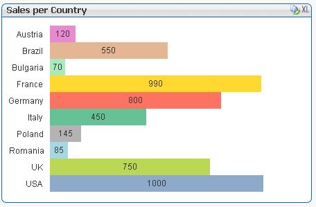
Hope this is ok for you.
Burkhard