Unlock a world of possibilities! Login now and discover the exclusive benefits awaiting you.
- Qlik Community
- :
- All Forums
- :
- QlikView App Dev
- :
- Re: Chart Question
- Subscribe to RSS Feed
- Mark Topic as New
- Mark Topic as Read
- Float this Topic for Current User
- Bookmark
- Subscribe
- Mute
- Printer Friendly Page
- Mark as New
- Bookmark
- Subscribe
- Mute
- Subscribe to RSS Feed
- Permalink
- Report Inappropriate Content
Chart Question
Hi
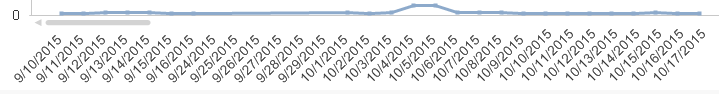
I Need to create a chart as below , but not sure which type of chart I need to use , attached is my application with some sample data and here is the condition for coloring the dots:
- If ingestion completed after 11:00 am, color the dot red
- If ingestion completed before 11:00 am then
if data parity is green, then color the day/dot green
If data parity is yellow or red, then color the day/dot red
Accepted Solutions
- Mark as New
- Bookmark
- Subscribe
- Mute
- Subscribe to RSS Feed
- Permalink
- Report Inappropriate Content
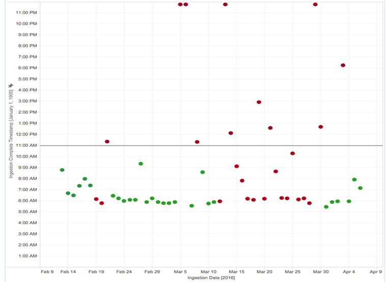
Maybe like attached?
I've used a calculcated dimension made of date and time as key, you probably should use something more meaningful.
- Mark as New
- Bookmark
- Subscribe
- Mute
- Subscribe to RSS Feed
- Permalink
- Report Inappropriate Content
Maybe like attached?
I've used a calculcated dimension made of date and time as key, you probably should use something more meaningful.
- Mark as New
- Bookmark
- Subscribe
- Mute
- Subscribe to RSS Feed
- Permalink
- Report Inappropriate Content
Yes the chart looks like what I wanted , but I have few questions here ,
1.What is the concatenation of date and time doing ? I mean how is it being calculated and plotting the dots.. I see a number but cannot understand how its helping to plot the chart
2.the enable scroll bar is disabled .. is that feature not allowed in these chart types? I want to see all dates with a scroll bar .. is that possible?
3.And also what does 2 represent , nothing seems to happen if I change it
- Mark as New
- Bookmark
- Subscribe
- Mute
- Subscribe to RSS Feed
- Permalink
- Report Inappropriate Content
1) You need at least one dimension in a scatter chart.
Since I haven't found a good candidate in your sample data table, I created a calculated dimension from these two fields.
As said, maybe not a the best or even a good choice, replace with something more appropriate (the field that should be used to group by your bubbles. Maybe something like IngestionID)
2) Not sure about that, I haven't encountered a need for that till now
3) 2 is an arbitrary number, you are right
- Mark as New
- Bookmark
- Subscribe
- Mute
- Subscribe to RSS Feed
- Permalink
- Report Inappropriate Content
Thank you so much .. I was actually looking for something as below for the scatter chart