Unlock a world of possibilities! Login now and discover the exclusive benefits awaiting you.
- Qlik Community
- :
- All Forums
- :
- QlikView App Dev
- :
- Chart Symbols won't appear unless an area is selec...
- Subscribe to RSS Feed
- Mark Topic as New
- Mark Topic as Read
- Float this Topic for Current User
- Bookmark
- Subscribe
- Mute
- Printer Friendly Page
- Mark as New
- Bookmark
- Subscribe
- Mute
- Subscribe to RSS Feed
- Permalink
- Report Inappropriate Content
Chart Symbols won't appear unless an area is selected
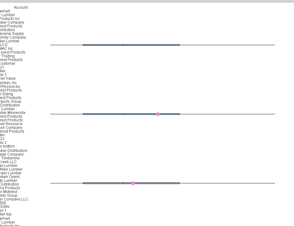
I have box plots, and for each one there is a dot symbol that appears showing that specific companies performance relative to the whole range. When I have it vertical, it looks fine. But when I change the orientation to horizontal, only the box plots remain, and the dot symbols go away - unless I select an area/specific company, then the symbols appear again.
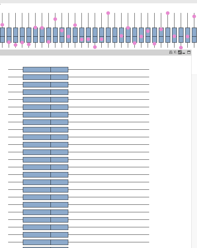 The top chart is fine, but I want to view it horizontally. The horizontal one doesn't show the pink dots. But when I select just one company, the dot shows up.
Any help is greatly appreciated
- Mark as New
- Bookmark
- Subscribe
- Mute
- Subscribe to RSS Feed
- Permalink
- Report Inappropriate Content
Hi
Please add a calculated dimension as same as your 1st dimension in the box plot chart.
If your dimension is Customer, then add calculated dimension simply '=Customer'
Regards
Taj Mohamed
- Mark as New
- Bookmark
- Subscribe
- Mute
- Subscribe to RSS Feed
- Permalink
- Report Inappropriate Content
Hi. Thank you for the reply
However, this method did not fully work.
I tried typing in just account, then =account, then '=account'
and all do not have the intended effect
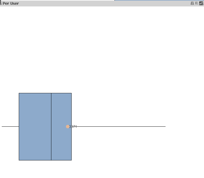
 This one shown is with just =account.
Also, the chart no longer lets me filter on an account, for example if I choose ABC's account, the chart says "Drawing of chart failed internally"
- Mark as New
- Bookmark
- Subscribe
- Mute
- Subscribe to RSS Feed
- Permalink
- Report Inappropriate Content
if vertical way is working good, then is it really required to show in horizontal way
- Mark as New
- Bookmark
- Subscribe
- Mute
- Subscribe to RSS Feed
- Permalink
- Report Inappropriate Content
For customer use, they want it horizontal.
- Mark as New
- Bookmark
- Subscribe
- Mute
- Subscribe to RSS Feed
- Permalink
- Report Inappropriate Content
on the expression tab please note the correct order as
Lower
Upper
Boxplot symbol
use promote or demote to allign