Unlock a world of possibilities! Login now and discover the exclusive benefits awaiting you.
- Qlik Community
- :
- All Forums
- :
- QlikView App Dev
- :
- Re: Chart creation
- Subscribe to RSS Feed
- Mark Topic as New
- Mark Topic as Read
- Float this Topic for Current User
- Bookmark
- Subscribe
- Mute
- Printer Friendly Page
- Mark as New
- Bookmark
- Subscribe
- Mute
- Subscribe to RSS Feed
- Permalink
- Report Inappropriate Content
Chart creation
Hi
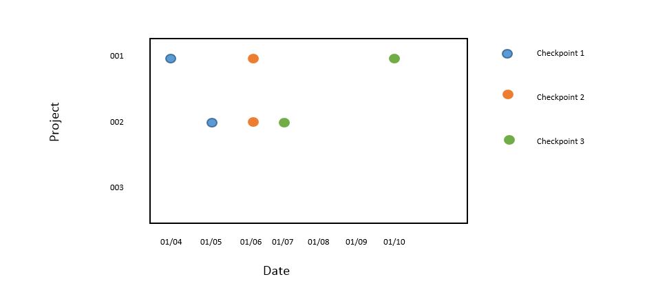
I am looking to create a a graph where I set the x & y axis. I have data like the below and I want to create a chart where x-axis showing a timeline, y-axis will show 'Project ID' and the values/data points will be the delivery date.
I also have a master calendar whose values I can use for the x-axis.
Project ID Checkpoint Delivery Date
001 1 01/04/2017
001 2 01/06/2017
001 3 01/10/2017
002 1 01/05/2017
002 2 01/06/2017
002 3 01/07/2017
- Mark as New
- Bookmark
- Subscribe
- Mute
- Subscribe to RSS Feed
- Permalink
- Report Inappropriate Content
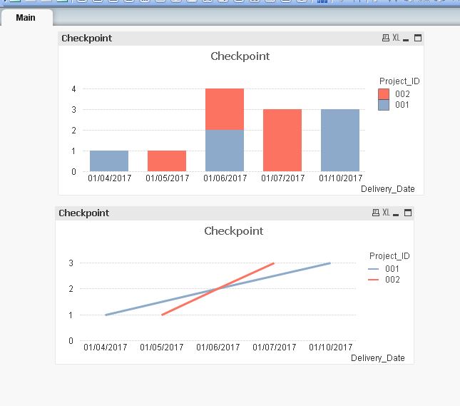
Hi,
Please refer to the attachment, it looks straight forward and what issue are you facing it?
is this below o/p u r looking it? if not share your expected output here? Thanks 
- Mark as New
- Bookmark
- Subscribe
- Mute
- Subscribe to RSS Feed
- Permalink
- Report Inappropriate Content
Hi Thank for that Devarasu,
To add to your solution I would like to have the y axis to show the project names. Like the below