Unlock a world of possibilities! Login now and discover the exclusive benefits awaiting you.
- Qlik Community
- :
- All Forums
- :
- QlikView App Dev
- :
- Chart
- Subscribe to RSS Feed
- Mark Topic as New
- Mark Topic as Read
- Float this Topic for Current User
- Bookmark
- Subscribe
- Mute
- Printer Friendly Page
- Mark as New
- Bookmark
- Subscribe
- Mute
- Subscribe to RSS Feed
- Permalink
- Report Inappropriate Content
Chart
Hello Experts,
I need some help in building my chart, below is the scenario I am working on.
I have product and their age related data that comes from my database tables as below.
| product | Age |
| P1 | 1 |
| p2 | 1 |
| p3 | 3 |
| p4 | 2 |
| p5 | 2 |
| p6 | 4 |
I have an inline load script as below
AgeCategory:
LOAD * INLINE [
Age, AgeName
1, Current
2, 0-30
3, 31-60
4, Over 60
];
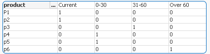
I wanted to build a chart as below.I have many dimensions in my actual chart, but I am just presenting one in the below example. if product age falls under "Current" category the there should be 1 else 0 in the 'Current' field and similarly for all the remaining fields.
| product | Current | 0-30 | 31-60 | over 60 |
| 2 | 2 | 1 | 1 | |
| p1 | 1 | 0 | 0 | 0 |
| p2 | 1 | 0 | 0 | 0 |
| p3 | 0 | 0 | 1 | 0 |
| p4 | 0 | 1 | 0 | 0 |
| p5 | 0 | 1 | 0 | 0 |
| p6 | 0 | 0 | 0 | 0 |
Any help would be highly appreciated.
Thanks
Heera
- Tags:
- new_to_qlikview
- Mark as New
- Bookmark
- Subscribe
- Mute
- Subscribe to RSS Feed
- Permalink
- Report Inappropriate Content
You can create a Pivot Table and pivot the AgeName dimension
- Mark as New
- Bookmark
- Subscribe
- Mute
- Subscribe to RSS Feed
- Permalink
- Report Inappropriate Content
Clever,
Thanks much for the reply.
I tried using Pivot table, but because of too many dimensions in my chart, the chart is looking very confusing ,is there any other option?
Thanks
Heera
- Mark as New
- Bookmark
- Subscribe
- Mute
- Subscribe to RSS Feed
- Permalink
- Report Inappropriate Content
This way?
- Mark as New
- Bookmark
- Subscribe
- Mute
- Subscribe to RSS Feed
- Permalink
- Report Inappropriate Content
Table: Mapping
LOAD * INLINE [
Age, AgeName
1, Current
2, 0-30
3, 31-60
4, Over 60
];
TableB:
LOAD * Inline [
product ,Age
P1, 1
p2 ,1
p3 ,3
p4 ,2
p5 ,2
p6 ,4
];
NoConcatenate
LOAD *,ApplyMap('Table',Age) as Bucket Resident TableB;
DROP Table TableB;
EXIT Script;
Copy this script and paste and reload
then create a pivort table product and bucket as dimension and expression as count (age)
finally drag the second dimension age as top so u will get what u want as u shown in ur output