Unlock a world of possibilities! Login now and discover the exclusive benefits awaiting you.
- Qlik Community
- :
- All Forums
- :
- QlikView App Dev
- :
- Combine 2 bell graphs into 1
- Subscribe to RSS Feed
- Mark Topic as New
- Mark Topic as Read
- Float this Topic for Current User
- Bookmark
- Subscribe
- Mute
- Printer Friendly Page
- Mark as New
- Bookmark
- Subscribe
- Mute
- Subscribe to RSS Feed
- Permalink
- Report Inappropriate Content
Combine 2 bell graphs into 1
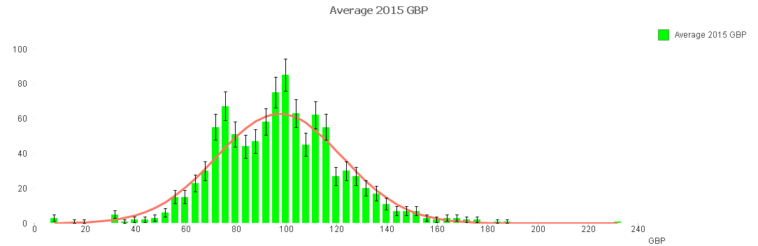
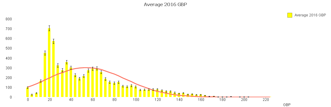
Hi, I am trying to compare 2 normalised distribution graphs for 2 different years (2015 and 2016). Currently, I have to create 2 seperate graphs for each year, however i would like them to be in 1 graph only. How do I combine both graphs together into one?
Currently I am coding it as:
Dimension : =Round(GBP, BinWidth)
1st expression : =Count({<YEAR ={"2015"}>}GBP)
2nd expression : =Only({<YEAR={"2015"}>}NORMDIST(Round(GBP, BinWidth),Avg(total GBP),Stdev(total GBP),0)*BinWidth*Count(total GBP))
for the specific year for 2015, and the same code is used for the graph for year 2016.
Is there a way to code such that both graphs are combined into one, so that comparisons between the 2 years can be more visual?
Thank you!
Attached images for the 2 different years.
- Mark as New
- Bookmark
- Subscribe
- Mute
- Subscribe to RSS Feed
- Permalink
- Report Inappropriate Content
please post an example qvw.
thanks
regards
Marco
- Mark as New
- Bookmark
- Subscribe
- Mute
- Subscribe to RSS Feed
- Permalink
- Report Inappropriate Content
....and it's not possible to have all four expressions in the same graph?
- Mark as New
- Bookmark
- Subscribe
- Mute
- Subscribe to RSS Feed
- Permalink
- Report Inappropriate Content
I agree with Klaus ...
You can have all your expressions in one CHART..
and then
- Edit the chart and add a third expression with just a value of 0:
- A new legend will appear.
- Open the properties and go to the Presentation tab. Deselect the Show Legend option:
this will make sure that your two years data will separate with some space