Unlock a world of possibilities! Login now and discover the exclusive benefits awaiting you.
- Qlik Community
- :
- All Forums
- :
- QlikView App Dev
- :
- Combining X axes of two animated charts to a singl...
- Subscribe to RSS Feed
- Mark Topic as New
- Mark Topic as Read
- Float this Topic for Current User
- Bookmark
- Subscribe
- Mute
- Printer Friendly Page
- Mark as New
- Bookmark
- Subscribe
- Mute
- Subscribe to RSS Feed
- Permalink
- Report Inappropriate Content
Combining X axes of two animated charts to a single one
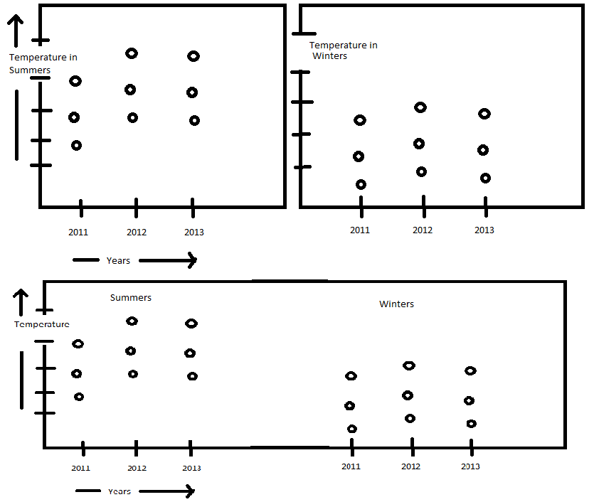
I have two charts each representing the average temperature of 3 cities in 3 consecutive years. The difference in the charts is - one represents average temperature of cities during Summers and the other one during Winters. The charts can be seen in the photo attached which gives the concept of these charts.
I want both chart to be combined and represent in a single chart as shown in the 3rd part og the photo attached. Is it possible to combine X axes of two different charts and represent the details separately in a single chart. Please help me in achieving this exact behaviour. I'm not getting the idea of combining X axes of two different charts to a single one.