Unlock a world of possibilities! Login now and discover the exclusive benefits awaiting you.
- Qlik Community
- :
- All Forums
- :
- QlikView App Dev
- :
- Re: Conditional Coloring in a Bar Chart with diffe...
- Subscribe to RSS Feed
- Mark Topic as New
- Mark Topic as Read
- Float this Topic for Current User
- Bookmark
- Subscribe
- Mute
- Printer Friendly Page
- Mark as New
- Bookmark
- Subscribe
- Mute
- Subscribe to RSS Feed
- Permalink
- Report Inappropriate Content
Conditional Coloring in a Bar Chart with different color
Hi,
I Want Different Colors on a Bar Chart(Grouped ) Side by Side with Two dimensions on X_Axis. .I don't want to Stacked Bar Chart.
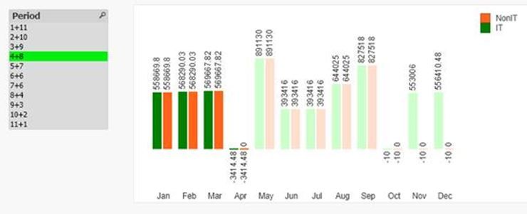
would like to display Two different Colors like Green and Orange based on the Period Selection with dark and light based on actual versus forecast.
1) The Actual bars (IT & NonIT) should be dark Green and Orange
2) The Forecast bars (IT & NonIT) should be light Green and Orange
Example1: If user select the period 2+10, the Jan and Feb should be dark and the rest will be light colors
Example2: If user select the period 4+8, from Jan to Apr should be dark and the rest will be light colors

Will you please verify the attached SampleData and QVW and need your support to achieve on this.
Thanks in advance!!!
- Mark as New
- Bookmark
- Subscribe
- Mute
- Subscribe to RSS Feed
- Permalink
- Report Inappropriate Content
you need a way to compare Actual field vs month to be able to say if the month is in actual or forecast period. i added month number to your XLS, simply Jan =1, Feb=2, etc..
then in the background expression, i test the dimension value and if the month is actual or forecast. there are other more efficient ways for sure but this is the simplest just pursuing the track you are currently on.