Unlock a world of possibilities! Login now and discover the exclusive benefits awaiting you.
- Qlik Community
- :
- All Forums
- :
- QlikView App Dev
- :
- Connected users chart
- Subscribe to RSS Feed
- Mark Topic as New
- Mark Topic as Read
- Float this Topic for Current User
- Bookmark
- Subscribe
- Mute
- Printer Friendly Page
- Mark as New
- Bookmark
- Subscribe
- Mute
- Subscribe to RSS Feed
- Permalink
- Report Inappropriate Content
Connected users chart
I have a table Connections, related to users connected to a streaming service, with connection and disconnection time — which always occur in the same day.
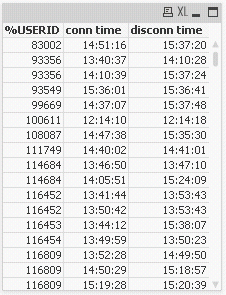
I need to create a chart showing
- on x-axis: time — by minute or by 10 minutes
- on y-axis: number of users connected
How can I achieve it?
Thanks for your help
- Mark as New
- Bookmark
- Subscribe
- Mute
- Subscribe to RSS Feed
- Permalink
- Report Inappropriate Content
Henric's post on creating missing data should answer your question.
Generating Missing Data In QlikView
See the example for creating data on each day a contract is valid.
- Mark as New
- Bookmark
- Subscribe
- Mute
- Subscribe to RSS Feed
- Permalink
- Report Inappropriate Content
Yes, thanks, very helpful link.
As a novice tho I cannot get how to round by single hour:minute — or 10 minutes.
I mean: to get following date I use
Date( FromDate + IterNo() – 1 )
i.e. I sum 1.
How about single minute?
How do I round by minute?
How do I increment by minute?
Thanks for your patience
EDIT
I got how to round by minute:
time(frac(floor(MyTIME, 1/1440)),'hh:mm')
- Mark as New
- Bookmark
- Subscribe
- Mute
- Subscribe to RSS Feed
- Permalink
- Report Inappropriate Content
It may be easier to convert the start and end time data to an integer minutes since midnight, and increment by the minute rather than working in fractions. You can then analyse the data by the minute, 10min or other intervals in your chart.