Unlock a world of possibilities! Login now and discover the exclusive benefits awaiting you.
- Qlik Community
- :
- All Forums
- :
- QlikView App Dev
- :
- Creating Arrow in Chart
- Subscribe to RSS Feed
- Mark Topic as New
- Mark Topic as Read
- Float this Topic for Current User
- Bookmark
- Subscribe
- Mute
- Printer Friendly Page
- Mark as New
- Bookmark
- Subscribe
- Mute
- Subscribe to RSS Feed
- Permalink
- Report Inappropriate Content
Creating Arrow in Chart
Hi All,
I need to create an arrow representation in my chart depending upon the increase or decrease in the current and previous value.
I have already tried in straight table but now i want to apply same in Line chart.
I have attached my chart for your reference also with what i want.
Thanks in Advance
Accepted Solutions
- Mark as New
- Bookmark
- Subscribe
- Mute
- Subscribe to RSS Feed
- Permalink
- Report Inappropriate Content
Can you use expression image arrows as a work around ? Or load similar images as Bundle load an use them.
For now i believe you can use if this would suffice your requirement?
Like:
Create your expression with the condition as your %ge value and then use
= IF(Yourexpression, ''qmem://<bundled>/BuiltIn/arrow_n_g.png', 'qmem://<bundled>/BuiltIn/arrow_s_r.png')
You can get these bundle images from expression window -> Image tab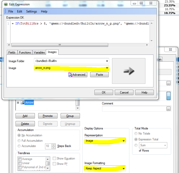
- Mark as New
- Bookmark
- Subscribe
- Mute
- Subscribe to RSS Feed
- Permalink
- Report Inappropriate Content
I didn't knew this...
Thanks for asking this question @Vivek and thanks for replying it @ Nagaraju...
- Mark as New
- Bookmark
- Subscribe
- Mute
- Subscribe to RSS Feed
- Permalink
- Report Inappropriate Content
This is straight table representation but i need in line chart representation @Vishwarath Nagaraju.
- Mark as New
- Bookmark
- Subscribe
- Mute
- Subscribe to RSS Feed
- Permalink
- Report Inappropriate Content
Can you provide sample to work, Where you want to show that arrow? And draw expected output which you need in line chart
- Mark as New
- Bookmark
- Subscribe
- Mute
- Subscribe to RSS Feed
- Permalink
- Report Inappropriate Content
This is a very loose example of how you could achieve this using text in chart.
Obviously for more measures just add more text in charts
- Mark as New
- Bookmark
- Subscribe
- Mute
- Subscribe to RSS Feed
- Permalink
- Report Inappropriate Content
Purely for my own interest I was wondering if the above proved to be useful?