Unlock a world of possibilities! Login now and discover the exclusive benefits awaiting you.
- Qlik Community
- :
- All Forums
- :
- QlikView App Dev
- :
- Re: Creating a Chart
- Subscribe to RSS Feed
- Mark Topic as New
- Mark Topic as Read
- Float this Topic for Current User
- Bookmark
- Subscribe
- Mute
- Printer Friendly Page
- Mark as New
- Bookmark
- Subscribe
- Mute
- Subscribe to RSS Feed
- Permalink
- Report Inappropriate Content
Creating a Chart
Hi,
I am a bit stuck with the below problem. My Data looks like the below :
Code Name Category Mon Tue Wed Thu Fri
123 ABC ABC 0.2 0.36 0.45 125 256
Thus, when I read this data into the script, the days (Mon-Fri) are fields.
What i would like recreate is the below:
I created a field that Checks if the category are like '*Franchise','* corporate' etc.
But when I have the categories as Dimension and AVG of the days as expressions, the below is seen.
Please share some ideas of how i can get it as the above graph.
Thanks in advance!
Accepted Solutions
- Mark as New
- Bookmark
- Subscribe
- Mute
- Subscribe to RSS Feed
- Permalink
- Report Inappropriate Content
Hello Ruan,
Please refer the attached sample application.
Regards!
Rahul
- Mark as New
- Bookmark
- Subscribe
- Mute
- Subscribe to RSS Feed
- Permalink
- Report Inappropriate Content
Hi Ruan,
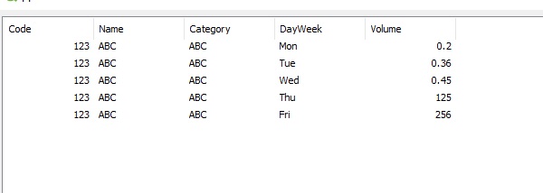
Can the following table conversion help?
CrossTable(DayWeek,Volume, 3)
LOAD*Inline
[Code,Name,Category,Mon,Tue,Wed,Thu,Fri
123,ABC,ABC,0.2,0.36,0.45,125,256];
Result

Regards,
Andrey
- Mark as New
- Bookmark
- Subscribe
- Mute
- Subscribe to RSS Feed
- Permalink
- Report Inappropriate Content
Hi Andrey,
You gave me the right idea with the cross table, so i used the transpose step in order to get the data, as this data was available in the Spreadsheet i use it from.
Thanks
- Mark as New
- Bookmark
- Subscribe
- Mute
- Subscribe to RSS Feed
- Permalink
- Report Inappropriate Content
Hello Ruan,
Please refer the attached sample application.
Regards!
Rahul
- Mark as New
- Bookmark
- Subscribe
- Mute
- Subscribe to RSS Feed
- Permalink
- Report Inappropriate Content
Thanks Rahul,
Please could you tell me how you got the data points to be circles ? I cant seem to find that option anywhere.
Regards,
- Mark as New
- Bookmark
- Subscribe
- Mute
- Subscribe to RSS Feed
- Permalink
- Report Inappropriate Content
Hello Ruan,
In the expression tab, under the Display Options tick the Symbol option and set as Dots (refer the attached screenshots). Repeat this for every expression. Once this is done then change the Symbol Size to 6 pt from Line/Symbol Settings available under Presentation tab.
Regards!
Rahul
- Mark as New
- Bookmark
- Subscribe
- Mute
- Subscribe to RSS Feed
- Permalink
- Report Inappropriate Content
Many thanks!