Unlock a world of possibilities! Login now and discover the exclusive benefits awaiting you.
- Qlik Community
- :
- All Forums
- :
- QlikView App Dev
- :
- Re: Creating a Pie Chart from Straight Table
- Subscribe to RSS Feed
- Mark Topic as New
- Mark Topic as Read
- Float this Topic for Current User
- Bookmark
- Subscribe
- Mute
- Printer Friendly Page
- Mark as New
- Bookmark
- Subscribe
- Mute
- Subscribe to RSS Feed
- Permalink
- Report Inappropriate Content
Creating a Pie Chart from Straight Table
I would like to create a Pie Chart from some data I prepared in a Straight Table. However, I would only like to chart a portion of the data.
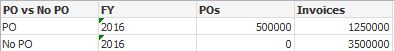
I only want to chart the ratio between the values on the PO row. How can I limit the data in this straight table and turn it into a Pie Chart? I had to create a calculated Dimension for the Po vs No PO field.
=If(Len([PO]) = 0,'No PO','PO')
- « Previous Replies
- Next Replies »
- Mark as New
- Bookmark
- Subscribe
- Mute
- Subscribe to RSS Feed
- Permalink
- Report Inappropriate Content
That makes all my PO counts 0
- Mark as New
- Bookmark
- Subscribe
- Mute
- Subscribe to RSS Feed
- Permalink
- Report Inappropriate Content
Cliff -
Would you be able to provide a sample? I think I don't have good understanding of what is needed. Would you be able to provide a sample in the Excel file?
- Mark as New
- Bookmark
- Subscribe
- Mute
- Subscribe to RSS Feed
- Permalink
- Report Inappropriate Content
It's really difficult to provide an example. Couldn't I somehow use the Conditional property and limit the results that way?
- Mark as New
- Bookmark
- Subscribe
- Mute
- Subscribe to RSS Feed
- Permalink
- Report Inappropriate Content
This is what I ended up doing for my two expressions:
=Count(DISTINCT If(FY=vFY_Current and Len([PO]) <> 0, [PO]))
=Sum(If(FY=vFY_Current and Len([PO]) <> 0, [Invoice]))
Would set analysis work better here?
- « Previous Replies
- Next Replies »